A free UI kit is a shortcut to consistent, professional interfaces. Instead of drawing every button, input and modal from scratch, you start with a library of ready-made components, typography and colour styles. The best free Figma UI kits come from teams that use them every day.
Below are ten free design systems and Figma UI kits we recommend, from official kits by Google, Apple and Microsoft to independent libraries loved by product designers. Each entry explains what is included, its license and who it is best for.
Click any screenshot to open the source and duplicate the free kit into your own Figma account.
Quick picks at a glance
| # | Resource | License | Best for |
|---|---|---|---|
| 1 | Material 3 Design Kit | Apache 2.0 | Android and cross-platform apps |
| 2 | Apple Design Resources | Apple license | iOS, iPadOS and macOS apps |
| 3 | Untitled UI (Free) | Free license | SaaS product design |
| 4 | Fluent 2 Design System | MIT | Microsoft-style and enterprise apps |
| 5 | IBM Carbon Design System | Apache 2.0 | Data-heavy enterprise products |
| 6 | Ant Design | MIT | Admin panels and back-office tools |
| 7 | shadcn/ui | MIT | Modern React and Next.js apps |
| 8 | Atlassian Design System | Atlassian terms | Collaboration and productivity tools |
| 9 | Figma Community | Varies (often CC BY 4.0) | Finding niche UI kits |
| 10 | Flowbite Figma (Free) | MIT (Community edition) | Tailwind CSS projects |
Material 3 Design Kit
Design system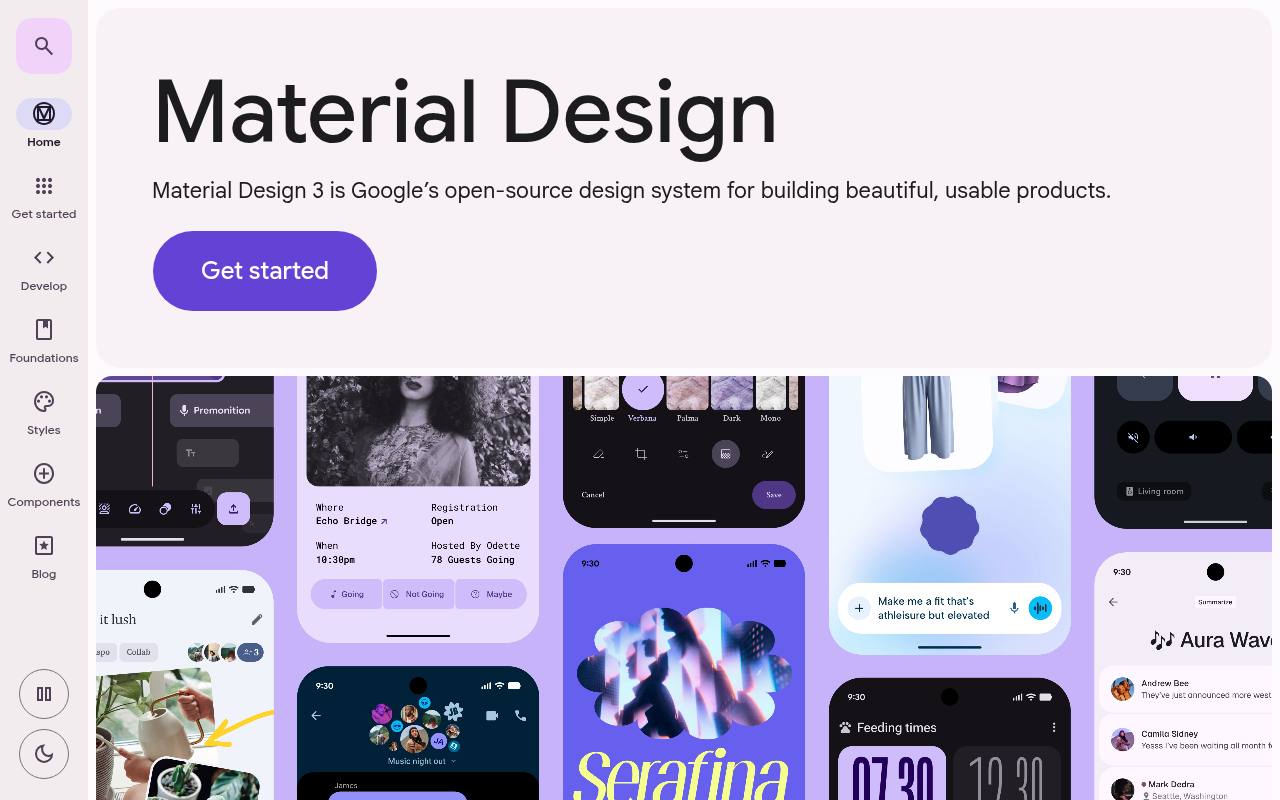
Google’s Material site pairs the free Figma M3 Design Kit with detailed guidance for building Material interfaces. The kit provides customizable components and styles for mockups and prototypes, including the newer M3 Expressive direction. On the site, Foundations, Styles, and Components explain color, typography, shape, motion, and interaction patterns; examples include toolbars, split buttons, button groups, and progress indicators.
Developer sections connect the design work to Android, Jetpack Compose, Flutter, and web implementations. Material’s open-source code uses Apache 2.0, making this an especially relevant starting point for teams connecting Android design decisions with implementation.
- Type
- Design system
- Best for
- Android and cross-platform apps
- License
- Apache 2.0
- Price
- Free
Apple Design Resources
Official UI kits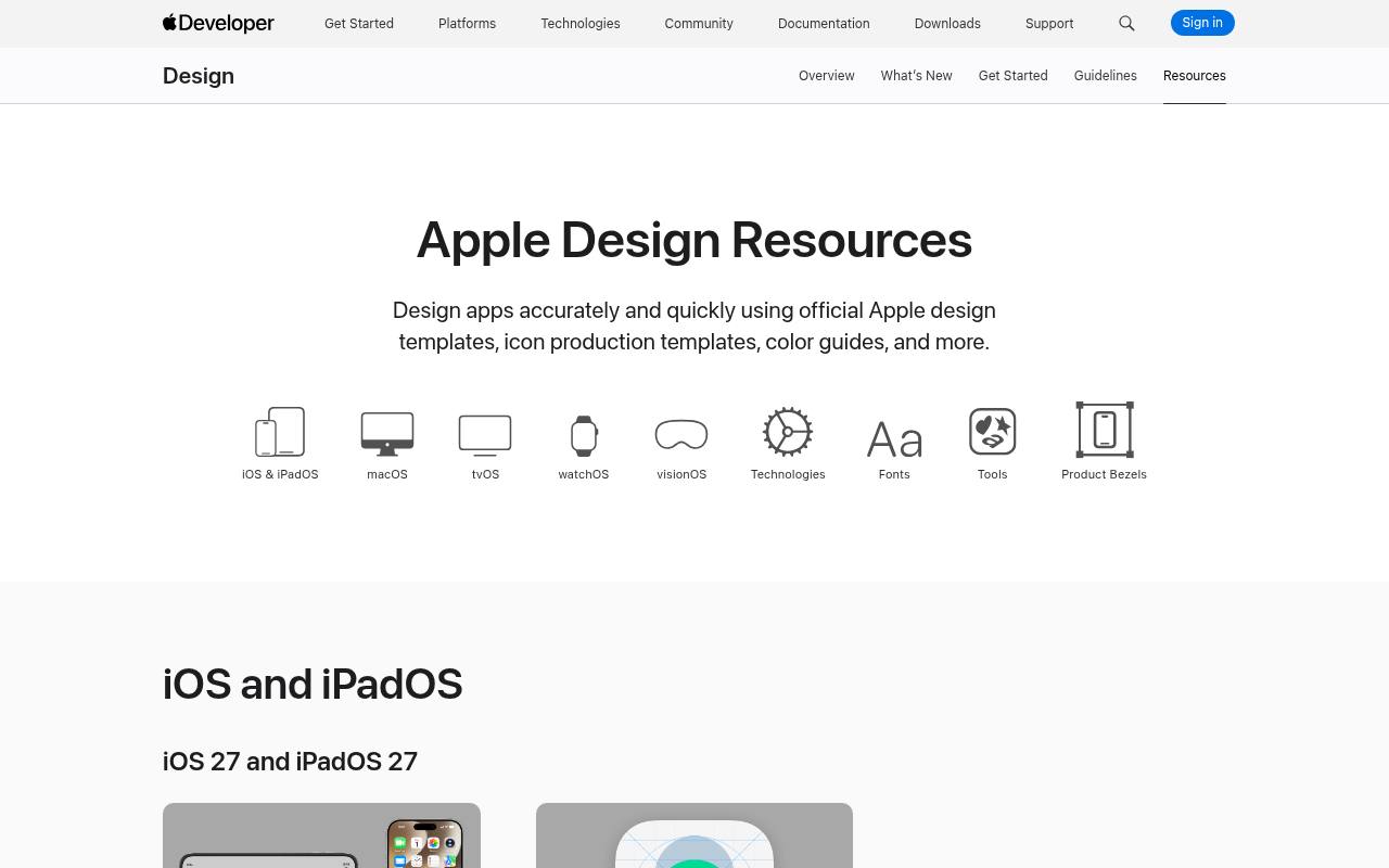
For platform-native mockups, Apple Design Resources brings together official UI kits, app icon templates, fonts, symbols, and device presentation assets. Its platform sections cover iOS and iPadOS, macOS, watchOS, tvOS, and visionOS, with formats varying by download, including Figma and Sketch.
The Technologies section adds templates for Apple Pay, Live Activities, App Clips, Wallet, and Sign in with Apple. Separate sections provide SF fonts, SF Symbols, Icon Composer, and product bezels, including Photoshop and PNG assets. These resources are free, but remain subject to Apple’s resource licenses, rather than a general open-source license.
- Type
- Official UI kits
- Best for
- iOS, iPadOS and macOS apps
- License
- Apple license
- Price
- Free
Untitled UI (Free)
Figma UI kit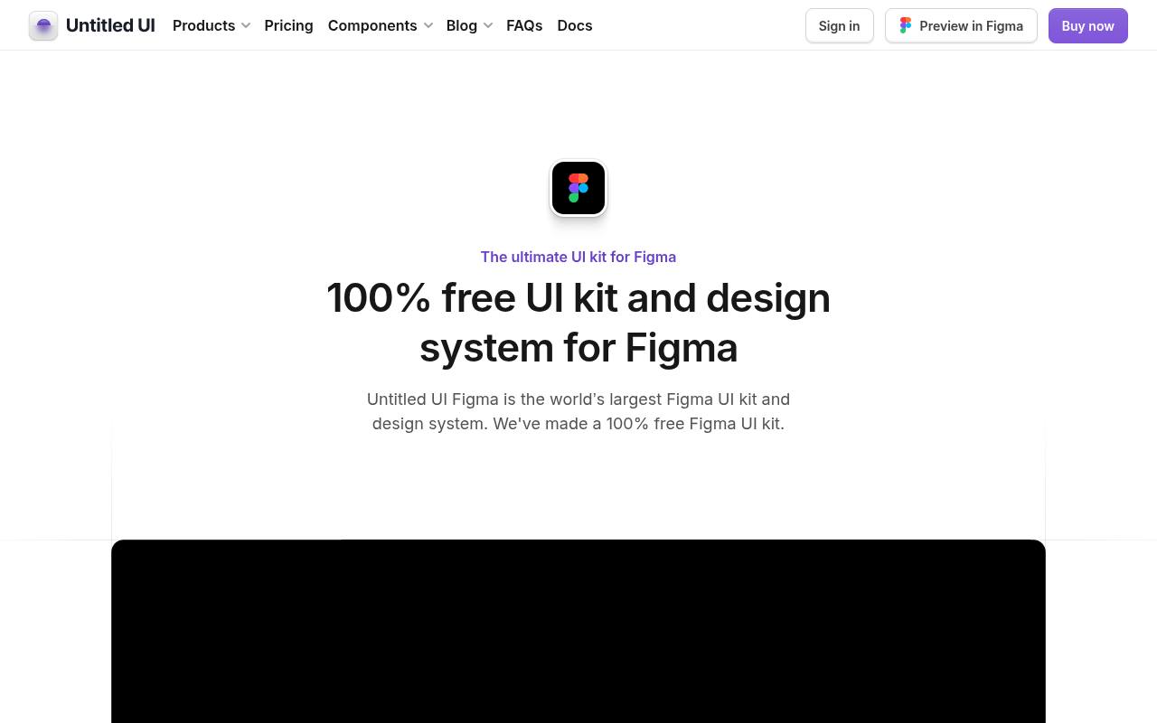
Untitled UI’s free edition introduces its Figma-based approach to reusable interface design, while the same product page also promotes a substantially larger paid library. The system emphasizes Auto Layout, component variants, and coordinated color, typography, and effect styles for assembling product screens and websites.
A free version download sits alongside previews and upgrade options, so the extensive page-example and website-section totals advertised across the page should not be treated as the free allowance. The files use Untitled UI’s own license terms, not MIT; the commercial kit and its expanded resources are separate from the starter download.
- Type
- Figma UI kit
- Best for
- SaaS product design
- License
- Free license
- Price
- Free + Pro
Fluent 2 Design System
Design system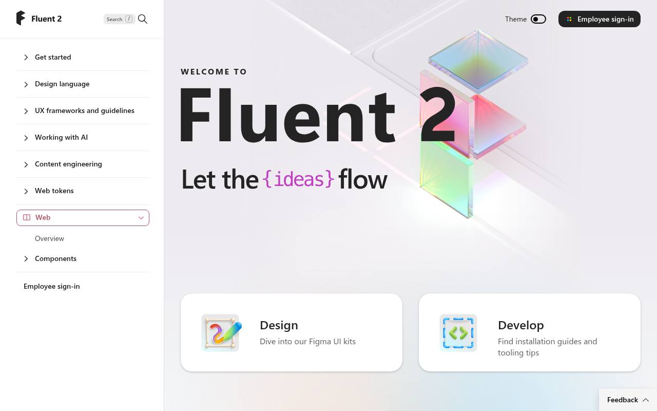
Microsoft organizes Fluent 2’s free design resources into Figma UI kits that map to its implementation libraries. Core kits cover web, iOS, and Android, while the wider system separates its design language, Copilot-focused patterns, and experimental Labs kits.
Figma Variables hold color, stroke width, corner radius, spacing, and sizing decisions, with light and dark styling supported. Component variants and properties correspond to code options, helping designers describe the same states developers implement. The site also links to focus-order annotations, a contrast checker, Content Reel, and an icon-scaling plugin. Fluent’s open-source implementation is MIT-licensed.
- Type
- Design system
- Best for
- Microsoft-style and enterprise apps
- License
- MIT
- Price
- Free
IBM Carbon Design System
Design system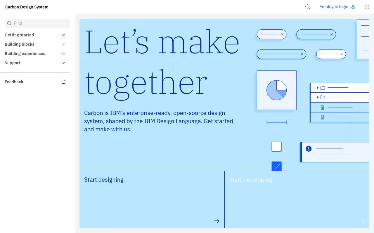
IBM’s Carbon combines a free enterprise design system with guidance for complex product experiences. Its Building blocks area separates Foundations, Components, Patterns, and Data visualization, making charts and information-heavy interfaces part of the system rather than an afterthought.
Start designing and Start developing provide separate entry points, while Universal Experiences covers journeys such as onboarding, learning, and adoption. The site also includes Carbon for AI and a Carbon MCP connection that exposes components, tokens, icons, guidance, and code to AI applications. Carbon’s Apache 2.0 licensing supports reuse of its open-source system in enterprise products.
- Type
- Design system
- Best for
- Data-heavy enterprise products
- License
- Apache 2.0
- Price
- Free
Ant Design
Design system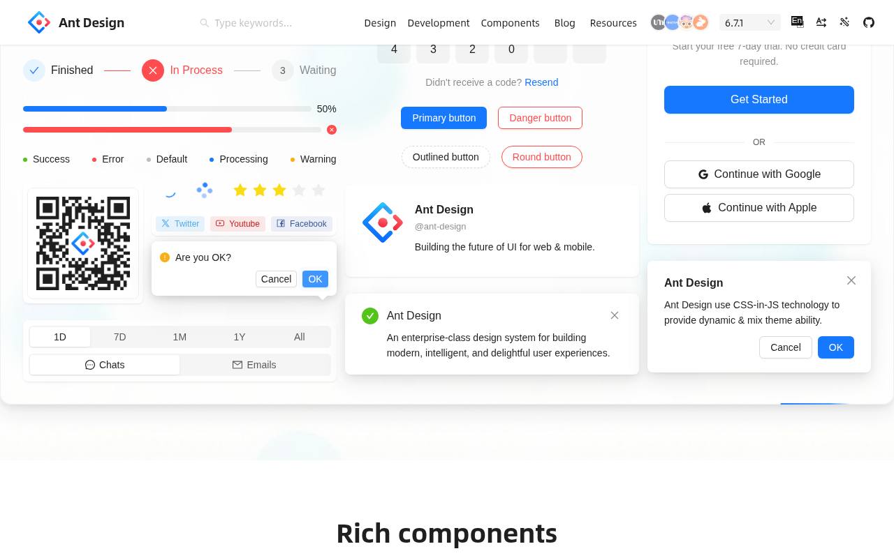
Ant Design’s resource directory goes beyond a component gallery: it includes official Sketch Symbols for desktop and mobile, Ant Design Pro page templates, chart symbols, and the Kitchen Sketch plugin collection. For Figma users, the directory explicitly distinguishes third-party Figma kits, including a free open-source library, from official resources.
This makes the site useful for planning admin interfaces while keeping the source of each design file visible. The accompanying design language and React library connect those mockups to implementation. Ant Design’s code is free under MIT, while independently supplied design kits have their own terms.
- Type
- Design system
- Best for
- Admin panels and back-office tools
- License
- MIT
- Price
- Free
shadcn/ui
Component library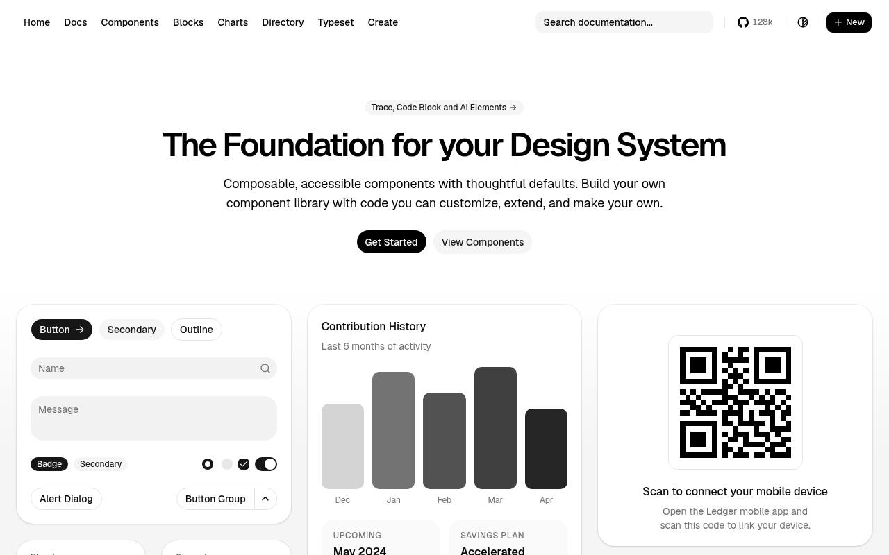
Rather than supplying a conventional downloadable design file, shadcn/ui presents a free, code-first foundation for building a custom interface system. Its component examples let designers explore actual interface compositions, and the site links directly to installation and component documentation.
The central model is editable component source: teams customize and extend the code inside their own projects instead of treating a finished visual theme as fixed. For a UI-kit roundup, it belongs on the implementation-led side of the selection, not as an official Figma download. The project’s MIT license permits reuse and modification of its code.
- Type
- Component library
- Best for
- Modern React and Next.js apps
- License
- MIT
- Price
- Free
Atlassian Design System
Design system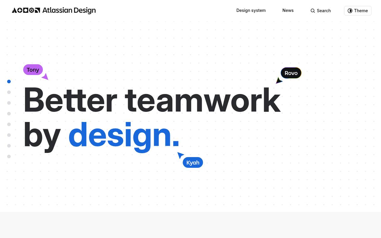
Atlassian’s system documents the interface building blocks behind its product ecosystem, with foundations, components, and patterns supported by design and development resources. The site includes design tokens, accessibility guidance, and tooling intended to keep product interfaces aligned.
It is free to explore, but its Atlassian Design System license is notably narrower than MIT: the grant covers software that integrates or interoperates with Atlassian products. The published terms also restrict modification, derivative works, and redistribution of the system itself. This makes it especially relevant to Atlassian add-ons, rather than an unrestricted starter kit for unrelated commercial applications.
- Type
- Design system
- Best for
- Collaboration and productivity tools
- License
- Atlassian terms
- Price
- Free to explore
Figma Community
Community files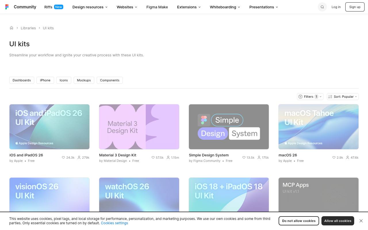
Browse Figma Community’s UI kits category to find files shared by many different creators rather than one centrally maintained design system. Listings include kits based on established systems, such as an Ant Design free version, alongside independently designed interface collections.
Each resource opens its own detail page, where the creator’s offering determines the included components and whether the file is free or paid. Because the directory mixes publishers, licensing varies by resource; it is not one blanket license for every kit. The collection is particularly useful when the desired deliverable is an editable Figma file rather than a coded library.
- Type
- Community files
- Best for
- Finding niche UI kits
- License
- Varies (often CC BY 4.0)
- Price
- Many free
Flowbite Figma (Free)
Tailwind UI kit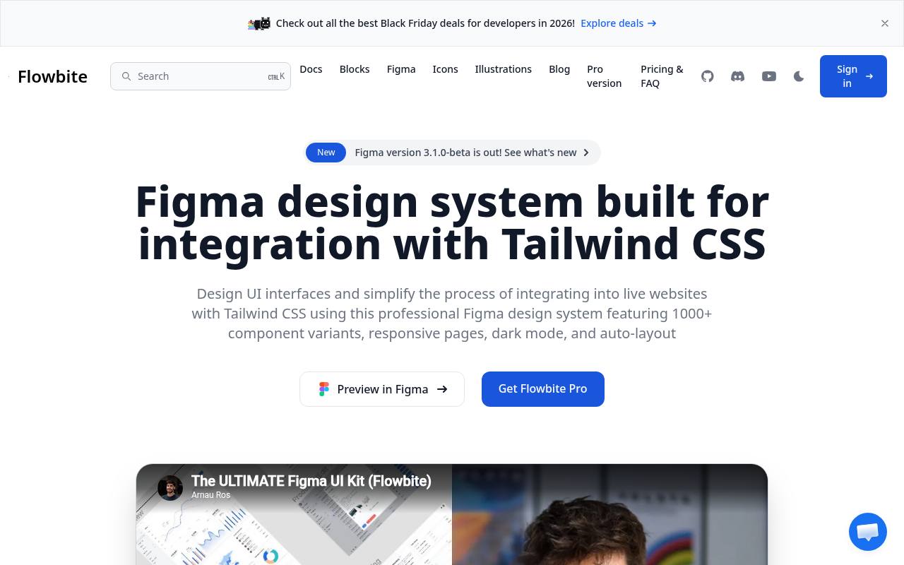
Flowbite’s Figma offering mirrors the structure of Tailwind CSS, but its Community edition is deliberately smaller than the paid design system. The free file includes minimal style guidelines, component variants, and a dashboard page with a corresponding mobile version.
It can be duplicated from Figma Community and is explicitly released under the MIT license, including use for commercial projects. The broader product page showcases Auto Layout, grid layouts, dark mode, and additional application, marketing, and e-commerce work. Those expanded assets and code packages belong to the separate paid editions, not automatically to the free starter file.
- Type
- Tailwind UI kit
- Best for
- Tailwind CSS projects
- License
- MIT (Community edition)
- Price
- Free + Pro
How to pick a free UI kit
Match the kit to your platform first: Apple's kits for iOS, Material 3 for Android, Fluent or Carbon for enterprise web apps. Then check whether the kit uses Figma variables and auto-layout — modern kits are far easier to customise.
If you build with React or Tailwind, choose a free design system that also ships code components (Ant Design, Carbon, shadcn/ui, Flowbite) so design and development stay in sync.
Frequently asked questions
What is the best free Figma UI kit? Untitled UI Free is the most polished general-purpose kit; Material 3 and Apple's kits are best for native apps.
Can I use free UI kits in commercial products? Yes for the kits listed here — open-source systems use MIT or Apache licenses, and official platform kits are provided for building apps on those platforms.
Audit one complete user task before adopting a kit
Instead of comparing free UI kits by the size of their component galleries, choose a task your product must support and sketch its full journey. An account settings flow, for example, may require navigation, editable fields, validation, confirmation and a recovery path when saving fails.
Check whether each candidate gives you a coherent starting point for those moments. A beautiful button collection is less useful if your team must invent the surrounding interaction patterns before it can deliver a working screen.
Use the same task to compare appropriate candidates from this article. IBM Carbon Design System and Ant Design are relevant to explore for detailed enterprise workflows, while Untitled UI (Free) offers a SaaS-oriented starting point.
Do not assume their free resources contain every specialised component your project needs. Open the actual files, inspect the available variants and record what is missing. This small audit helps you separate genuine coverage from an impressive preview and makes future design work easier to estimate.
Establish a visual foundation before editing individual screens
When you duplicate a free Figma UI kit, begin with the underlying styles rather than recolouring isolated buttons. Identify how the file defines typography, spacing, surfaces, borders and semantic colours. Map those choices to your product's needs and create a small test screen to review them together.
A primary colour that looks attractive on a large banner may not work for a compact control, so evaluate combinations in context before spreading changes throughout a large collection of screens and variants.
Separate brand expression from functional meaning. Your warning treatment, focus indicator and disabled state need to remain understandable even if your brand palette is restrained or unusual. Material 3 Design Kit and Fluent 2 Design System provide useful guidance to study, but your own combinations still need testing.
Document any deliberate departures from the starting system, including when a specific colour or text style should be used. A free design system becomes more valuable when your team can explain its decisions consistently.
Use low-detail screens to resolve structure first
A free wireframe kit can help you discuss navigation and information hierarchy before visual details dominate the conversation. Build the key screens with realistic labels and representative content, then ask a colleague to describe how they would complete the task.
Listen for hesitation around terminology, grouping and next steps. These observations are more actionable than general reactions to whether a polished screen looks modern, and they let you make structural changes before investing heavily in finished component styling and presentation.
When exploring Figma community files, inspect the organisation of the file as carefully as its cover image. Look for clear component names, reusable layout patterns and a structure that your team can understand without a guided tour.
Figma Community can help you find niche starting points, but availability and quality vary between contributions. Keep your exploratory wireframes separate from approved product components so an experimental layout does not accidentally become the standard simply because someone copied it into a production design page.
Specify the states that polished previews leave out
A production interface needs to handle more than populated cards and successful submissions. Design empty results, loading feedback, long labels, missing images and permission restrictions before your handover. For forms, show how an error is explained and how the user recovers without losing their work.
Free UI kits provide useful ingredients, but you should not interpret an absent example as evidence that the state is unnecessary. The less glamorous screens often determine whether a product feels clear when something goes wrong.
Test those states with realistic content constraints. Expand a navigation label, add a long customer name and replace a short status message with a fuller explanation. Check whether auto-layout behaves as intended and whether components remain understandable when the frame narrows.
If you work with Apple Design Resources, consider the relevant platform guidance alongside the file itself. A static mockup can demonstrate appearance, but interaction expectations, text resizing and assistive technology behaviour require explicit discussion with the people implementing the interface.
Keep a source register for future updates and handovers
Record the origin of each adopted resource, the file you duplicated and the licence information available at the time. Read each source's licence page, particularly when combining an official platform kit with community additions or resources offering free and paid editions.
Do not assume that permission to design with a file includes permission to redistribute it as your own kit. If a requirement is unclear, resolve it before incorporating the resource into a client deliverable or shared internal asset library.
Give one person responsibility for reviewing upstream changes and deciding which are relevant to your product. Avoid replacing your customised library wholesale whenever a newer source file appears; compare changes on a separate page and test their effect on representative screens.
Keep a short record of local decisions so future designers understand why your system differs from the original. This measured approach preserves the convenience of free resources without letting outside updates unexpectedly reshape a product that your team has already tested and approved.