
Building every button, dialog and dropdown yourself is slow and error-prone, especially when accessibility matters. Free React component libraries give you tested, accessible building blocks so you can focus on your product.
This list covers the full spectrum: headless libraries that handle behaviour and leave styling to you, Tailwind-based component collections, and complete design systems with their own visual language. All are open source and free for commercial use.
For each library we explain its approach, license and ideal use case, with a link to the official docs and free download.
Quick picks at a glance
| # | Resource | License | Best for |
|---|---|---|---|
| 1 | shadcn/ui | MIT | Full control with great defaults |
| 2 | Radix UI | MIT | Accessible custom design systems |
| 3 | MUI (Material UI) | MIT | Material Design apps |
| 4 | Chakra UI | MIT | Fast, accessible app building |
| 5 | Mantine | MIT | Feature-rich dashboards |
| 6 | Ant Design | MIT | Admin and back-office apps |
| 7 | Headless UI | MIT | Tailwind CSS projects |
| 8 | daisyUI | MIT | Quick themed prototypes |
| 9 | React Aria | Apache 2.0 | Accessibility-first design systems |
| 10 | HeroUI | MIT | Beautiful modern interfaces |
shadcn/ui
Copy-paste components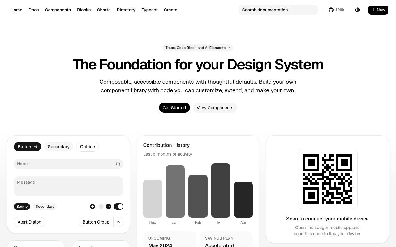
With shadcn/ui, the reusable unit is component source that becomes part of your application. The free collection emphasizes composable, accessible components and thoughtful defaults, with installation documentation and a browsable component catalog. Instead of locking customization behind a packaged theme, its own-the-code approach allows teams to modify markup, styling, and behavior directly and grow a project-specific library.
The homepage demonstrates assembled product interfaces, so developers can see how individual pieces work together beyond isolated controls. Distributed under MIT, the code is suited to React teams that want ownership of their interface layer rather than a fixed visual framework.
- Type
- Copy-paste components
- Best for
- Full control with great defaults
- License
- MIT
- Price
- Free
Radix UI
Headless primitives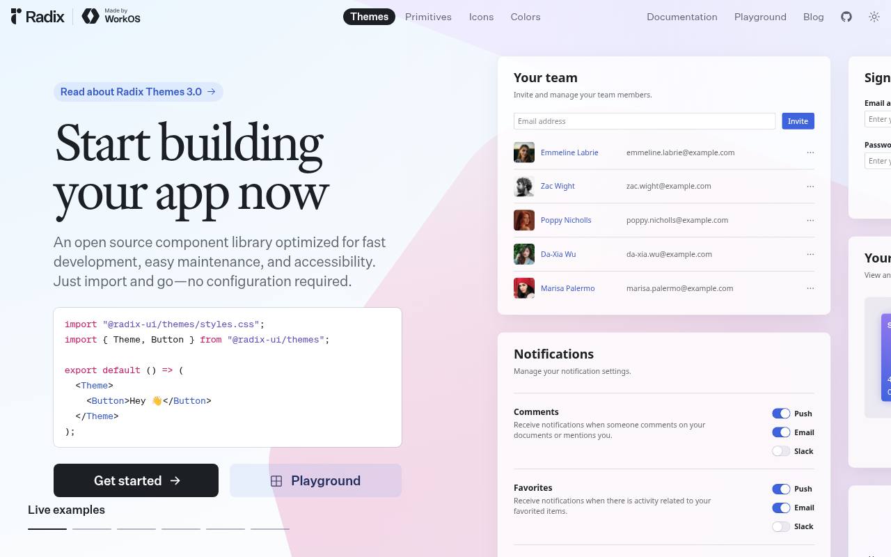
Radix offers two complementary routes for React interfaces: Themes supplies styled components, while Primitives provides lower-level accessible building blocks for custom designs. The homepage demonstrates a realistic application surface, including team management, notification settings, pricing choices, signup fields, activity, and financial information.
That presentation makes it easy to see how controls can fit together in a product rather than only viewing individual examples. Developers can start with the themed system or use primitives when their own visual language needs more control. The libraries are free and MIT-licensed, with documentation and source available through the project.
- Type
- Headless primitives
- Best for
- Accessible custom design systems
- License
- MIT
- Price
- Free
MUI (Material UI)
Complete design system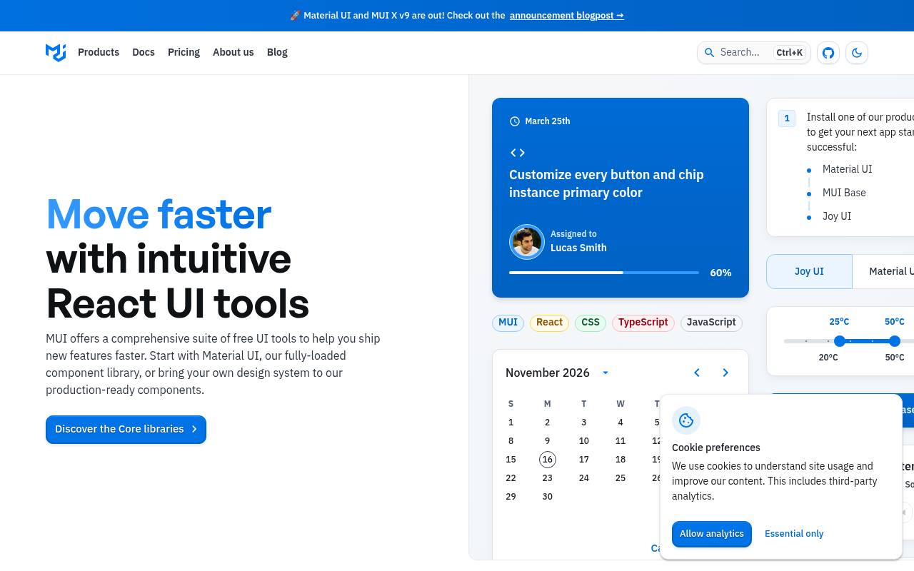
MUI’s toolkit centers on Material UI, a React component library with production-oriented controls and a customizable implementation of Material Design. The site demonstrates components in working interface examples and emphasizes theming, accessibility, and detailed documentation. Its wider ecosystem includes MUI X for more advanced interface needs and design resources for coordinating design and development.
The core library is free under MIT, but MUI is not an entirely free catalog: advanced commercial offerings, templates, and some MUI X capabilities are sold separately. This distinction matters when a project moves from standard forms and navigation into specialized data-heavy components.
- Type
- Complete design system
- Best for
- Material Design apps
- License
- MIT
- Price
- Free core + paid extras
Chakra UI
Styled components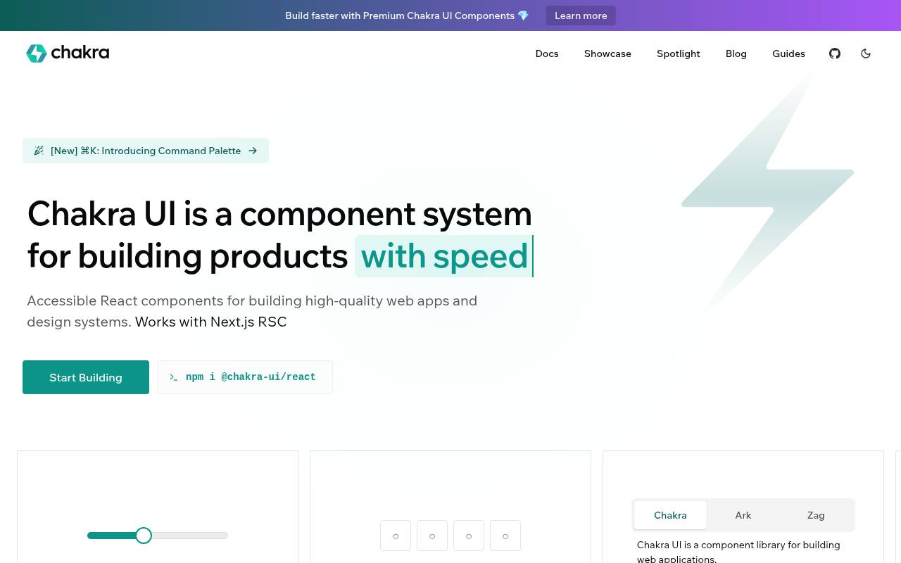
Chakra UI focuses on building a product’s own design system from reusable React components rather than adopting a rigid finished theme. Its site provides component documentation, installation guidance, and examples, alongside tools for configuring the system’s visual foundations.
Style props and theming connect component styling to reusable design decisions, supporting consistent product interfaces without writing every control from scratch. The core is free and MIT-licensed, while the surrounding ecosystem includes separate premium resources through Chakra UI Pro. Teams can therefore use the open-source component system independently of purchasing the additional ready-made interface material promoted alongside it.
- Type
- Styled components
- Best for
- Fast, accessible app building
- License
- MIT
- Price
- Free
Mantine
Full-featured library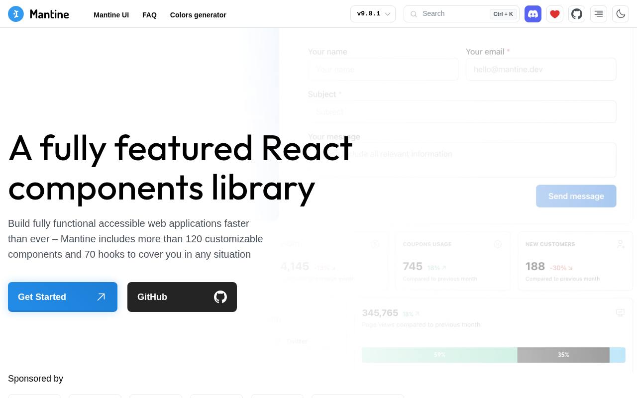
Mantine bundles 120+ components with 70+ hooks, covering both visible interface elements and common React behavior. The component selection includes custom selects, date pickers, notifications, and modals, while hooks handle tasks such as resize observation and keyboard shortcuts. Its composable Combobox supports custom select, multiselect, autocomplete, and tags-input patterns.
Styling uses native CSS, with a Styles API and support for bringing other styling tools; light and dark color schemes are built in. The free MIT-licensed collection also provides form-related tooling and extensive documentation, making it broader than a set of isolated visual controls.
- Type
- Full-featured library
- Best for
- Feature-rich dashboards
- License
- MIT
- Price
- Free
Ant Design
Enterprise design system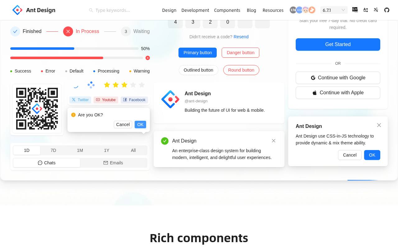
For data-heavy React applications, Ant Design connects a broad component library with enterprise-focused design guidance. The live site demonstrates tables, forms, and dashboards and promotes flexible theme customization through style algorithms and semantic structures. Developers can explore components, follow getting-started documentation, and extend projects with related resources such as Ant Design Pro.
The design language gives teams a reference for consistent business interfaces, while the implementation supplies the reusable controls. Its core library is free under the MIT license; third-party design resources linked from the ecosystem are separately identified and do not automatically share the code library’s terms.
- Type
- Enterprise design system
- Best for
- Admin and back-office apps
- License
- MIT
- Price
- Free
Headless UI
Headless components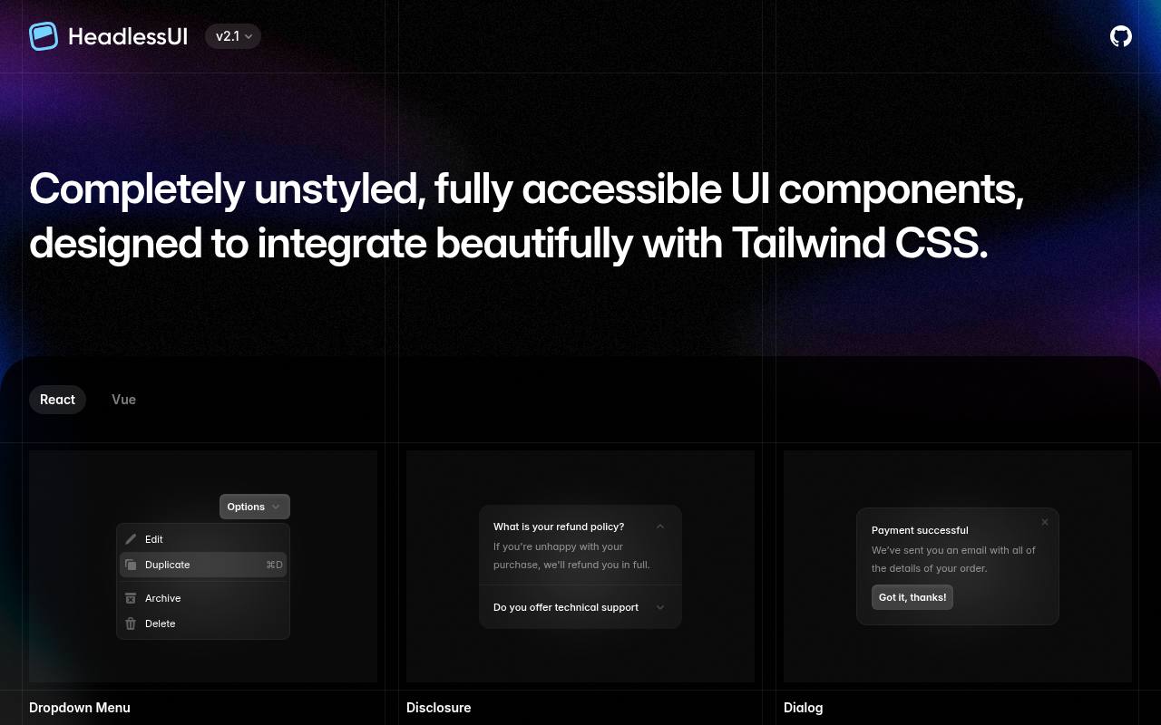
Headless UI supplies unstyled, accessible components designed to integrate with Tailwind CSS. Its catalog offers both React and Vue versions, including Dialog, Menu, Listbox, Combobox, Popover, Tabs, Disclosure, Switch, and Transition. Because the library handles interactive behavior without imposing a finished appearance, developers supply the visual design while retaining reusable patterns for menus, overlays, and selection controls.
The documentation separates framework examples, so React users can follow the implementation relevant to their app. These building blocks are free under MIT, making Headless UI a behavior-focused option rather than a predesigned dashboard or visual theme pack.
- Type
- Headless components
- Best for
- Tailwind CSS projects
- License
- MIT
- Price
- Free
daisyUI
Tailwind plugin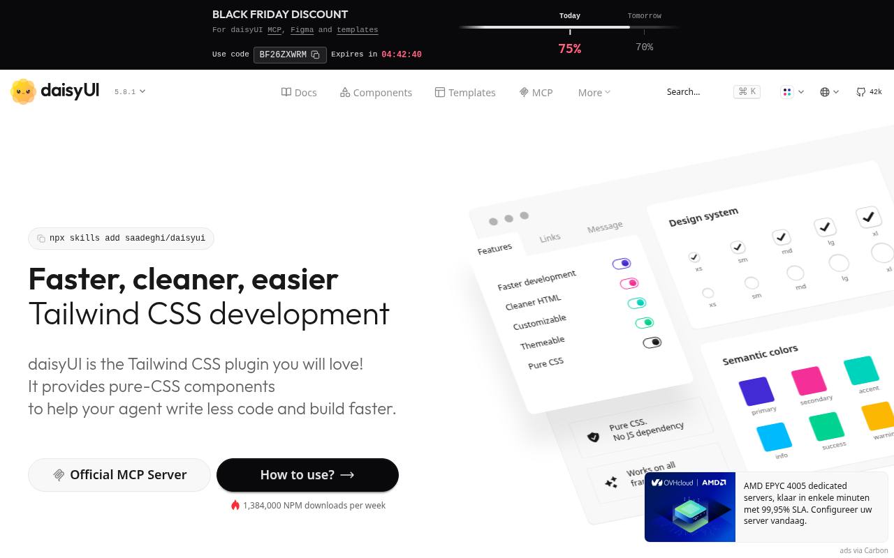
Although it appears in React UI roundups, daisyUI is a Tailwind CSS plugin, not a React-only component runtime. It adds semantic classes for familiar interface pieces, letting developers use ordinary markup and bring their own JavaScript behavior. The site organizes documentation around installation, component examples, customization, and themes, with controls and layouts styled through CSS rather than React-specific APIs.
That framework-independent approach allows the same class patterns to work inside React applications or other stacks. The main library is free and MIT-licensed; separately promoted templates and other commercial products are not required to use its core components.
- Type
- Tailwind plugin
- Best for
- Quick themed prototypes
- License
- MIT
- Price
- Free
React Aria
Accessible hooks & components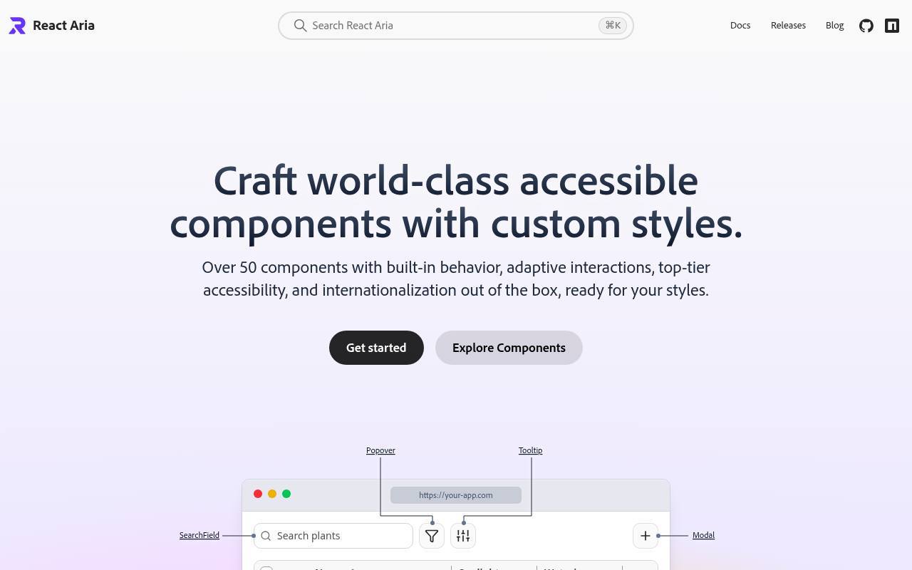
Adobe’s React Aria puts interaction and accessibility ahead of a prescribed visual style. Its unstyled components support custom CSS, Tailwind, and other styling approaches, with states, render props, and slots for controlling appearance. The library handles mouse, touch, keyboard, focus management, and screen-reader interactions, and includes internationalization support for multilingual interfaces.
Developers can compose high-level components or drop down to the low-level hooks when they need closer control over DOM structure and behavior. The free Apache 2.0 project is therefore a foundation for a custom React design system rather than a ready-made branded theme.
- Type
- Accessible hooks & components
- Best for
- Accessibility-first design systems
- License
- Apache 2.0
- Price
- Free
HeroUI
Styled Tailwind components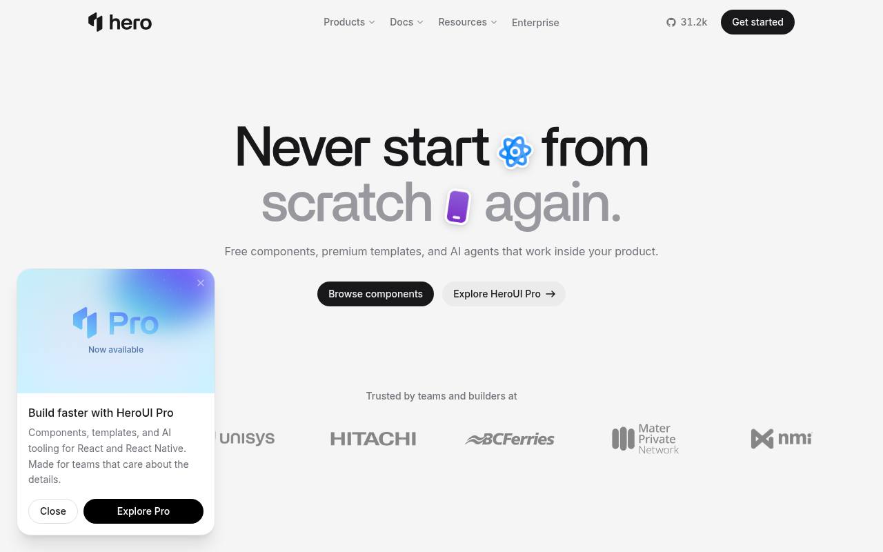
HeroUI now presents free interface components alongside a broader paid product family. The site offers React and React Native components with coordinated theming, so its scope extends beyond web-only controls. The open-source component library is MIT-licensed, while HeroUI Pro adds premium components, complete application templates, extra themes, Figma resources, and AI-oriented tooling.
Examples of paid templates include dashboard, CRM, mail, chat, and finance interfaces. Separate product sections also promote agents and HeroSpace, which are not simply part of the free component download. For React projects, the component documentation is the direct entry point to the reusable library.
- Type
- Styled Tailwind components
- Best for
- Beautiful modern interfaces
- License
- MIT
- Price
- Free
Headless vs. styled component libraries
Headless libraries (Radix, Headless UI) give you behaviour and accessibility without visual opinions — perfect for unique brands. Styled libraries (MUI, Chakra, Mantine, Ant Design) give you a complete look immediately — perfect for internal tools and fast launches. shadcn/ui sits in between: styled defaults you fully own.
Whichever you choose, check bundle size, TypeScript support and accessibility documentation before committing.
Frequently asked questions
What is the best free React UI library? shadcn/ui for modern custom apps, MUI for Material Design, Mantine for feature-rich dashboards.
Are these libraries free for commercial use? Yes — every library above uses the permissive MIT license.
Prototype the hardest interaction before standardising
Shortlist free React component libraries around your product's most demanding interaction rather than its simplest screen. A dashboard might depend on a complex filter form, while a customer portal may need a carefully managed account dialog.
Build a small working example with realistic content and error states. This exercise reveals whether the library's composition model fits your team and whether you can deliver the required behaviour without extensive workarounds that erase the time saved by adopting ready-made components in the first place.
For a data-heavy internal tool, you could compare a focused implementation using Ant Design with one using Mantine. Examine how clearly you can express validation, disabled actions and feedback, not just how quickly the first view appears.
Keep your evaluation criteria consistent across candidates and record compromises. A free React UI library is a foundation you will live with through maintenance and feature requests, so a realistic trial is more informative than a polished demonstration containing only ideal data and successful interactions.
Decide who owns the component code and its updates
With copied components, you can inspect and adapt the implementation directly, but you also need a plan for maintaining your changes. shadcn/ui follows this ownership model, so treat copied files as part of your application rather than assuming an installed package will keep every local modification current.
Record why you changed behaviour and avoid editing the same pattern differently across multiple screens. The freedom offered by open source UI components is most useful when paired with clear responsibility for review and ongoing upkeep.
A package-based React UI library creates a different maintenance boundary. Your team usually works through its documented interfaces, while upgrades can introduce changes that require testing across your application.
For MUI (Material UI) or Chakra UI, keep a representative set of screens available for upgrade checks and read the relevant release guidance before updating. Neither approach removes maintenance; they distribute it differently. Choose the model your team can support, especially if the original implementer will not remain available throughout the product's life.
Treat accessibility as an integration responsibility
Libraries such as Radix UI and React Aria give you valuable behaviour to build on, but application-level decisions still matter. A dialog needs a meaningful title, controls need understandable labels and validation must explain how to recover.
Test a complete user journey with the keyboard, including opening overlays, moving between controls, submitting forms and returning to the previous context. When you customise components, verify that the changes preserve these behaviours instead of assuming accessibility survives every alteration to markup, styling or event handling.
Headless UI components are particularly useful when you want your own visual language, but unstyled does not mean unfinished decisions can be ignored. If you use Headless UI, plan visible focus treatment, adequate contrast and clear selected or expanded states as part of your design work.
Test with enlarged text and realistic content as well as a mouse. An accessible primitive can still become confusing when embedded in a page with unclear headings, competing overlays or controls whose purpose is conveyed only by an icon.
Create a theme boundary that prevents visual drift
Agree a shared vocabulary for colour, spacing, typography and component emphasis before several developers begin building screens. Whether you choose HeroUI, Chakra UI or another candidate, identify the intended customisation mechanism and use it consistently.
Repeated local overrides can make a free library harder to maintain because the same component gradually acquires different appearances across the product. Start with a small reference screen containing common controls, then review it whenever you change the visual foundation or introduce a new interaction pattern.
If you are evaluating free Tailwind components, distinguish visual utilities from interactive behaviour. daisyUI supplies semantic classes and themes, but you still need to implement and test the interactions required by your chosen markup.
Likewise, adding your own styling around another library should not obscure focus states or create competing style rules. Keep the boundaries clear: document which layer supplies layout, which supplies visual treatment and which manages behaviour. That separation makes future customisation more predictable when several contributors work in the same codebase.
Measure the result inside your actual application
Do not judge performance from a library's marketing demo or assume that fewer visible components automatically means a lighter page. Add your candidate to a representative route and inspect the resulting experience with your own content, assets and application framework.
Check initial loading, interaction responsiveness and layout stability. Follow the library's documented import and rendering guidance, then measure again after changes. Useful performance decisions come from observing what your application delivers, not from comparing unsupported claims about which library is always fastest.
Pay attention to boundaries between static content and interactive controls. Some components need browser behaviour, and your framework's rendering approach may affect how they are integrated. Test direct navigation, page refreshes and delayed data rather than only moving through the app after everything has loaded.
When an issue appears, reduce it to a small example before applying broad workarounds. Free React component libraries can simplify interface work, but they cannot automatically resolve unrelated data-fetching delays, oversized media or application-wide rendering choices that you introduce around them.
Review licences and free-tier scope before handover
Read each source's licence page and preserve the notices required for the components you actually use. The entries here identify React Aria as Apache 2.0, while the other listed libraries show MIT; avoid treating every project as if it had identical terms.
Check relevant dependencies and any separately downloaded assets too. Open source does not mean there is no documentation to keep, and a client handover is easier when you can explain where the code came from and where its licence records are stored.
Separate a library's free core from additional products offered alongside it. MUI (Material UI), for example, is listed with free core components and paid extras, so verify the specific feature you intend to ship rather than assuming every related offering is included.
Keep this scope check alongside your technical evaluation and revisit it when requirements expand. A suitable free foundation should meet the agreed product needs transparently, with any missing capability identified early enough for your team to adapt the design or make an informed purchasing decision.