Typewriter fonts carry the romance of the writer's desk: clacking keys, inked ribbons and slightly imperfect letters. They add authenticity to quotes, journals, vintage invitations and screenplays.
These ten free typewriter fonts range from crisp classic faces to rough, distressed styles with real ink texture. All are free on Google Fonts and open-licensed for commercial use.
Each card shows a live preview and links directly to the free download at the source.
Quick picks at a glance
| # | Resource | Style | Best for |
|---|---|---|---|
| 1 | Special Elite | Distressed typewriter | Vintage and noir designs |
| 2 | Courier Prime | Screenplay typewriter | Screenplays and manuscripts |
| 3 | Cutive Mono | Classic typewriter | Letters and quotes |
| 4 | Anonymous Pro | Coding typewriter | Technical writing |
| 5 | Syne Mono | Experimental mono | Art and editorial |
| 6 | Xanh Mono | Elegant mono serif | Literary design |
| 7 | Major Mono Display | Geometric mono display | Experimental headlines |
| 8 | Nova Mono | Retro-tech mono | Retro computing |
| 9 | Share Tech Mono | Technical mono | Sci-fi interfaces |
| 10 | Oxygen Mono | Humanist mono | Clean typewriter text |
Special Elite
Distressed typewriter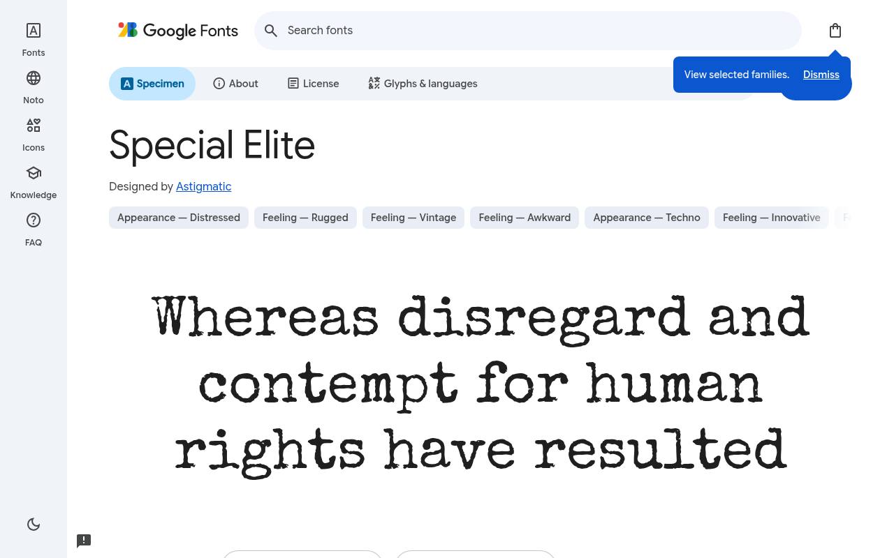
Dear reader, it's free.
ABCDEFGHIJKLM abcdefghijklm 0123456789
Uneven ink and worn edges make Special Elite resemble an aging typewriter impression rather than a pristine digital mono. A noir poster, mystery-book promotion, or retro package can use a short passage as an atmospheric artifact. The texture is built into the single design, not supplied as a separate distressing effect.
Astigmatic designed Special Elite; its free Google Fonts download includes 1 style at weight 400, without italics. Special Elite’s listed subsets cover Latin and extended Latin. Special Elite’s Open Font License permits commercial vintage and noir designs projects.
- Style
- Distressed typewriter
- Best for
- Vintage and noir designs
- License
- SIL Open Font License
- Price
- 100% free
Courier Prime
Screenplay typewriter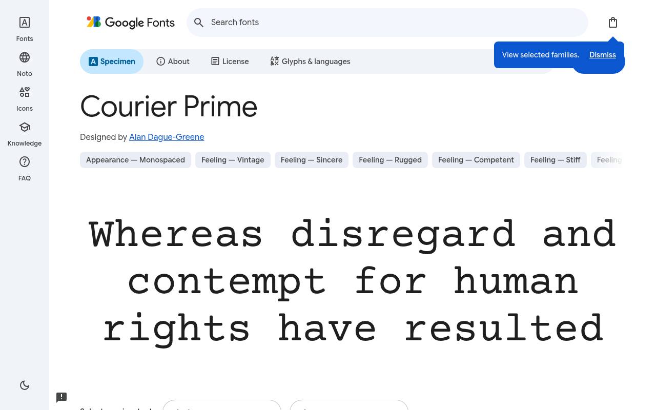
Dear reader, it's free.
ABCDEFGHIJKLM abcdefghijklm 0123456789
Screenplay work shaped Courier Prime’s refinement of the familiar Courier typewriter model. Dialogue, scene headings, and manuscript pages can retain a conventional fixed-width rhythm with a cleaner, more considered drawing. Its four styles cover regular, bold, italic, and bold italic rather than offering variable controls or a large graduated weight family.
The free Google Fonts selection for Courier Prime, by Alan Dague-Greene, contains 4 styles spanning weights 400–700, with matching italics. Script coverage for Courier Prime includes Latin and extended Latin. Courier Prime’s Open Font License permits commercial screenplays and manuscripts projects.
- Style
- Screenplay typewriter
- Best for
- Screenplays and manuscripts
- License
- SIL Open Font License
- Price
- 100% free
Cutive Mono
Classic typewriter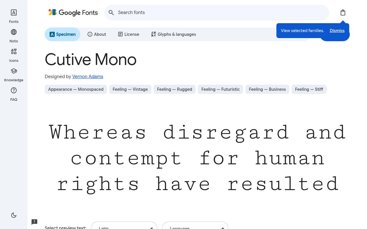
Dear reader, it's free.
ABCDEFGHIJKLM abcdefghijklm 0123456789
IBM Selectric inspiration gives Cutive Mono a recognizable typewriter cadence without distressed ink effects. A literary quotation or personal letter can use its clean serifed forms to suggest typed correspondence while remaining visually composed. The download contains one upright regular style, so emphasis needs to come from the text layout rather than unavailable italics.
For Cutive Mono, Google Fonts supplies 1 style at weight 400, without italics free, crediting Vernon Adams. The Cutive Mono download supports Latin and extended Latin. Cutive Mono’s Open Font License permits commercial letters and quotes projects.
- Style
- Classic typewriter
- Best for
- Letters and quotes
- License
- SIL Open Font License
- Price
- 100% free
Anonymous Pro
Coding typewriter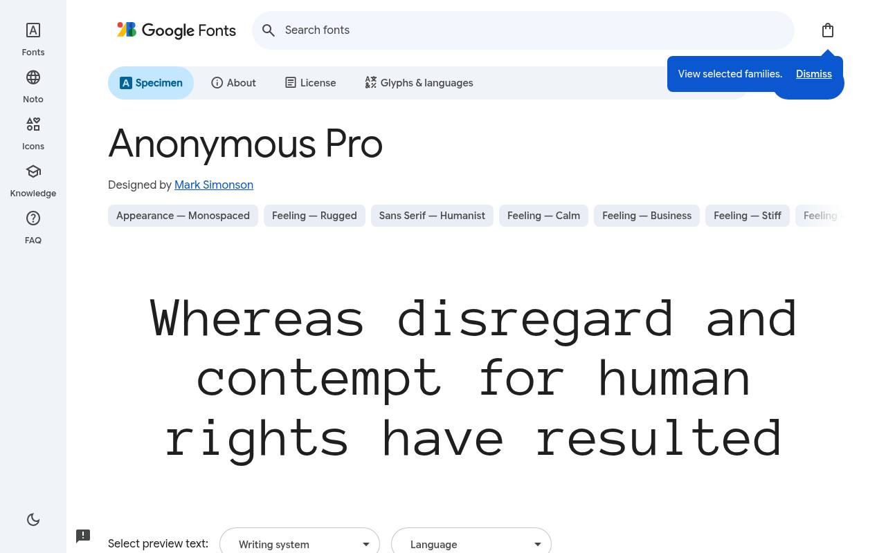
Dear reader, it's free.
ABCDEFGHIJKLM abcdefghijklm 0123456789
Designed for code, Anonymous Pro combines fixed-width discipline with a subtle typewriter heritage. Technical blogs can use it for command examples or terminal-like excerpts without the deliberately damaged texture of vintage novelty faces.
Its regular-and-bold structure includes matching italics, making it suitable for annotations as well as plain upright listings. Credited to Mark Simonson, Anonymous Pro comes free from Google Fonts in 4 styles spanning weights 400–700, with matching italics. Included subsets in Anonymous Pro span Cyrillic, Greek, Latin, and extended Latin.
Anonymous Pro’s Open Font License permits commercial technical writing projects.Like every free font in this list, it ships under the SIL Open Font License, so it is free for personal and commercial projects alike.
- Style
- Coding typewriter
- Best for
- Technical writing
- License
- SIL Open Font License
- Price
- 100% free
Syne Mono
Experimental mono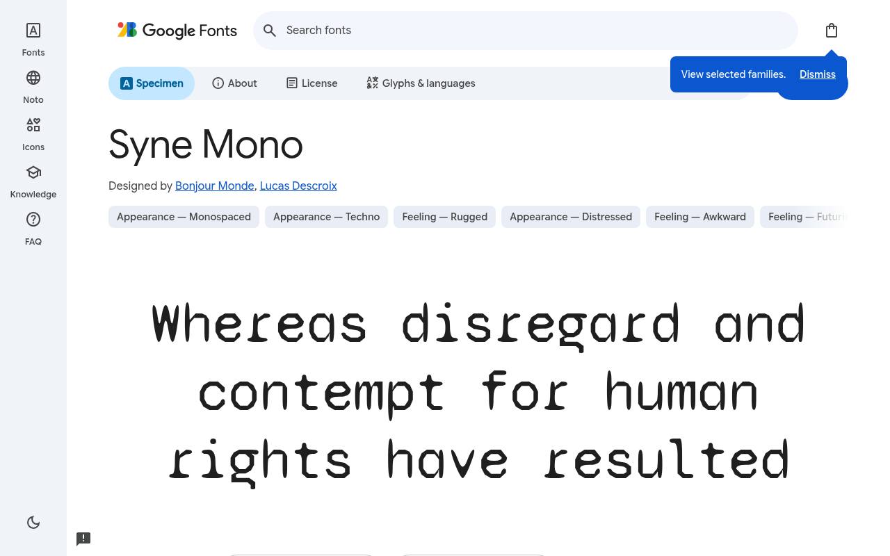
Dear reader, it's free.
ABCDEFGHIJKLM abcdefghijklm 0123456789
Expressive, unconventional shapes make Syne Mono an experimental alternative to a quiet programming font. An exhibition poster or art-publication heading can use the monospaced rhythm as part of the composition, letting individual letters contribute personality. The download is deliberately focused on one regular design rather than a family of editorial weights.
Google Fonts lists Bonjour Monde and Lucas Descroix as Syne Mono’s designer credits and offers 1 style at weight 400, without italics in the free download. Syne Mono’s listed subsets cover Latin and extended Latin. Syne Mono’s Open Font License permits commercial art and editorial projects.
- Style
- Experimental mono
- Best for
- Art and editorial
- License
- SIL Open Font License
- Price
- 100% free
Xanh Mono
Elegant mono serif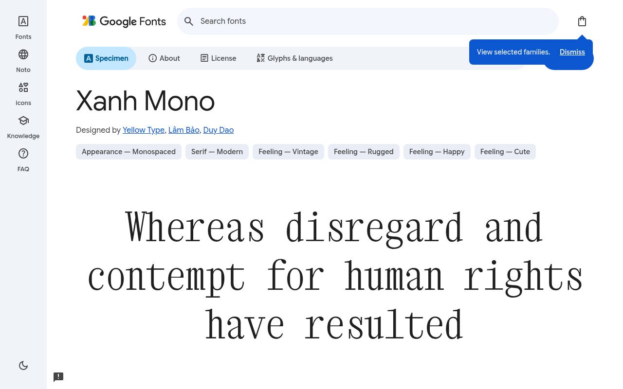
Dear reader, it's free.
ABCDEFGHIJKLM abcdefghijklm 0123456789
Calligraphic touches lend Xanh Mono an elegance uncommon in typewriter-style lettering. A literary journal can use its upright monospaced serif for a short introduction and the matching italic for a quotation, keeping the fixed rhythm while changing tone. Vietnamese coverage is an important part of this compact, two-style download.
Yellow Type, Lâm Bảo, and Duy Dao designed Xanh Mono; its free Google Fonts download includes 2 styles spanning weights 400, with matching italics. Script coverage for Xanh Mono includes Latin, extended Latin, and Vietnamese. Xanh Mono’s Open Font License permits commercial literary design projects.
- Style
- Elegant mono serif
- Best for
- Literary design
- License
- SIL Open Font License
- Price
- 100% free
Major Mono Display
Geometric mono display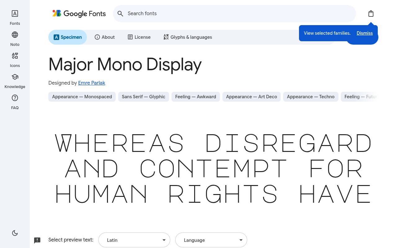
Dear reader, it's free.
ABCDEFGHIJKLM abcdefghijklm 0123456789
Uppercase and lowercase forms interact unusually in Major Mono Display, turning a monospaced grid into experimental headline material. An art poster or editorial title can use those geometric contrasts to make the exact wording part of the visual design. One regular style supplies the concept without additional weights or italic variants.
The free Google Fonts selection for Major Mono Display, by Emre Parlak, contains 1 style at weight 400, without italics. The Major Mono Display download supports Latin, extended Latin, and Vietnamese. Major Mono Display’s Open Font License permits commercial experimental headlines projects.
- Style
- Geometric mono display
- Best for
- Experimental headlines
- License
- SIL Open Font License
- Price
- 100% free
Nova Mono
Retro-tech mono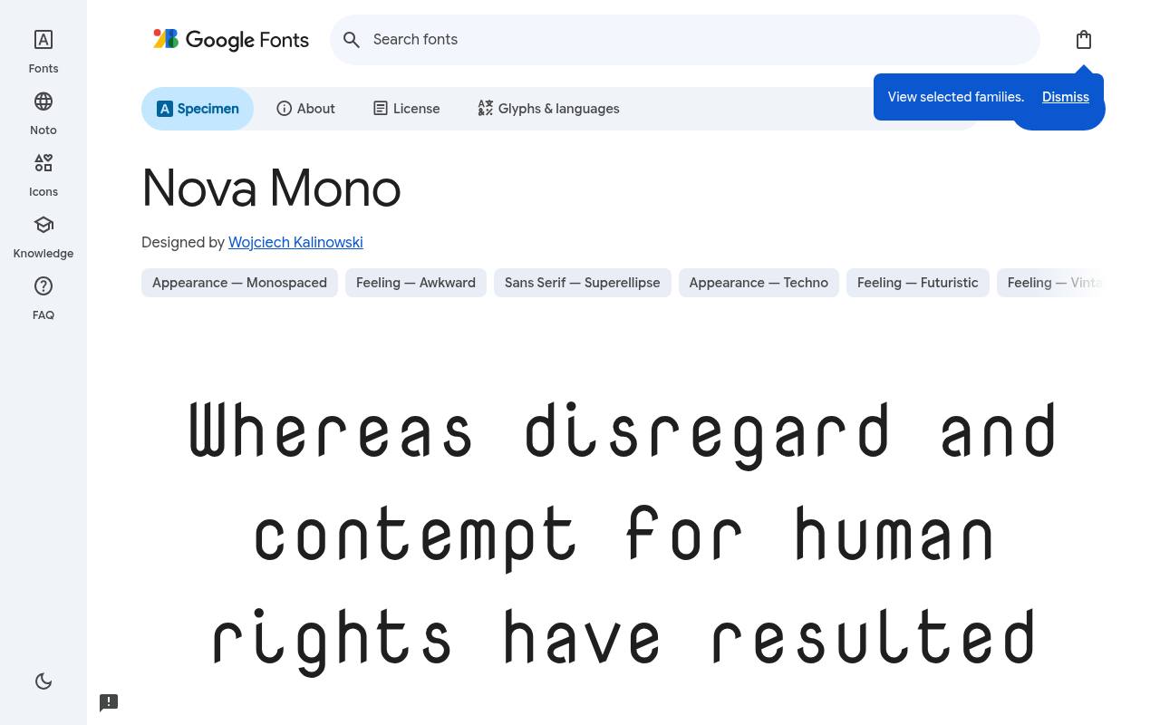
Dear reader, it's free.
ABCDEFGHIJKLM abcdefghijklm 0123456789
A retro-technical mood connects Nova Mono with early computer-terminal aesthetics. Short code excerpts, computing-history captions, and vintage software-themed headings can use its fixed-width rhythm without introducing distressed typewriter texture. The supplied Greek coverage adds a practical distinction to a compact download otherwise centered on one regular Latin-based design.
For Nova Mono, Google Fonts supplies 1 style at weight 400, without italics free, crediting Wojciech Kalinowski. Included subsets in Nova Mono span Greek, Latin, and extended Latin. Nova Mono’s Open Font License permits commercial retro computing projects.
- Style
- Retro-tech mono
- Best for
- Retro computing
- License
- SIL Open Font License
- Price
- 100% free
Share Tech Mono
Technical mono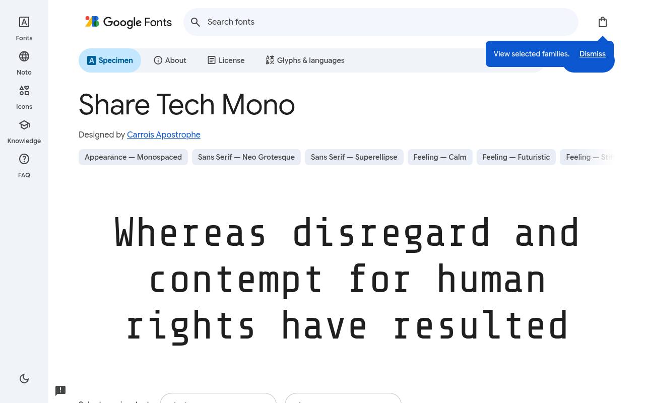
Dear reader, it's free.
ABCDEFGHIJKLM abcdefghijklm 0123456789
Clean technical forms give Share Tech Mono a futuristic edge for terminal-style interfaces. A fictional instrument panel or compact dashboard can use its fixed-width rhythm for readouts and short labels, making the typography itself carry the science-fiction mood.
This focused download contains one regular style and Latin coverage rather than a broad multilingual family. Credited to Carrois Apostrophe, Share Tech Mono comes free from Google Fonts in 1 style at weight 400, without italics. Share Tech Mono’s listed subsets cover Latin. Share Tech Mono’s Open Font License permits commercial sci-fi interfaces projects.
- Style
- Technical mono
- Best for
- Sci-fi interfaces
- License
- SIL Open Font License
- Price
- 100% free
Oxygen Mono
Humanist mono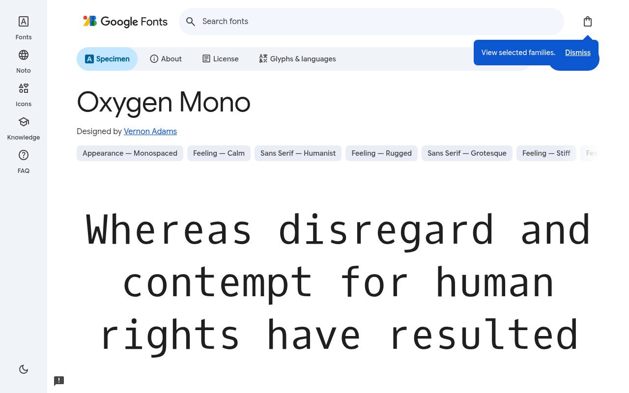
Dear reader, it's free.
ABCDEFGHIJKLM abcdefghijklm 0123456789
Humanist details keep Oxygen Mono’s fixed-width rhythm friendly rather than severe. Personal notes and understated typewriter-inspired layouts can use its clean forms without adding simulated ink damage. The single upright design is suited to a consistent typed voice, with changes of size and spacing doing the work of distinguishing a heading from the note itself.
Google Fonts lists Vernon Adams as Oxygen Mono’s designer credits and offers 1 style at weight 400, without italics in the free download. Script coverage for Oxygen Mono includes Latin and extended Latin. Oxygen Mono’s Open Font License permits commercial clean typewriter text projects.
- Style
- Humanist mono
- Best for
- Clean typewriter text
- License
- SIL Open Font License
- Price
- 100% free
Using free typewriter fonts
Typewriter fonts work best for short passages: quotes, captions, labels, letters and headings. For screenplays, use Courier Prime at 12pt, the industry standard size.
Pair a distressed typewriter font like Special Elite with a clean serif for body text, and add paper textures or muted colours for an authentic vintage feel.
Typewriter fonts in branding
Bookshops, coffee roasters, journalists, writers and indie publishers often use free typewriter fonts to signal craft and storytelling. They also suit wedding stationery with a vintage theme and mystery or detective-themed events.
All ten fonts are free under the Open Font License, so they can be used in logos, packaging and printed products.
Frequently asked questions
What is the best free typewriter font? Special Elite for vintage texture, Courier Prime for clean readability.
What font is used for screenplays? Courier at 12pt; Courier Prime is a free, improved version designed for screenwriters.
Separate the look of typing from the mechanics of spacing
A typewriter appearance and fixed character spacing are related ideas, but they are not interchangeable design requirements. You might want the atmosphere of an old letter, or you might need characters to align for a technical document. Decide which matters before choosing your typewriter font.
Cutive Mono can help you explore a literary direction, while Anonymous Pro gives you a useful comparison for practical technical text. Use the same passage in both so you can judge the tone without confusing differences in copy with differences in the lettering.
When looking for a free monospaced serif, also check the details that will appear in your document: punctuation, italics where available, numerals and accented characters. Equal spacing can create an appealing rhythm, but it usually asks for a different line length from proportional text.
Do not squeeze a page merely to imitate a specimen you have seen elsewhere. Choose margins and text width around the actual passage, then review whether the result feels inviting. A convincing typed effect should serve the reader as well as your interest in the visual style.
Format a script around the recipient's requirements
Courier Prime is an appropriate candidate to investigate when you need a screenplay font, but choosing the family is only one part of preparing a submission. Read the recipient's formatting requirements before arranging dialogue, scene headings and page breaks.
The application template may already control much of that structure, so confirm how your chosen font interacts with it. A free typeface does not make every exported script automatically compliant, and a visually convincing first page does not prove that the rest of the document follows the requested format.
Export a sample containing a scene transition, a long speech and a page break, then inspect the result rather than relying only on the editor view. Make sure collaborators open the document with the intended font installed, and check the final file on another device if possible.
Changing a family late in the process may alter pagination, so finish the typography before relying on page references in feedback. Free typewriter fonts can support a professional workflow when you treat installation, formatting and export as connected checks rather than separate tasks left until delivery.
Control texture before adding more distress
Special Elite already brings an uneven, inked character to the page. Before layering paper grain, stains or fading over it, view the words on a plain background at their final size. This gives you a useful baseline for judging how much additional texture the design can tolerate.
A distressed heading may remain clear on a large poster yet become difficult to read on a small product image. Free typography gives you room to test different treatments, but extra atmosphere should not obscure the words you need the audience to notice.
Use wear selectively rather than distributing the same heavy effect over every element. An untextured address, date or instruction can provide a welcome anchor next to an expressive title. If you are searching for vintage fonts free to use in a client project, keep the historical mood separate from any claim that the finished piece is an authentic old document.
A new invitation or fictional prop can suggest age without misleading people about its origin. Thoughtful restraint often makes the treatment feel more convincing than adding every available sign of damage at once.
Compose correspondence with a deliberate reading rhythm
For a letter, journal extract or personal message, start with the length of the passage and the relationship you want with the reader. Oxygen Mono can provide a cleaner typed rhythm, while Xanh Mono offers a more literary direction worth testing in the same composition.
Give the text a comfortable measure and check how frequently long words break the flow. A monospaced layout can become visually dense when lines are very long, even if each individual character remains easy to identify in a close up preview.
Use paragraph breaks, a clear salutation and a restrained signature area to organise the page. You do not need to imitate every mechanical limitation of a typewriter to evoke correspondence. Avoid inserting repeated spaces to force alignment, because those arrangements can fail when the text moves into another application or onto a smaller screen.
Use the layout tools provided by your software instead. The free font supplies the character of the writing, while dependable structure keeps that character intact when you revise the message or adapt it for another format later.
Keep experimental headlines separate from practical instructions
Syne Mono and Major Mono Display can help you explore a more experimental direction than a traditional typed letter. Try them on a short title, an exhibition name or a single editorial statement, then place the practical information beside the result.
You should be able to distinguish the expressive element from dates, navigation and explanatory copy immediately. A free display choice becomes more effective when it has a defined job rather than being asked to establish atmosphere, explain the content and carry detailed instructions all at the same time.
For retro computing projects, compare Nova Mono and Share Tech Mono using realistic labels and short messages rather than decorative strings alone. The mood may be nostalgic or technical, but the audience still needs to understand what to do next.
Keep important interface text selectable and avoid substituting an image of a terminal for functional content. If you animate a typing effect, make sure the complete message remains available without forcing users to wait for each character. A visual reference to older technology should not require people to tolerate avoidable limitations in a modern experience.
Preserve the typed character across print and web
Download your selected free family from the official source and install it using your computer's font tools before creating editable artwork. Reopen the application if necessary and confirm that the expected family appears in the document.
For web use, follow the source's embedding guidance or implement suitable self hosting, requesting only the styles you actually need. Include an appropriate generic fallback and test the layout while the preferred font is unavailable. Typewriter inspired designs often depend strongly on line endings, so a fallback test can reveal problems before visitors encounter them.
For print, export a proof and inspect the actual output rather than assuming it matches the working canvas. For a website, allow zoom and narrower screens without clipping a quotation or forcing the reader to scroll across every sentence.
Keep the supplied licence documentation with project assets, especially when you pass font files to another supplier or include them in a distributed package. These free typewriter fonts give you creative flexibility, but a dependable production process is what preserves the design. Clear source records and a checked final export make future revisions much easier for everyone involved.