Looking for free fonts that make a modern website feel designed rather than defaulted? You are in the right place. Every free font in this round-up is hosted on Google Fonts, licensed for commercial use, and costs exactly nothing to download, self-host or embed.
We picked these ten free web fonts for range: two editorial serifs, a clutch of contemporary sans-serifs, a free monospace for code, and one heavy poster face. Mix one headline font with one body font from the list and you have a complete free type system for a blog, a portfolio or a product page.
Each card shows a live preview, a screenshot of the free font's page, a short review and a button that takes you straight to the free download at the source.
Quick picks at a glance
| # | Resource | Style | Best for |
|---|---|---|---|
| 1 | Fraunces | Soft serif | Editorial headlines with personality |
| 2 | Space Grotesk | Geometric sans | Tech brands and product pages |
| 3 | DM Serif Display | Display serif | Big, elegant titles |
| 4 | Syne | Expressive sans | Art, music and portfolio sites |
| 5 | Manrope | Modern sans | Clean body text and UI |
| 6 | Playfair Display | High-contrast serif | Fashion, food and luxury |
| 7 | Bricolage Grotesque | Quirky grotesque | Friendly startups and blogs |
| 8 | JetBrains Mono | Monospace | Code snippets and dev tools |
| 9 | Lora | Text serif | Long-form reading |
| 10 | Archivo Black | Heavy sans | Posters and punchy headings |
Fraunces
Soft serif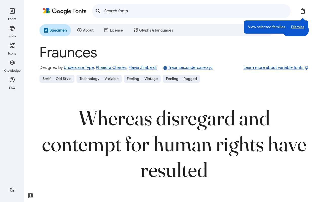
The quick brown fox jumps
ABCDEFGHIJKLM abcdefghijklm 0123456789
Windsor and other early 20th-century serifs inform Fraunces, whose swelling curves give modern editorial pages an appealingly offbeat voice. Undercase Type, Phaedra Charles and Flavia Zimbardi designed the free Google Fonts release of Fraunces, which includes 18 styles spanning weights 100–900, including italics.
Variable controls cover Softness 0–100, Wonky 0–1, Optical Size 9–144, Weight 100–900. Fraunces includes Latin, extended Latin and Vietnamese coverage. A food magazine could use its softer settings for recipe titles and a firmer treatment for introductory decks.
- Style
- Soft serif
- Best for
- Editorial headlines with personality
- License
- SIL Open Font License
- Price
- 100% free
Space Grotesk
Geometric sans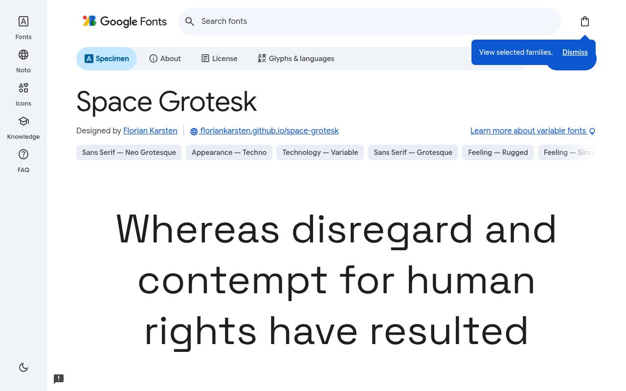
The quick brown fox jumps
ABCDEFGHIJKLM abcdefghijklm 0123456789
Space Mono's unusual details survive in Space Grotesk, but proportional spacing makes the technical look more comfortable for website headings. The free Space Grotesk download credits Florian Karsten and supplies 5 styles spanning weights 300–700, with no italics. Variable controls cover Weight 300–700.
Character coverage in Space Grotesk extends to Latin, extended Latin and Vietnamese. On a developer-tool landing page, its distinctive a and G can give feature names personality without turning the navigation into code. Its proportional rhythm also separates marketing copy visually from embedded monospace code examples.
- Style
- Geometric sans
- Best for
- Tech brands and product pages
- License
- SIL Open Font License
- Price
- 100% free
DM Serif Display
Display serif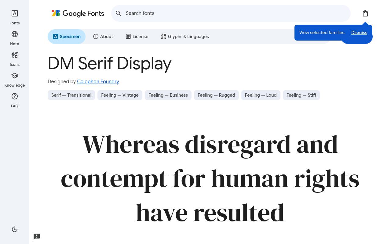
The quick brown fox jumps
ABCDEFGHIJKLM abcdefghijklm 0123456789
Sharp thick–thin contrast gives DM Serif Display the presence of a magazine title rather than an interface workhorse. Google Fonts offers DM Serif Display free with 2 styles spanning weights 400–400, including italics; the design credit goes to Colophon Foundry.
The DM Serif Display character set covers Latin and extended Latin. For a design studio homepage, put a short project statement in its upright face and use the italic for a contrasting editorial accent. The limited weight selection puts the emphasis on scale and upright–italic contrast instead.
- Style
- Display serif
- Best for
- Big, elegant titles
- License
- SIL Open Font License
- Price
- 100% free
Syne
Expressive sans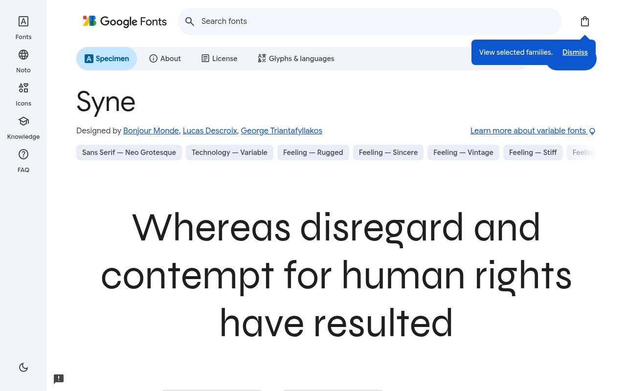
The quick brown fox jumps
ABCDEFGHIJKLM abcdefghijklm 0123456789
Commissioned for a Paris art center, Syne moves from relatively quiet lighter forms to dramatically broad, forceful heavy lettering. Bonjour Monde, Lucas Descroix and George Triantafyllakos designed the free Google Fonts release of Syne, which includes 5 styles spanning weights 400–800, with no italics.
Variable controls cover Weight 400–800. Syne includes Greek, Latin and extended Latin coverage. A music portfolio could make the artist's name the visual centerpiece, with lighter settings distinguishing project categories beneath the oversized opening line. The broadest heavy forms can become a portfolio graphic in their own right.
- Style
- Expressive sans
- Best for
- Art, music and portfolio sites
- License
- SIL Open Font License
- Price
- 100% free
Manrope
Modern sans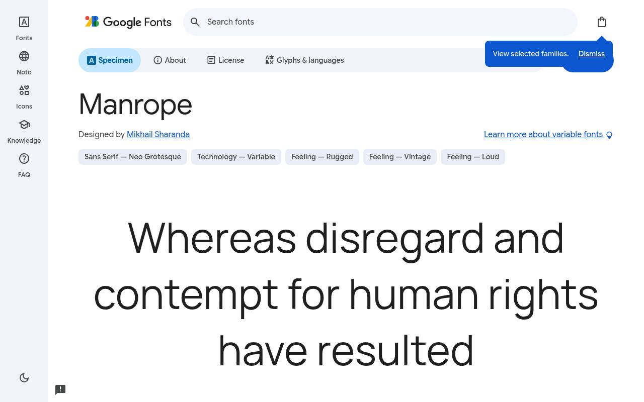
The quick brown fox jumps
ABCDEFGHIJKLM abcdefghijklm 0123456789
Semi-rounded curves and slightly compact proportions make Manrope feel warmer than a strictly mechanical interface sans. The free Manrope download credits Mikhail Sharanda and supplies 7 styles spanning weights 200–800, with no italics. Variable controls cover Weight 200–800.
Character coverage in Manrope extends to Cyrillic, extended Cyrillic, Greek, Latin, extended Latin and Vietnamese. Its tidy rhythm suits a subscription dashboard, where regular labels, stronger balances, and compact section headings can share a consistent typographic voice. Its restrained rounding adds friendliness to dense account information without resembling toy lettering.
- Style
- Modern sans
- Best for
- Clean body text and UI
- License
- SIL Open Font License
- Price
- 100% free
Playfair Display
High-contrast serif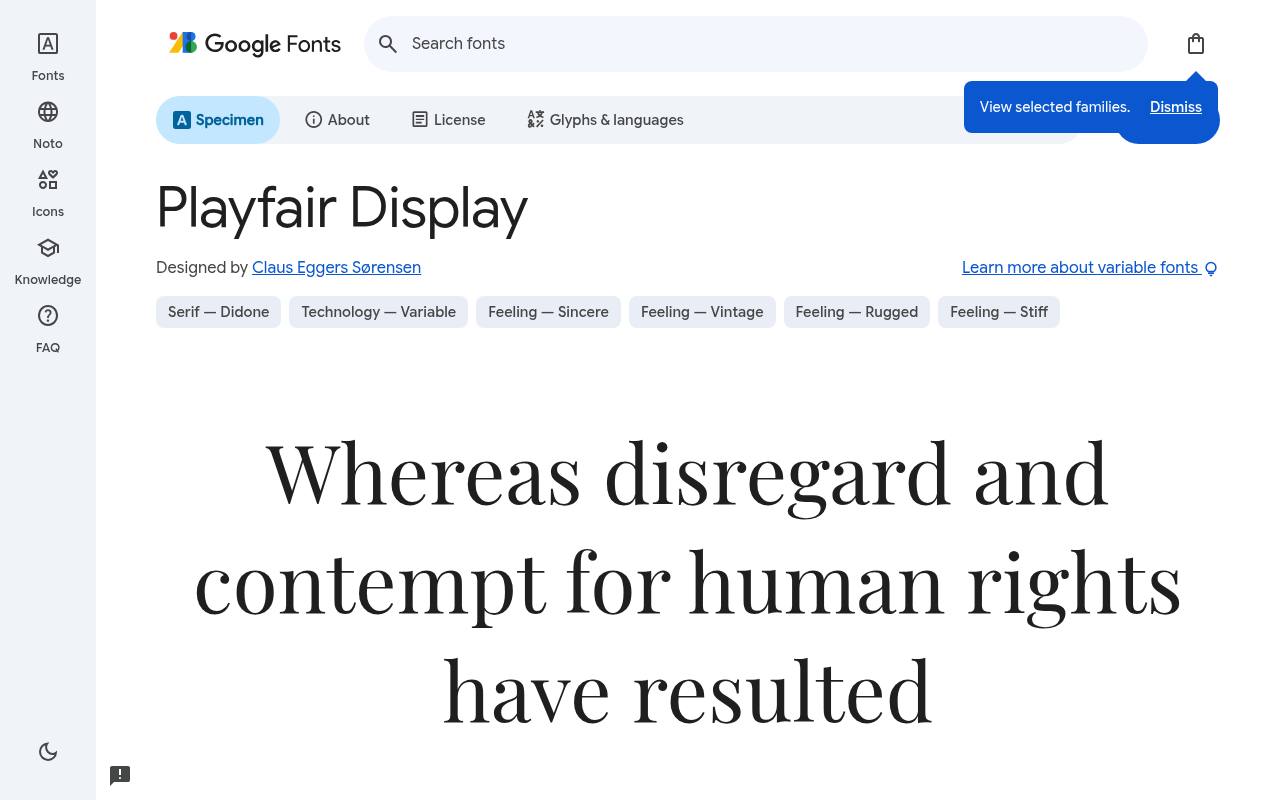
The quick brown fox jumps
ABCDEFGHIJKLM abcdefghijklm 0123456789
Eighteenth-century transitional lettering supplies Playfair Display with dramatic stroke contrast and distinctive ball terminals. Google Fonts offers Playfair Display free with 12 styles spanning weights 400–900, including italics; the design credit goes to Claus Eggers Sørensen. Variable controls cover Weight 400–900.
The Playfair Display character set covers Cyrillic, Latin, extended Latin and Vietnamese. For a restaurant website, an expansive seasonal-menu heading can establish elegance while its italic highlights a short chef's introduction above plainer booking information. The contrasting italic brings another expressive voice to pull quotes and seasonal announcements.
- Style
- High-contrast serif
- Best for
- Fashion, food and luxury
- License
- SIL Open Font License
- Price
- 100% free
Bricolage Grotesque
Quirky grotesque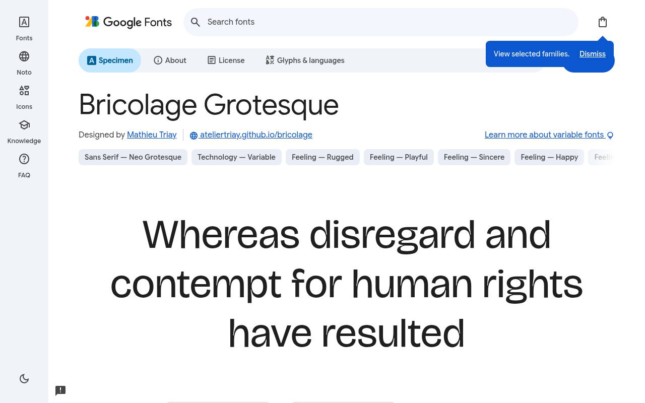
The quick brown fox jumps
ABCDEFGHIJKLM abcdefghijklm 0123456789
French and British grotesque traditions meet in Bricolage Grotesque, with playful construction and ink-trap details most apparent in heavier settings. Mathieu Triay designed the free Google Fonts release of Bricolage Grotesque, which includes 7 styles spanning weights 200–800, with no italics.
Variable controls cover Optical Size 12–96, Width 75–100, Weight 200–800. Bricolage Grotesque includes Latin, extended Latin and Vietnamese coverage. A friendly startup homepage could combine a compact product headline with wider, quieter navigation, keeping both in the same expressive family.
- Style
- Quirky grotesque
- Best for
- Friendly startups and blogs
- License
- SIL Open Font License
- Price
- 100% free
JetBrains Mono
Monospace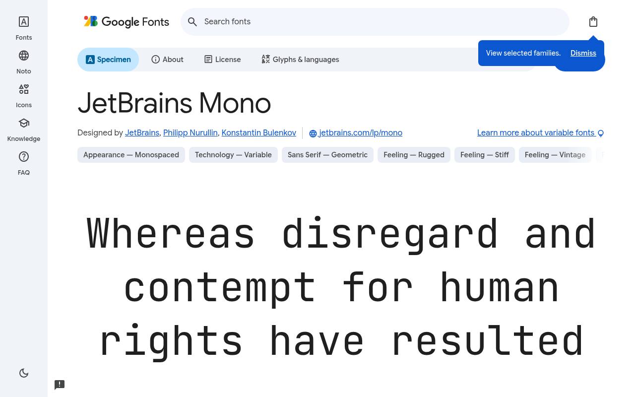
The quick brown fox jumps
ABCDEFGHIJKLM abcdefghijklm 0123456789
A tall x-height and optional coding ligatures mark JetBrains Mono as a working programmer's typeface, not merely a technological decoration. The free JetBrains Mono download credits JetBrains, Philipp Nurullin and Konstantin Bulenkov and supplies 16 styles spanning weights 100–800, including italics.
Variable controls cover Weight 100–800. Character coverage in JetBrains Mono extends to Cyrillic, extended Cyrillic, Greek, Latin, extended Latin and Vietnamese. On developer documentation pages, its equal-width characters align code samples while italic comments distinguish explanation from executable statements.
- Style
- Monospace
- Best for
- Code snippets and dev tools
- License
- SIL Open Font License
- Price
- 100% free
Lora
Text serif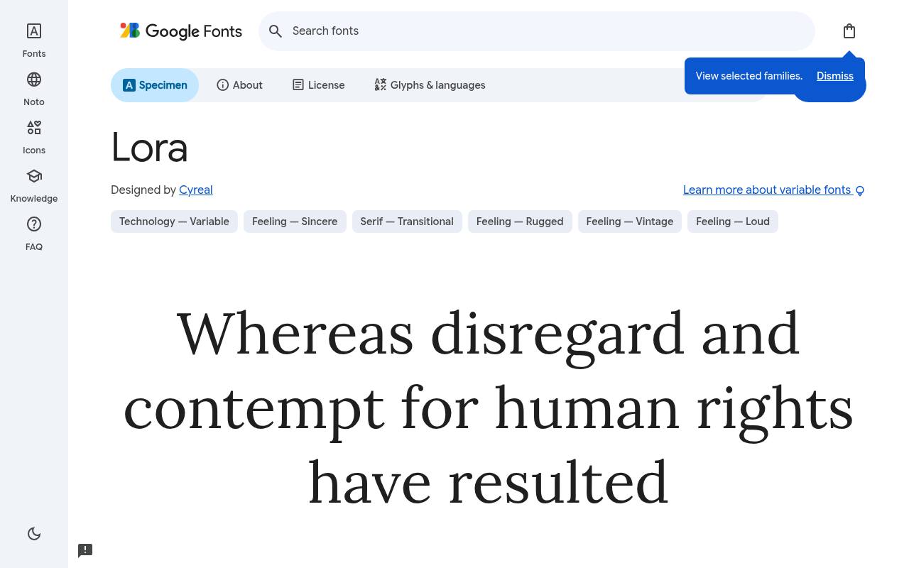
The quick brown fox jumps
ABCDEFGHIJKLM abcdefghijklm 0123456789
Calligraphic roots soften Lora's contemporary serif structure, giving screen reading a literary rhythm without the fragility of a fashion display face. Google Fonts offers Lora free with 8 styles spanning weights 400–700, including italics; the design credit goes to Cyreal.
Variable controls cover Weight 400–700. The Lora character set covers Cyrillic, extended Cyrillic, Latin, extended Latin, math, symbols and Vietnamese. A long-form travel journal could use the upright for essays and the italic for brief quotations, with heavier weights marking chapter openings.
- Style
- Text serif
- Best for
- Long-form reading
- License
- SIL Open Font License
- Price
- 100% free
Archivo Black
Heavy sans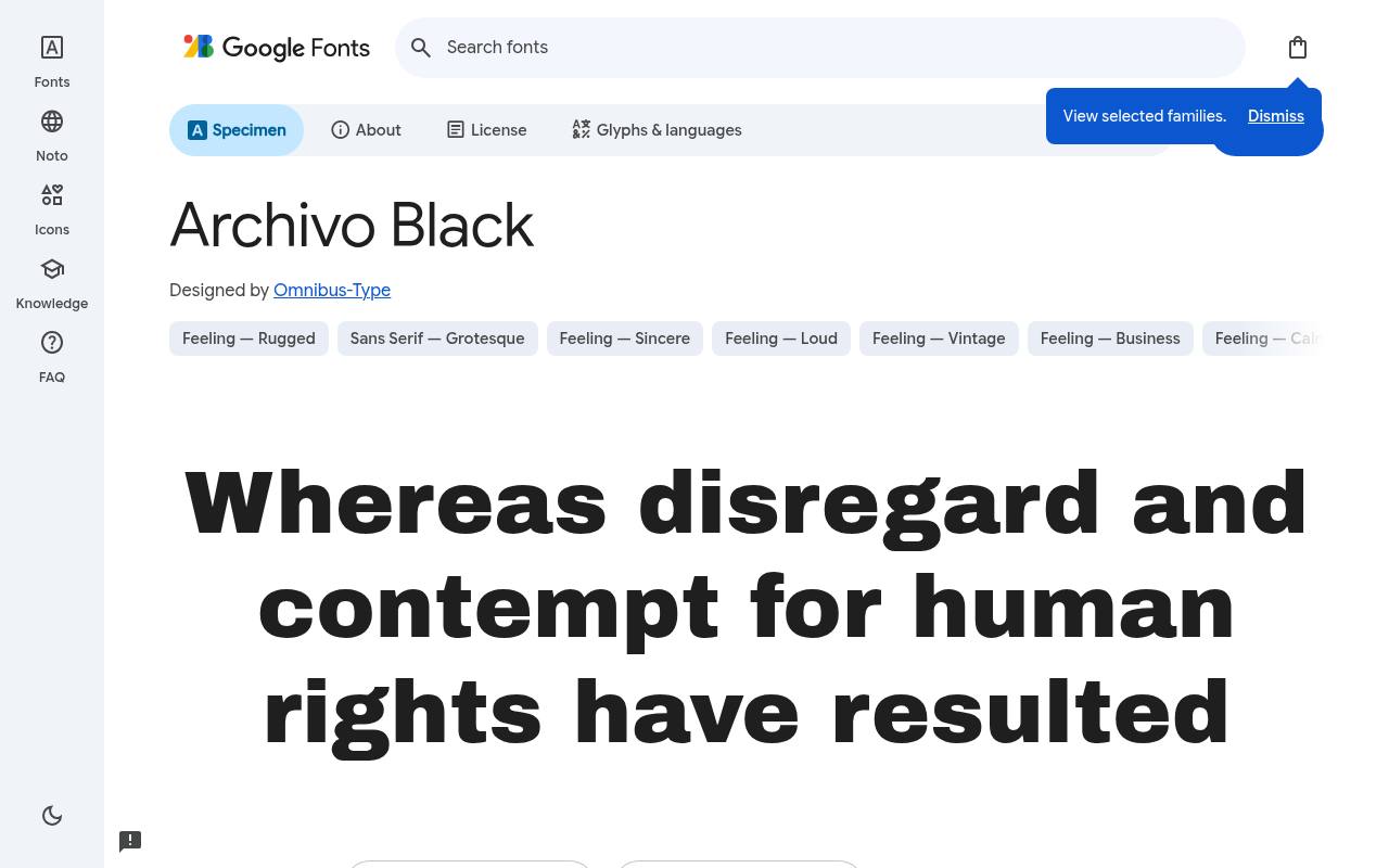
The quick brown fox jumps
ABCDEFGHIJKLM abcdefghijklm 0123456789
Dense strokes make Archivo Black the emphatic member of the Archivo grotesque family, despite its nominal Regular style label. Omnibus-Type designed the free Google Fonts release of Archivo Black, which includes one upright style at weight 400 and no separate italic.
Archivo Black includes Latin and extended Latin coverage. A modern campaign website could devote its opening line to this heavy silhouette, then switch to a lighter text family for the policy explanation below. There are no variable axes here; the deliberately heavy texture is the point.
- Style
- Heavy sans
- Best for
- Posters and punchy headings
- License
- SIL Open Font License
- Price
- 100% free
How to pair these free fonts
A reliable recipe for free font pairing is contrast plus restraint: pick one expressive headline face (Fraunces, Syne or Archivo Black) and one quiet body face (Manrope, Lora). Keep to two families per site and use weights, not extra fonts, to build hierarchy.
All ten free fonts can be self-hosted for speed and privacy — download the free files from Google Fonts and serve them as WOFF2 from your own domain.
Why these free web fonts made the cut
We judged every free font on four things: how it renders on phones and cheap laptop screens, how many weights it offers, whether it supports accented European languages, and whether its license truly allows commercial use.
Plenty of beautiful free fonts failed the last test — download sites often hide 'personal use only' terms in a text file. Everything here is open-licensed and free to use in client work.
We also looked for range. A modern website rarely needs more than two fonts, but those two need to cover headlines, navigation, buttons, captions and long reading. Variable free fonts like Fraunces, Manrope and Bricolage Grotesque do that in a single file, which keeps pages fast.
Free web fonts and page speed
Every font file you load adds weight to your page. To keep free web fonts fast, load only the weights you actually use, prefer WOFF2 files, add font-display: swap so text appears immediately, and preconnect to the font host.
If privacy or speed matters most, download the free fonts and self-host them — the open license explicitly allows it.
A typical modern site can load a headline font and a body font in under 100KB. That is a small price for a site that looks designed, trustworthy and unmistakably yours.
Frequently asked questions
Are Google Fonts really free for commercial use? Yes. Every font in this list uses the SIL Open Font License or Apache license, which allow commercial websites, apps, logos and print. You cannot sell the font files themselves, but you can sell anything you make with them.
Can I use these free fonts in a logo? Yes — the open license permits logos and trademarks. Just remember that other people can use the same free font too, so customise the letterforms if exclusivity matters.
Build a specimen from your actual website copy
Before choosing free fonts, collect the awkward text your website really needs to display: a long product name, a short button label, a price, a quotation and a navigation menu. Put that material into a simple test page rather than judging a typeface from a polished alphabet sample.
You will quickly see whether attractive modern fonts also handle your everyday content, especially when a heading wraps or a compact label contains several narrow letters. Include a realistic form error too, since helpful messages need to remain clear under pressure.
Compare Manrope and Space Grotesk using exactly the same copy and layout. Then try Lora for an article excerpt and Fraunces for its title. Keep the surrounding colours and images unchanged so typography is the only moving part.
The best free fonts for websites are not necessarily the most striking in isolation; they are the ones that make your particular information easy to recognise, understand and act on.
Keep your layout stable while typography loads
A free web font can change the width and height of text when it replaces your browser's initial typeface. Watch your page during that transition, not just after everything has loaded.
A heading that suddenly gains another line can push a button down the screen. Choose a fallback with reasonably similar proportions, and avoid fixed-height text containers that might crop your carefully written message when the final font appears.
Test a deliberately slow connection and temporarily block the font request. Your navigation, forms and essential content should remain usable in both situations. With expressive choices such as Syne or Archivo Black, pay particular attention to short hero headings whose width influences the whole composition.
Free web fonts should improve the experience without becoming a requirement for understanding it, so treat the fallback layout as a real design state rather than a technical afterthought.
Design a type system for content you have not written yet
A launch page may contain only a few neat headings, but a growing website soon needs error messages, testimonials, tables and help articles. Document which free fonts handle each role before those additions arrive.
For example, reserve JetBrains Mono for code-related material rather than applying it to every technical-looking label. Give each role a clear purpose so future contributors can extend the site without introducing a different visual voice on every page.
Include examples of unusually long headings, empty states and dense information in your design notes. If Bricolage Grotesque carries your friendly brand voice, decide where its strongest weights belong and where calmer text should take over.
Save these examples alongside your colour and spacing decisions. A small, practical reference makes your free Google Fonts selection easier to maintain when somebody else adds a page or updates a component months after the original design work.
Check zoom, language and everyday reading conditions
Preview your chosen free fonts with the language and punctuation your audience actually uses. Accented names, currency symbols and quotation marks deserve the same attention as your main headline.
Do not assume that a good-looking English sample proves every required character is available in every downloaded file. If you use a reduced character set, check that it still includes the words your visitors, editors and customers are likely to enter.
Finally, enlarge the text in your browser and review the page on a narrow screen. Buttons should expand with their labels, paragraphs should remain visible, and navigation should not overlap.
Compare DM Serif Display or Playfair Display headings against their backgrounds rather than assessing their elegance alone. A subtle colour combination can undermine otherwise excellent typography. These checks help you choose free fonts that remain welcoming when readers use different devices, settings and levels of vision.