Slab serif fonts have thick, block-like serifs that make them feel solid, dependable and confident. They first appeared on 19th-century posters and remain a favourite for brands that want strength with a touch of warmth.
These ten free slab serif fonts range from friendly and rounded to crisp and technical. All are free on Google Fonts, open-licensed and suitable for websites, logos, packaging and print.
Each card includes a live preview, a screenshot of the source page and a direct link to download the font free.
Quick picks at a glance
| # | Resource | Style | Best for |
|---|---|---|---|
| 1 | Roboto Slab | Neutral slab | Reliable headings and body |
| 2 | Zilla Slab | Contemporary slab | Editorial and tech brands |
| 3 | Arvo | Geometric slab | Clean, modern layouts |
| 4 | Bitter | Screen slab | Long-form reading |
| 5 | Josefin Slab | Vintage geometric slab | Elegant, retro branding |
| 6 | Aleo | Semi-slab | Warm, friendly brands |
| 7 | Crete Round | Rounded slab | Approachable headlines |
| 8 | Rokkitt | Condensed slab | Space-efficient headlines |
| 9 | Patua One | Display slab | Logos and signage |
| 10 | Kameron | Classic slab | Newspapers and reports |
Roboto Slab
Neutral slab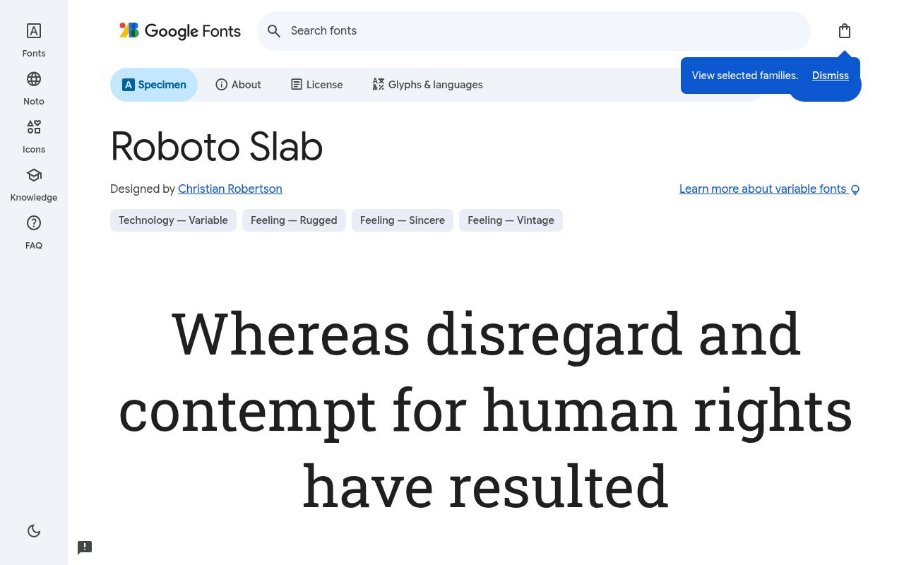
Solid, sturdy & free
ABCDEFGHIJKLM abcdefghijklm 0123456789
Mechanical structure and friendly curves meet in Roboto Slab, tying substantial serifs to the familiar Roboto design language. A content-heavy website can use its lighter cuts for article text and heavier settings for headings, then pair navigation with Roboto. The family is upright-only despite its extensive weight range.
Christian Robertson designed Roboto Slab; its free Google Fonts download includes 9 styles spanning weights 100–900, without italics. Roboto Slab’s axes cover Weight 100–900. Roboto Slab’s listed subsets cover Cyrillic, extended Cyrillic, Greek, extended Greek, Latin, extended Latin, and Vietnamese. Roboto Slab’s Open Font License permits commercial reliable headings and body projects.
- Style
- Neutral slab
- Best for
- Reliable headings and body
- License
- SIL Open Font License
- Price
- 100% free
Zilla Slab
Contemporary slab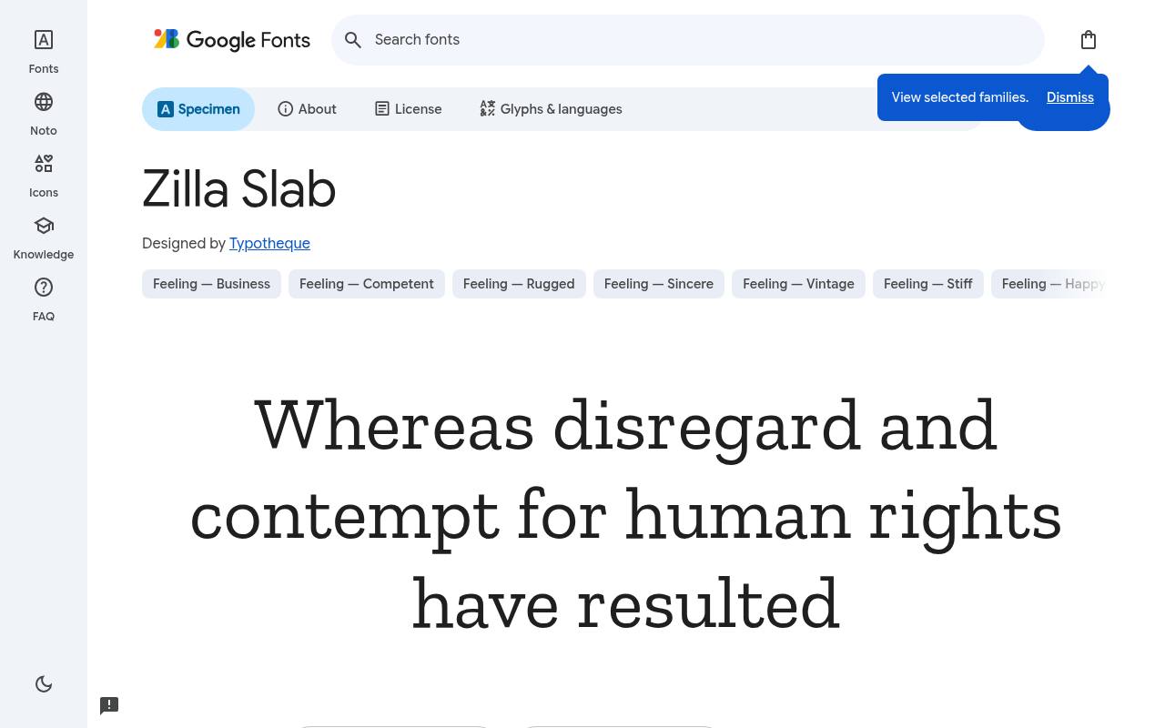
Solid, sturdy & free
ABCDEFGHIJKLM abcdefghijklm 0123456789
Created for Mozilla’s brand, Zilla Slab gives contemporary technology publishing a slightly quirky serif voice. Bold article titles feel substantial without the severity of a traditional newspaper slab, while the lighter cuts and italics can carry introductions and quotations. Its download consists of named static styles rather than a variable family.
The free Google Fonts selection for Zilla Slab, by Typotheque, contains 10 styles spanning weights 300–700, with matching italics. Script coverage for Zilla Slab includes Latin and extended Latin. Zilla Slab’s Open Font License permits commercial editorial and tech brands projects.
- Style
- Contemporary slab
- Best for
- Editorial and tech brands
- License
- SIL Open Font License
- Price
- 100% free
Arvo
Geometric slab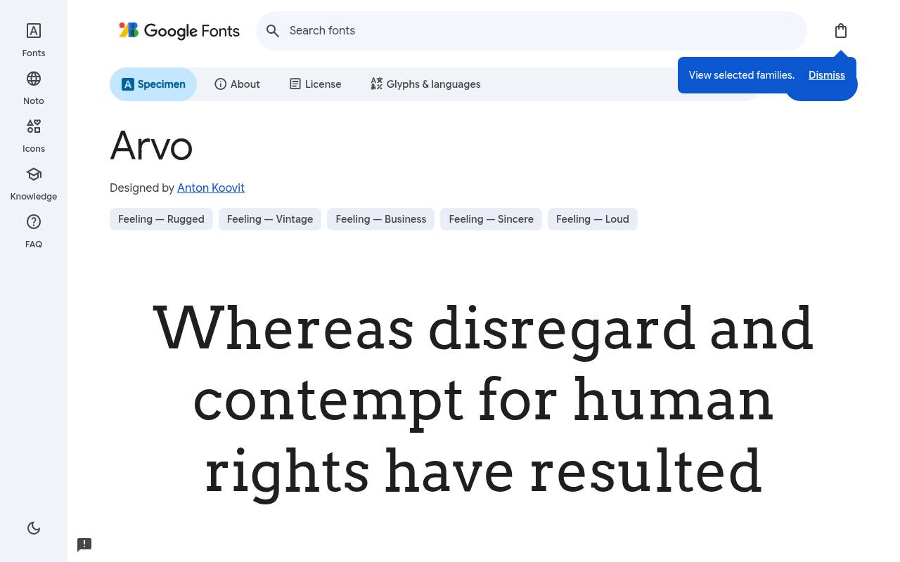
Solid, sturdy & free
ABCDEFGHIJKLM abcdefghijklm 0123456789
Even strokes and geometric slabs make Arvo feel orderly on a clean modern project presentation page. A project overview can use bold headings above short regular paragraphs, with matching italics reserved for quotations or emphasized terms.
The compact download covers the familiar regular-and-bold structure rather than a broad continuum of intermediate weights. For Arvo, Google Fonts supplies 4 styles spanning weights 400–700, with matching italics free, crediting Anton Koovit. The Arvo download supports Latin.
Arvo’s Open Font License permits commercial clean, modern layouts projects.Like every free font in this list, it ships under the SIL Open Font License, so it is free for personal and commercial projects alike.
- Style
- Geometric slab
- Best for
- Clean, modern layouts
- License
- SIL Open Font License
- Price
- 100% free
Bitter
Screen slab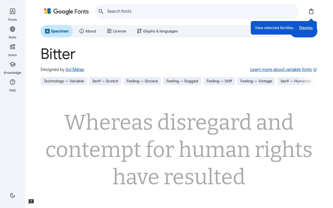
Solid, sturdy & free
ABCDEFGHIJKLM abcdefghijklm 0123456789
A large x-height and restrained stroke contrast reflect Bitter’s focus on reading on screens. Long-form essays can use its substantial lowercase forms for a steady text texture, with heavier headings and real italics maintaining hierarchy inside one family. Its slab serifs bring firmness without relying on decorative headline-only construction.
Credited to Sol Matas, Bitter comes free from Google Fonts in 18 styles spanning weights 100–900, with matching italics. Bitter’s axes cover Weight 100–900. Included subsets in Bitter span Cyrillic, extended Cyrillic, Latin, extended Latin, and Vietnamese. Bitter’s Open Font License permits commercial long-form reading projects.
- Style
- Screen slab
- Best for
- Long-form reading
- License
- SIL Open Font License
- Price
- 100% free
Josefin Slab
Vintage geometric slab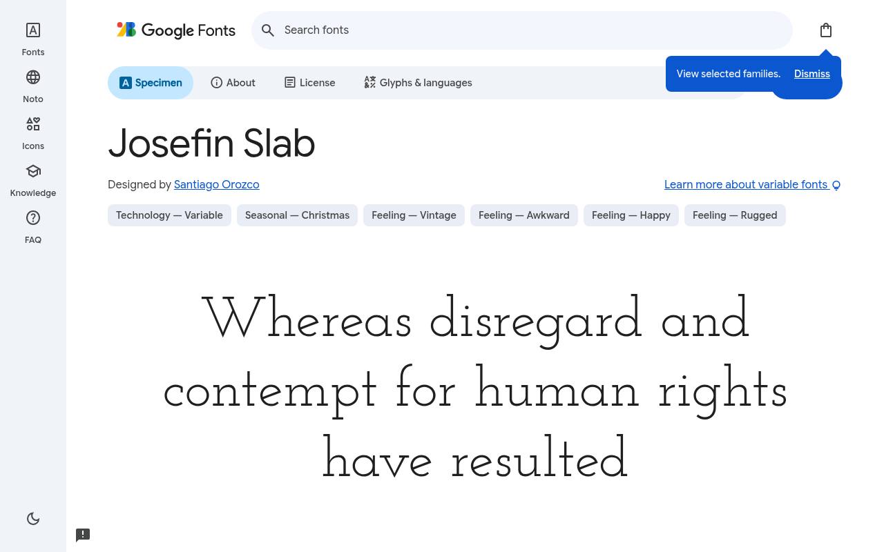
Solid, sturdy & free
ABCDEFGHIJKLM abcdefghijklm 0123456789
Inspired by 1930s geometric type, Josefin Slab combines vintage proportions with a notably light, elegant mood. A boutique identity or retro editorial opener can use its slender settings for spacious titles, then increase weight for supporting headings. The included italics provide a complementary slant rather than a separate script-like decoration.
Google Fonts lists Santiago Orozco as Josefin Slab’s designer credits and offers 14 styles spanning weights 100–700, with matching italics in the free download. Josefin Slab’s axes cover Weight 100–700. Josefin Slab’s listed subsets cover Latin. Josefin Slab’s Open Font License permits commercial elegant, retro branding projects.
- Style
- Vintage geometric slab
- Best for
- Elegant, retro branding
- License
- SIL Open Font License
- Price
- 100% free
Aleo
Semi-slab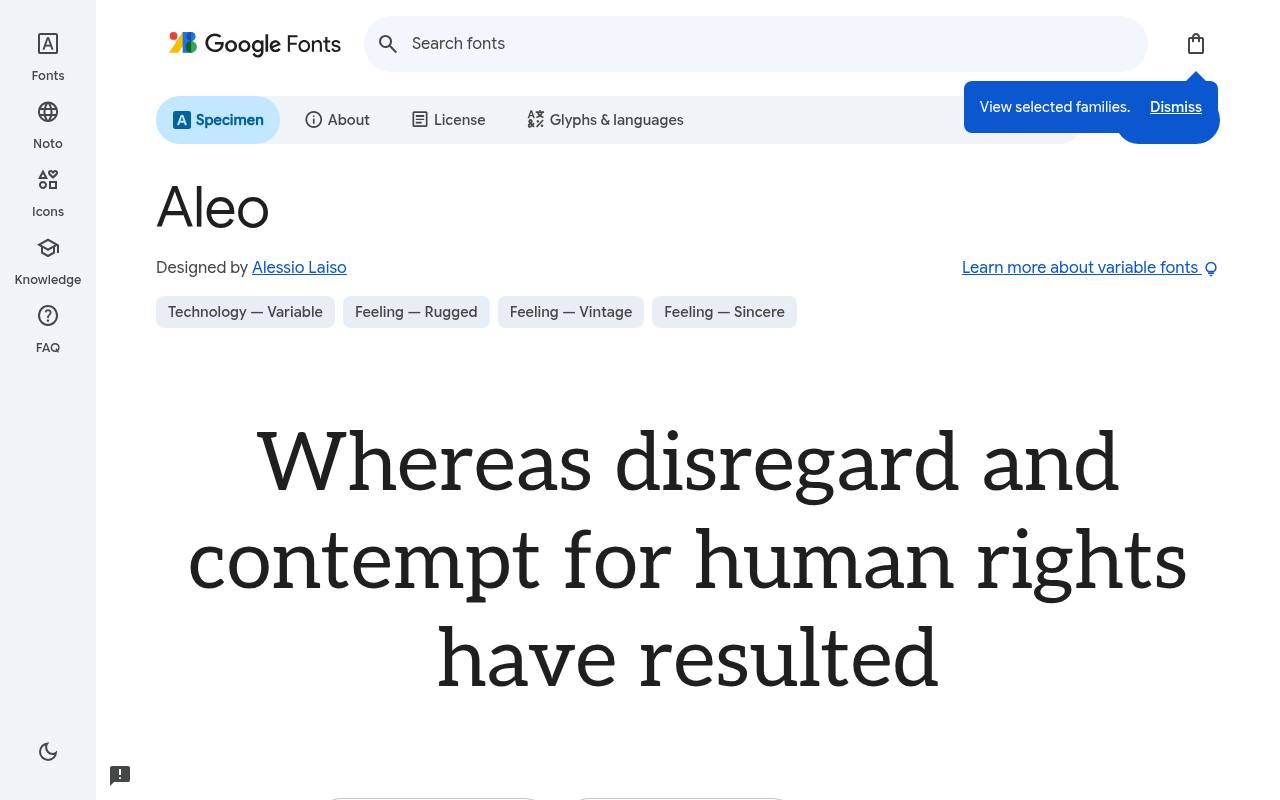
Solid, sturdy & free
ABCDEFGHIJKLM abcdefghijklm 0123456789
Semi-rounded details soften Aleo’s slab-serif framework, giving café menus and lifestyle publishing a warmer voice. A menu can distinguish section headings, item names, and brief descriptions through its broad weight span, keeping the same family throughout. Matching italics are available for notes without breaking the relationship between sturdy serifs and gentler curves.
Alessio Laiso designed Aleo; its free Google Fonts download includes 18 styles spanning weights 100–900, with matching italics. Aleo’s axes cover Weight 100–900. Script coverage for Aleo includes Latin, extended Latin, and Vietnamese. Aleo’s Open Font License permits commercial warm, friendly brands projects.
- Style
- Semi-slab
- Best for
- Warm, friendly brands
- License
- SIL Open Font License
- Price
- 100% free
Crete Round
Rounded slab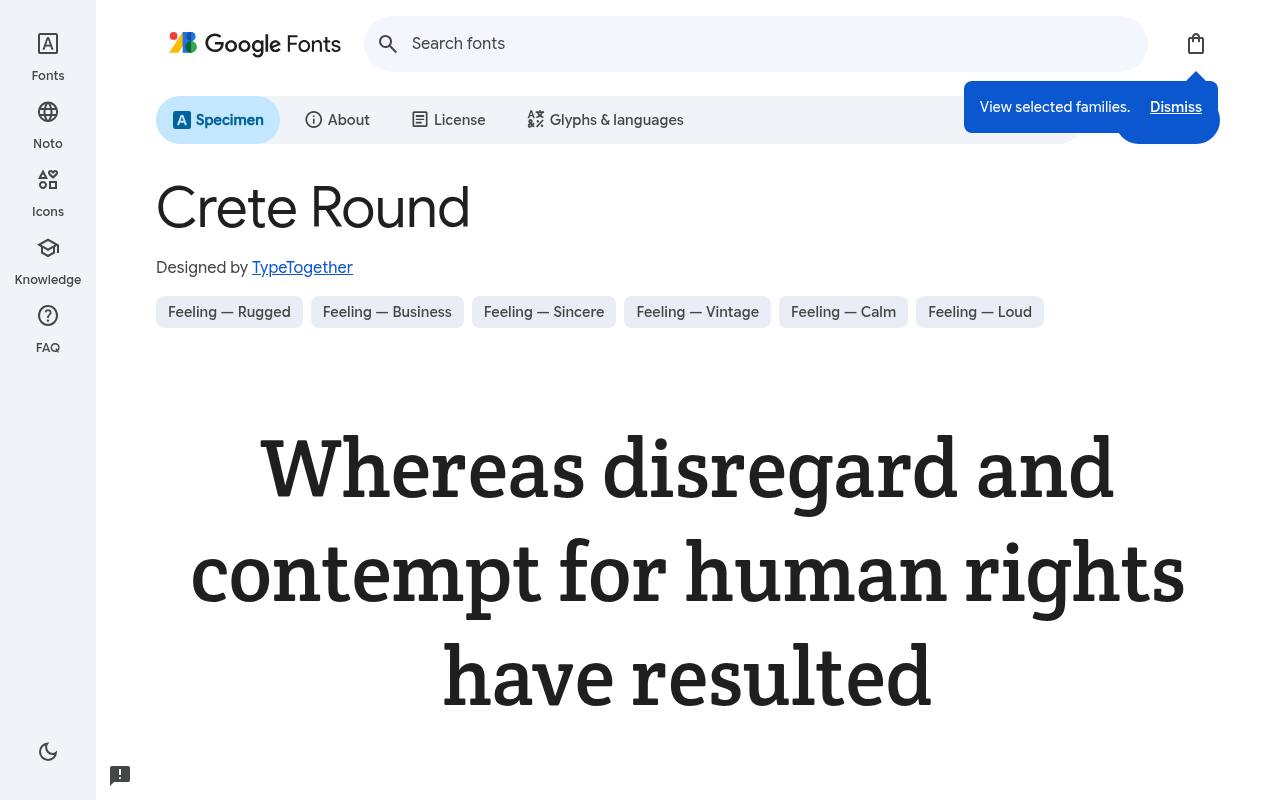
Solid, sturdy & free
ABCDEFGHIJKLM abcdefghijklm 0123456789
Rounded terminals give Crete Round a friendly twist on substantial slab-serif lettering. A community newsletter or welcoming product headline can use its regular cut for a solid, approachable title and its italic for a brief quotation. This is a focused two-style family rather than a collection of multiple headline weights.
The free Google Fonts selection for Crete Round, by TypeTogether, contains 2 styles spanning weights 400, with matching italics. The Crete Round download supports Latin and extended Latin. Crete Round’s Open Font License permits commercial approachable headlines projects.
- Style
- Rounded slab
- Best for
- Approachable headlines
- License
- SIL Open Font License
- Price
- 100% free
Rokkitt
Condensed slab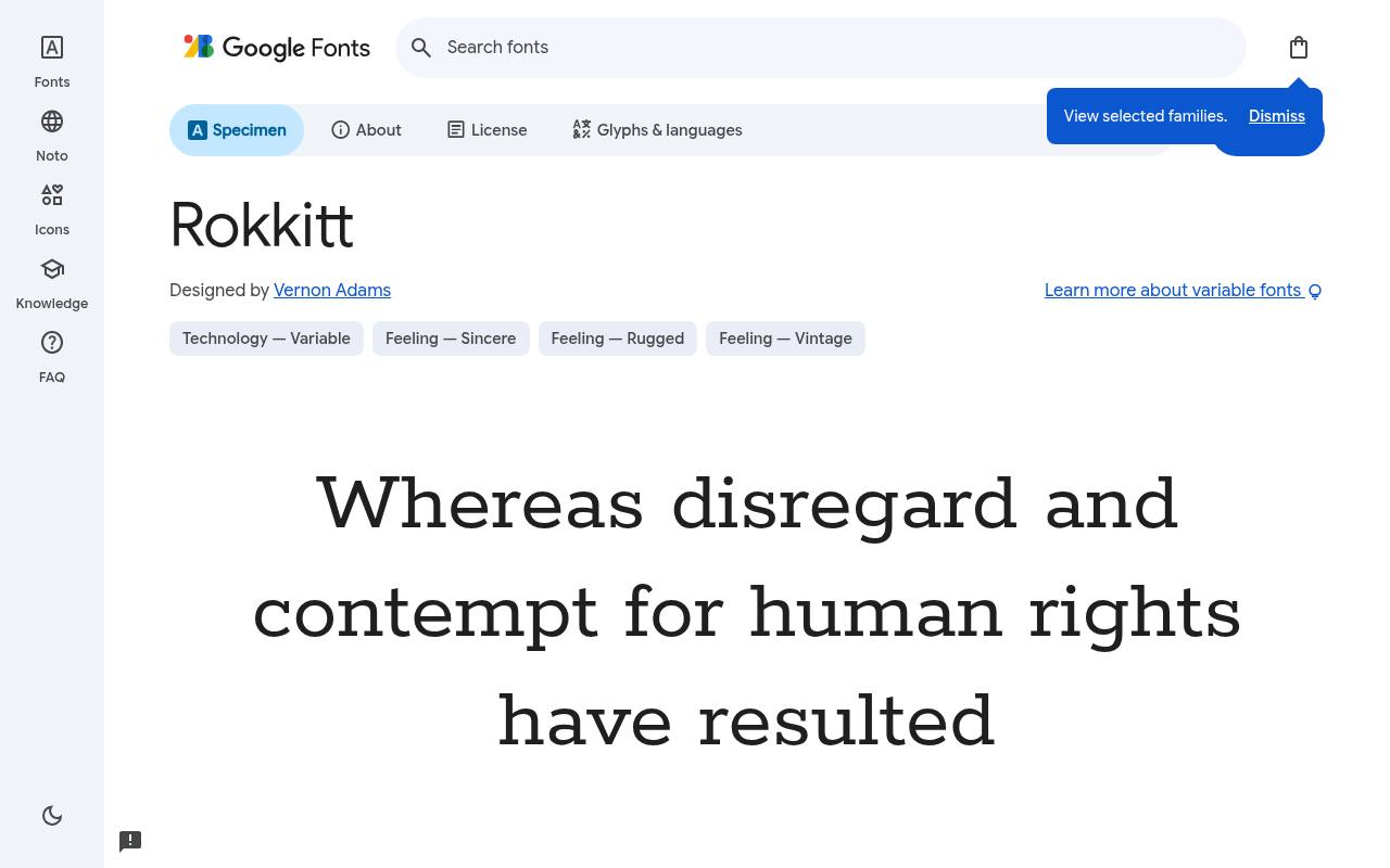
Solid, sturdy & free
ABCDEFGHIJKLM abcdefghijklm 0123456789
Slightly condensed proportions help Rokkitt fit substantial slab-serif headlines into magazine columns and poster panels. Its narrower rhythm gives titles presence without requiring extremely wide settings, while the extensive weights and italics support captions or secondary lines. A compact editorial cover can therefore establish several levels of emphasis within this family.
For Rokkitt, Google Fonts supplies 18 styles spanning weights 100–900, with matching italics free, crediting Vernon Adams. Rokkitt’s axes cover Weight 100–900. Included subsets in Rokkitt span Latin, extended Latin, and Vietnamese. Rokkitt’s Open Font License permits commercial space-efficient headlines projects.
- Style
- Condensed slab
- Best for
- Space-efficient headlines
- License
- SIL Open Font License
- Price
- 100% free
Patua One
Display slab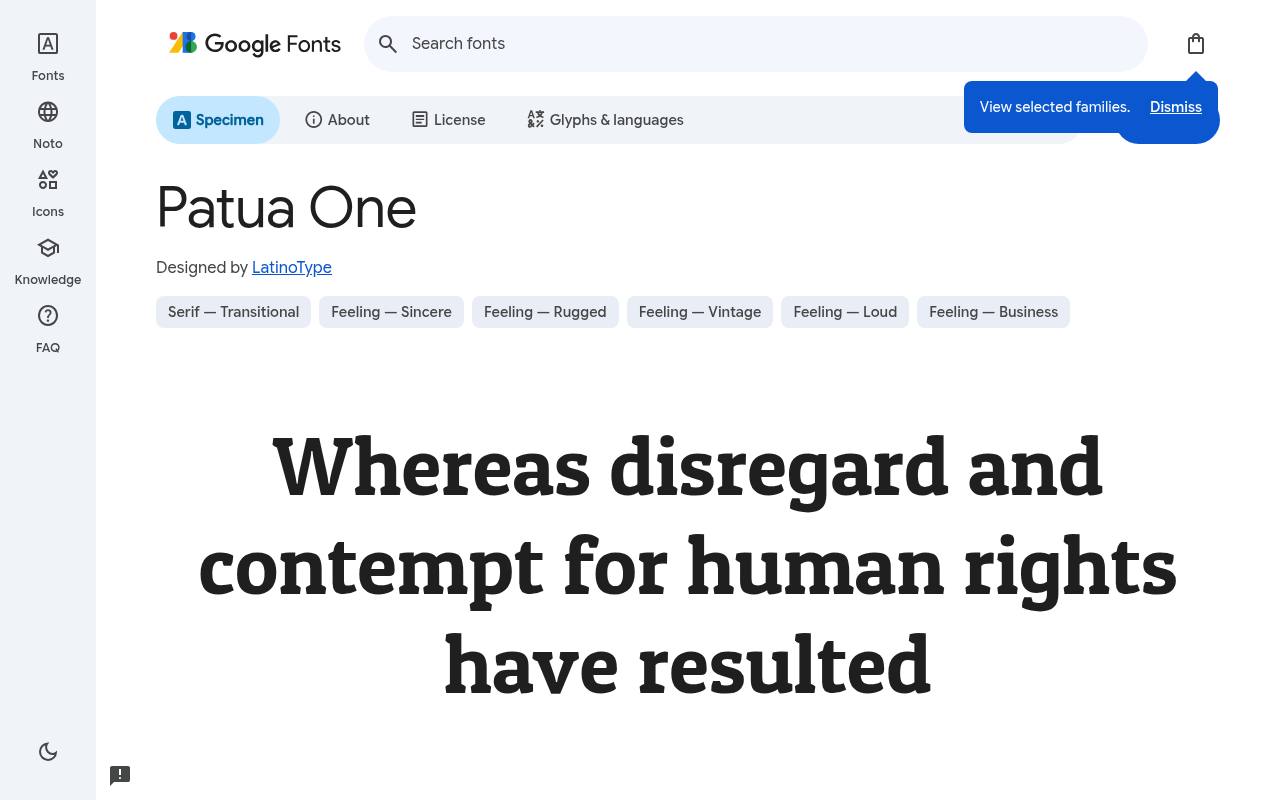
Solid, sturdy & free
ABCDEFGHIJKLM abcdefghijklm 0123456789
Bold rounded slabs give Patua One the character of a ready-made sign letter rather than a neutral reading serif. A shop label, café logo, or short directional sign can use its sturdy silhouette as the main visual element.
The single regular style is already emphatic; there is no separate bold cut to add. Credited to LatinoType, Patua One comes free from Google Fonts in 1 style at weight 400, without italics. Patua One’s listed subsets cover Latin. Patua One’s Open Font License permits commercial logos and signage projects.
- Style
- Display slab
- Best for
- Logos and signage
- License
- SIL Open Font License
- Price
- 100% free
Kameron
Classic slab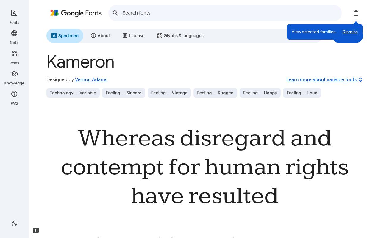
Solid, sturdy & free
ABCDEFGHIJKLM abcdefghijklm 0123456789
Vintage newspaper lettering informs Kameron’s serious, journalistic slab-serif voice. Reports and editorial pages can move from regular subheadings to bold section titles while keeping that traditional character consistent. Its current download supplies four upright weights through a variable range, rather than the regular-and-bold italic quartet often expected of text families.
Google Fonts lists Vernon Adams as Kameron’s designer credits and offers 4 styles spanning weights 400–700, without italics in the free download. Kameron’s axes cover Weight 400–700. Script coverage for Kameron includes Latin and extended Latin. Kameron’s Open Font License permits commercial newspapers and reports projects.
- Style
- Classic slab
- Best for
- Newspapers and reports
- License
- SIL Open Font License
- Price
- 100% free
When to use a slab serif font
Slab serifs project stability and confidence, which is why they are popular with construction, outdoor, coffee and technology brands. They also read well at small sizes and low resolutions thanks to their sturdy serifs.
Pair a free slab serif font headline with a clean sans-serif for body text — Roboto Slab with Roboto, or Zilla Slab with Inter — for a balanced, professional result.
Slab serif fonts for branding
Because slab serifs have strong, even strokes, they hold up well when printed small on packaging or embroidered on merchandise. Patua One and Aleo bring friendliness to logos, while Kameron and Roboto Slab feel more corporate and reliable.
All ten are free under the Open Font License, so you can use them in logos and commercial products without fees.
Frequently asked questions
What is the most popular free slab serif font? Roboto Slab is the most widely used, followed by Arvo and Bitter.
Are slab serif fonts good for body text? Yes — Bitter and Roboto Slab are designed to be comfortable for reading on screens.
Compare candidates through a complete editorial spread
A slab serif can look convincing in a single title yet feel very different across a full page of information. Build a small editorial spread containing a headline, introduction, quotation, caption and ordinary paragraph. Compare Bitter, Zilla Slab and Kameron using exactly the same copy.
This reveals whether you want a contemporary voice, a quieter reading experience or a more traditional editorial character. Free slab serif fonts give you plenty of scope to explore these differences without buying several families before you understand the direction.
Pay attention to the transitions between text roles. A strong headline should lead into the article rather than make the body look weak or unrelated. You can often achieve a coherent spread by changing weight, size and spacing within one family, where suitable styles are available.
Avoid judging every candidate at identical numerical settings if their proportions differ noticeably. Start with a fair comparison, then refine each layout to see whether the slab serif font genuinely supports the content when given a sensible amount of care.
Understand the brief behind the word Egyptian
You may encounter the label egyptian fonts when looking for slab serifs. In typography, that historical term is associated with this broad category of sturdy serif lettering; it does not mean the designs reproduce ancient Egyptian writing.
If a client uses the phrase, ask for visual examples before starting. They may want a traditional poster atmosphere, a dependable editorial voice or simply thick square serifs. Those are different directions, and clarifying the intention will help you choose among the free options in this article.
Use a short comparison sheet to make the conversation concrete. Set the same product name in Josefin Slab, Arvo and Patua One, then describe the visual differences without turning them into fixed rules about personality.
Josefin Slab can suggest a lighter, more elegant direction, while the other options invite different treatments of weight and structure. Your client can respond to a real example instead of an ambiguous category name. This keeps a historical search term useful without allowing it to dictate an unsuitable look for the actual project.
Build headlines around awkward words as well as easy ones
When you test free headline fonts, include the longest title your layout is likely to carry. Short sample words flatter almost any design, whereas a lengthy product name or editorial heading exposes problems with width and line breaks.
Try Rokkitt when horizontal space is limited, but still check whether your chosen breaks preserve meaning. A narrower appearance does not remove the need to edit a heading or redesign a crowded card. You should not have to sacrifice clarity just to keep every title on one line.
Review punctuation and numbers in the same layout. A headline might contain a percentage, a price, quotation marks or a parenthetical phrase, and these details can change its visual balance. Keep related words together where possible, then inspect the result at both desktop and phone widths.
If you increase spacing, do so gently and assess whole words rather than individual letters. Free slab serif fonts have enough structural presence already; the goal is a readable headline with a confident rhythm, not a block of type forced into a predetermined rectangle.
Make reports easier to scan without making them louder
Reports need several levels of information, but those levels do not all need different typefaces. Start with a clear system for chapter titles, section headings, notes and tables. Roboto Slab or Bitter can provide a useful starting point for testing extended passages, while Arvo can bring structure to shorter explanatory blocks.
Use real report content, including a dense page, rather than approving the typography from a cover alone. A dependable document should be comfortable in its busiest section, not merely impressive at its beginning.
For tables, check numeric alignment and label length independently of the main text treatment. Keep units visible and give explanatory notes enough space to remain useful. If a chart is exported as an image, check the final output at the size readers will actually see, especially inside presentation slides or downloaded documents.
Choosing free fonts for branding should not mean treating every practical report as an advertisement. A restrained system can carry the organisation's character while letting evidence, comparisons and conclusions remain the centre of attention throughout the document.
Move from download to an editable working file
Download your chosen free family from its official Google Fonts page and inspect the supplied files before installation. On your computer, use the operating system's font installation process, then reopen the design application if the family does not appear immediately.
Start a new document and confirm that the intended styles are available. Avoid relying on an application to imitate a missing bold or italic automatically, because simulated styles can change the appearance you approved. A brief installation check prevents confusing differences between an early mockup and the working artwork.
When you share an editable file, tell collaborators which family and styles it uses and where they can obtain them. A missing font can change line endings, push a caption out of place or alter the fit of a label without looking obviously broken.
Export a reference copy alongside the editable document so the intended layout is clear. Keep the licence information with your project resources and consult it before redistributing font files. Free access makes collaboration easier, but a careful handover is still what protects the design from accidental substitutions.
Test sturdy lettering in demanding viewing conditions
Thick serifs can create a reassuring impression, but no category is automatically readable in every situation. Preview your design on a smaller screen, under lower contrast conditions and at increased zoom. For printed material, examine a proof from a realistic reading distance.
Aleo and Crete Round offer approachable starting points, yet their success still depends on size, spacing and the amount of surrounding content. Test the exact setting you plan to publish instead of assuming that the family description guarantees a result for your particular audience.
If the text feels crowded, increase the space available before adding decorative effects. Extra shadows, outlines and textures can interfere with the strong shapes you chose in the first place. Check reversed text on a dark background separately from dark text on a light background, since the visual weight may feel different.
For a website, include a sensible serif fallback and confirm that the layout survives a failed font download. Your free slab selection should remain part of a resilient design, not a dependency that makes the content unusable when conditions change.