Rounded fonts feel safe, soft and human. By smoothing away sharp corners, they make brands feel approachable — which is why you see them on banking apps for kids, food delivery services, wellness products and community platforms.
Unlike our loud free comic fonts, these rounded fonts stay professional enough for interfaces and body text. They are friendly without being silly. All ten are free on Google Fonts and licensed for commercial use.
Browse the live previews, click a screenshot to see the source page, and download your favourite free rounded font.
Quick picks at a glance
| # | Resource | Style | Best for |
|---|---|---|---|
| 1 | Nunito | Rounded sans | Friendly apps |
| 2 | Quicksand | Light rounded geometric | Wellness and lifestyle |
| 3 | Varela Round | Rounded UI | Clean interfaces |
| 4 | M PLUS Rounded 1c | Rounded gothic | Multilingual friendly brands |
| 5 | Comfortaa | Rounded geometric display | Logos and titles |
| 6 | Baloo 2 | Chunky rounded | Kids and education |
| 7 | Mali | Rounded handwriting | Notes and cute designs |
| 8 | Itim | Casual rounded | Informal messaging |
| 9 | Sniglet | Bubbly rounded | Party and candy brands |
| 10 | Grandstander | Playful rounded | Games and family brands |
Nunito
Rounded sans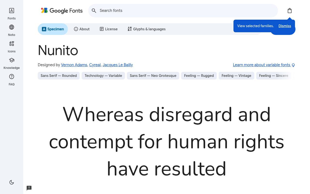
Soft, friendly & free
ABCDEFGHIJKLM abcdefghijklm 0123456789
Rounded terminals soften Nunito’s balanced sans-serif structure, creating a welcoming tone for consumer apps. The substantial weight span can cover lightweight onboarding explanations, everyday interface labels, and emphatic section headings. Matching italics let quoted messages and secondary commentary remain part of the same friendly system instead of introducing a separate handwritten face.
Vernon Adams, Cyreal, and Jacques Le Bailly designed Nunito; its free Google Fonts download includes 18 styles spanning weights 200–1000, with matching italics. Nunito’s axes cover Weight 200–1000. The Nunito download supports Cyrillic, extended Cyrillic, Latin, extended Latin, and Vietnamese. Nunito’s Open Font License permits commercial friendly apps projects.
- Style
- Rounded sans
- Best for
- Friendly apps
- License
- SIL Open Font License
- Price
- 100% free
Quicksand
Light rounded geometric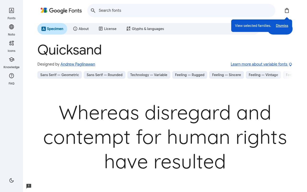
Soft, friendly & free
ABCDEFGHIJKLM abcdefghijklm 0123456789
Airy geometry and rounded ends give Quicksand a gentle character suited to wellness branding. A yoga studio can put class names and short introductory headings in its lighter settings, then use stronger weights for booking details. The family stays upright throughout, so its softness comes from the drawing rather than italic movement.
The free Google Fonts selection for Quicksand, by Andrew Paglinawan, contains 5 styles spanning weights 300–700, without italics. Quicksand’s axes cover Weight 300–700. Included subsets in Quicksand span Latin, extended Latin, and Vietnamese. Quicksand’s Open Font License permits commercial wellness and lifestyle projects.
- Style
- Light rounded geometric
- Best for
- Wellness and lifestyle
- License
- SIL Open Font License
- Price
- 100% free
Varela Round
Rounded UI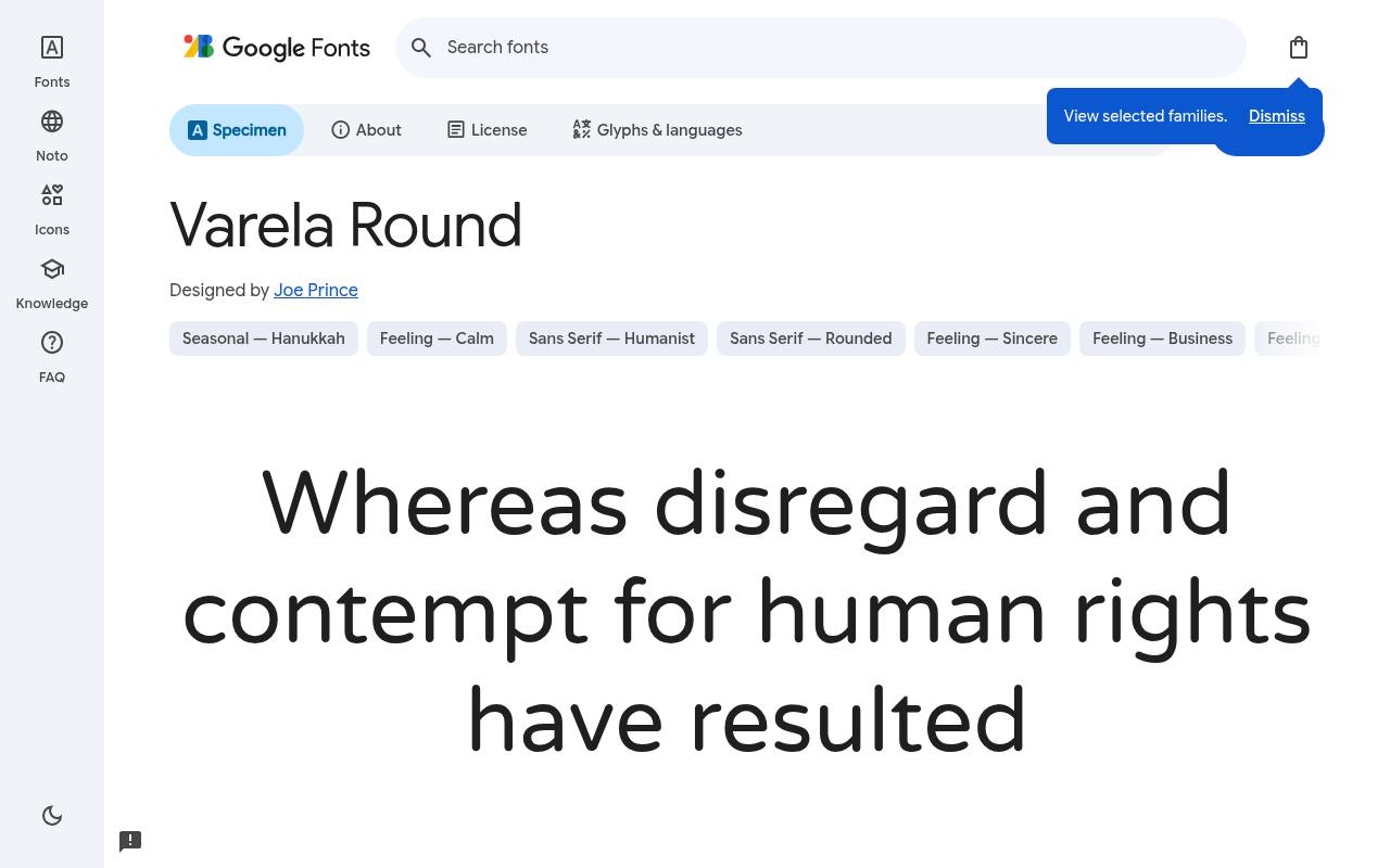
Soft, friendly & free
ABCDEFGHIJKLM abcdefghijklm 0123456789
A rounded counterpart to Varela, Varela Round softens interface text with simple curves rather than decorative flourishes. Its single regular cut suits a compact app’s labels or a welcoming settings screen, where size and spacing establish hierarchy. Hebrew support makes the download relevant beyond Latin-only interface projects.
For Varela Round, Google Fonts supplies 1 style at weight 400, without italics free, crediting Joe Prince. Varela Round’s listed subsets cover Hebrew, Latin, extended Latin, and Vietnamese. Varela Round’s Open Font License permits commercial clean interfaces projects.
- Style
- Rounded UI
- Best for
- Clean interfaces
- License
- SIL Open Font License
- Price
- 100% free
M PLUS Rounded 1c
Rounded gothic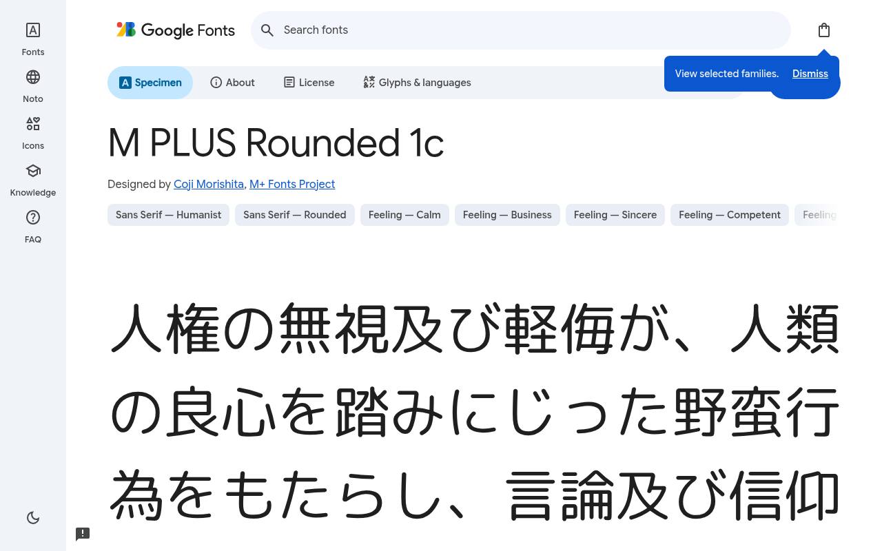
Soft, friendly & free
ABCDEFGHIJKLM abcdefghijklm 0123456789
Japanese and Latin lettering share a soft, rounded treatment in M PLUS Rounded 1c. An international family-oriented product can carry that consistent tone across onboarding titles and short interface messages, while the seven listed weights provide several levels of emphasis.
Its script coverage extends well beyond those two primary writing systems. Credited to Coji Morishita and M+ Fonts Project, M PLUS Rounded 1c comes free from Google Fonts in 7 styles spanning weights 100–900, without italics. Script coverage for M PLUS Rounded 1c includes Cyrillic, extended Cyrillic, Greek, extended Greek, Hebrew, Japanese, Latin, extended Latin, and Vietnamese.
M PLUS Rounded 1c’s Open Font License permits commercial multilingual friendly brands projects.Like every free font in this list, it ships under the SIL Open Font License, so it is free for personal and commercial projects alike.
- Style
- Rounded gothic
- Best for
- Multilingual friendly brands
- License
- SIL Open Font License
- Price
- 100% free
Comfortaa
Rounded geometric display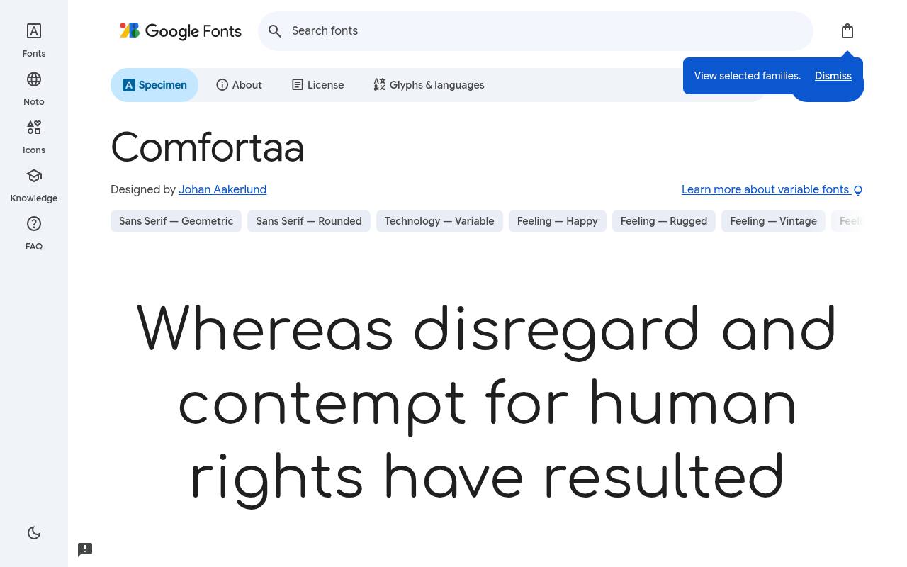
Soft, friendly & free
ABCDEFGHIJKLM abcdefghijklm 0123456789
Circles and smooth curves give Comfortaa an immediately recognizable geometric personality. A short logo or product title can make those repeated rounded forms the center of the identity, while supporting information uses more restrained typography. Its variable weight control changes emphasis without turning the family into an italic or width-adjustable design.
Google Fonts lists Johan Aakerlund as Comfortaa’s designer credits and offers 5 styles spanning weights 300–700, without italics in the free download. Comfortaa’s axes cover Weight 300–700. The Comfortaa download supports Cyrillic, extended Cyrillic, Greek, Latin, extended Latin, and Vietnamese. Comfortaa’s Open Font License permits commercial logos and titles projects.
- Style
- Rounded geometric display
- Best for
- Logos and titles
- License
- SIL Open Font License
- Price
- 100% free
Baloo 2
Chunky rounded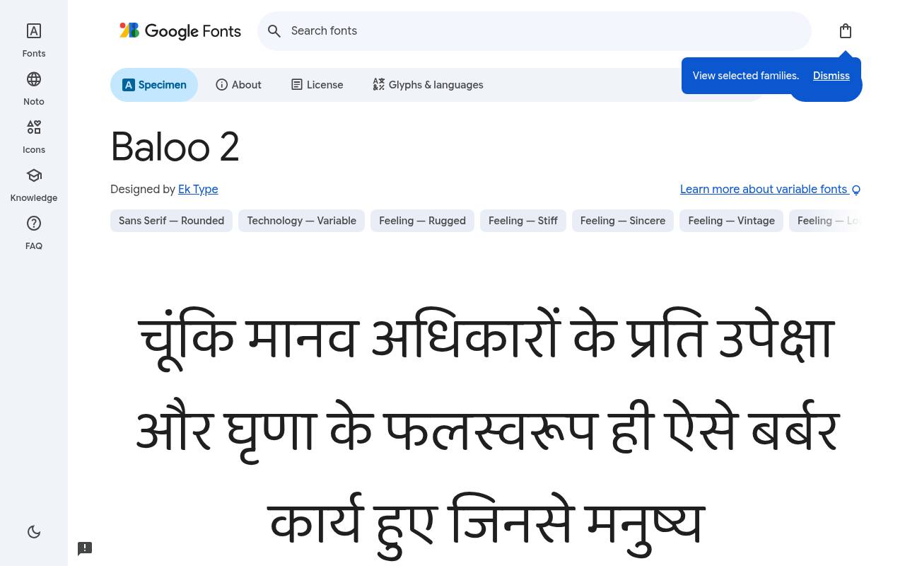
Soft, friendly & free
ABCDEFGHIJKLM abcdefghijklm 0123456789
Broad, chunky forms make Baloo 2 feel exuberant without requiring illustrated lettering. Children’s learning apps can use it for lesson titles and reward screens, especially where Devanagari and Latin text need a related visual voice. The available weights begin at regular and grow heavier, rather than extending into delicate thin cuts.
Ek Type designed Baloo 2; its free Google Fonts download includes 5 styles spanning weights 400–800, without italics. Baloo 2’s axes cover Weight 400–800. Included subsets in Baloo 2 span Devanagari, Latin, extended Latin, and Vietnamese. Baloo 2’s Open Font License permits commercial kids and education projects.
- Style
- Chunky rounded
- Best for
- Kids and education
- License
- SIL Open Font License
- Price
- 100% free
Mali
Rounded handwriting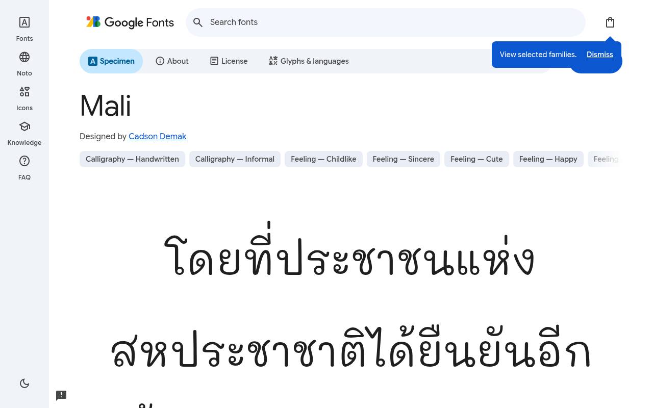
Soft, friendly & free
ABCDEFGHIJKLM abcdefghijklm 0123456789
Neat, rounded handwriting gives Mali a childlike, personal tone without the connected strokes of a formal script. Sticker captions, journal prompts, and playful package notes can use its light-to-bold selection for varied emphasis. Thai coverage is a central practical feature for bilingual projects rather than an incidental extension of Latin lettering.
The free Google Fonts selection for Mali, by Cadson Demak, contains 12 styles spanning weights 200–700, with matching italics. Mali’s listed subsets cover Latin, extended Latin, Thai, and Vietnamese. Mali’s Open Font License permits commercial notes and cute designs projects.
- Style
- Rounded handwriting
- Best for
- Notes and cute designs
- License
- SIL Open Font License
- Price
- 100% free
Itim
Casual rounded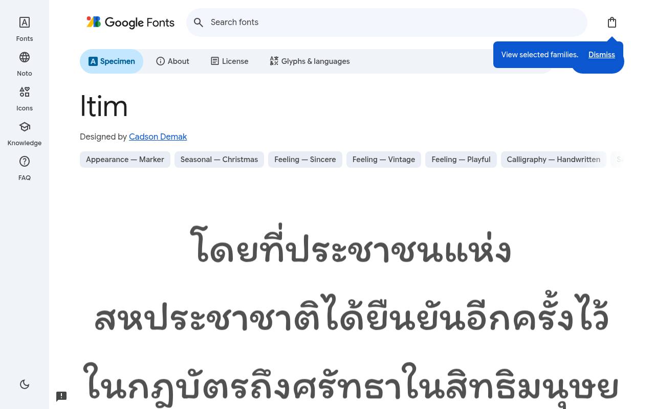
Soft, friendly & free
ABCDEFGHIJKLM abcdefghijklm 0123456789
Casual penlike curves make Itim feel conversational in a café heading or a personal blog introduction. Its rounded construction supplies warmth without the density of a bubbly display face. The download offers one regular cut, so a menu should distinguish prices and item descriptions through layout rather than expecting a matching bold.
For Itim, Google Fonts supplies 1 style at weight 400, without italics free, crediting Cadson Demak. Script coverage for Itim includes Latin, extended Latin, Thai, and Vietnamese. Itim’s Open Font License permits commercial informal messaging projects.
- Style
- Casual rounded
- Best for
- Informal messaging
- License
- SIL Open Font License
- Price
- 100% free
Sniglet
Bubbly rounded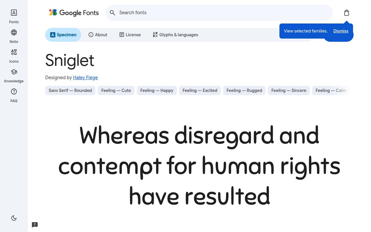
Soft, friendly & free
ABCDEFGHIJKLM abcdefghijklm 0123456789
Bubbly, inflated shapes give Sniglet the cheerful presence of confectionery lettering. A party invitation or candy label can use the regular cut for a short phrase and the much heavier extra-bold for the main celebration. These are two discrete upright styles, not endpoints of a listed variable weight axis.
Credited to Haley Fiege, Sniglet comes free from Google Fonts in 2 styles spanning weights 400–800, without italics. The Sniglet download supports Latin and extended Latin. Sniglet’s Open Font License permits commercial party and candy brands projects.
- Style
- Bubbly rounded
- Best for
- Party and candy brands
- License
- SIL Open Font License
- Price
- 100% free
Grandstander
Playful rounded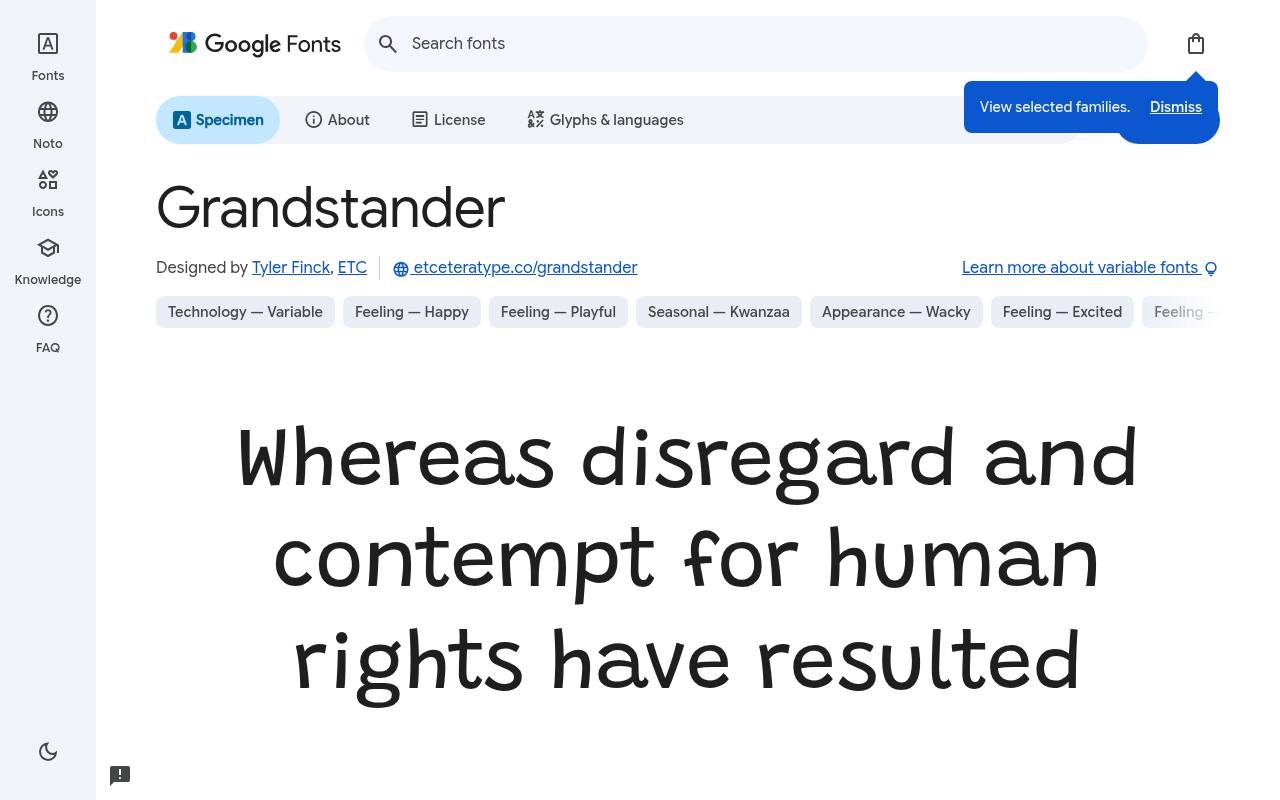
Soft, friendly & free
ABCDEFGHIJKLM abcdefghijklm 0123456789
Bouncy letterforms give Grandstander an energetic, informal rhythm that fits family games and playful branding. A game title, reward message, and short character quotation can all take different weights or italics without losing that rounded personality. Its unusually broad style selection makes it more flexible than a single novelty headline cut.
Google Fonts lists Tyler Finck and ETC as Grandstander’s designer credits and offers 18 styles spanning weights 100–900, with matching italics in the free download. Grandstander’s axes cover Weight 100–900. Included subsets in Grandstander span Latin, extended Latin, and Vietnamese. Grandstander’s Open Font License permits commercial games and family brands projects.
- Style
- Playful rounded
- Best for
- Games and family brands
- License
- SIL Open Font License
- Price
- 100% free
Using free rounded fonts professionally
Rounded fonts pair well with lots of white space and soft colours. Use a medium weight for body text and a bold weight for headings to keep hierarchy clear.
If a rounded font starts to feel too childish, pair it with a straight-edged sans for small UI text. All ten of these free fonts are open-licensed, so experiment freely.
Why rounded fonts feel friendly
Our brains read sharp corners as alert and rounded shapes as safe. Rounded fonts borrow that instinct: softened terminals and circular forms feel warm, informal and trustworthy. That is why you see them in children's products, health and wellness apps, food brands and community platforms.
Rounded fonts also tend to be very legible on screens, because their open, simple shapes render cleanly at small sizes.
Pairing free rounded fonts
Nunito or Varela Round can handle a whole interface on their own. For a more playful brand, use Baloo 2, Sniglet or Grandstander for headlines and Nunito for body text. For a calm wellness look, pair Quicksand headlines with a light serif. For notes or stickers, add Mali or Itim as an accent.
Soft pastel or bright candy colours suit rounded type naturally. Combine them with rounded buttons and cards for a consistent friendly look.
Frequently asked questions
What is the best free rounded font for apps? Nunito is the most versatile; Varela Round is great for simple interfaces.
Are rounded fonts professional? Yes, when used with restraint — many banks, healthcare brands and tech companies use rounded type to feel approachable.
Match warmth to the task in front of you
Start with the moment your reader is experiencing rather than an abstract idea of friendliness. A community welcome screen can be light and conversational, whereas a payment confirmation should communicate certainty first. Compare Nunito and Varela Round using the actual words on those screens.
Their rounded character can support an approachable identity without making the message feel like entertainment. Free rounded fonts work best when the tone of the copy, the importance of the action and the visual treatment all point in the same direction.
A useful exercise is to set a cheerful message, an error and a serious notice in your shortlisted family. If the serious notice seems flippant, adjust the typography or reserve the more expressive face for promotional content.
Soft fonts do not need to soften the meaning of an instruction. You can remain friendly while stating a cancellation, warning or price clearly. This practical test is more informative than judging a font only through an upbeat brand name or a sample sentence full of welcoming words.
Check small controls before approving the identity
A brand presentation usually gives type plenty of space, but real interfaces include crowded navigation, form labels and compact account menus. Test your rounded sans serif in these less glamorous places before committing to a full design system.
Use realistic labels rather than short placeholders, and check how the layout behaves when a user increases text size. Nunito is a useful candidate for this exercise because you can explore hierarchy within the family instead of introducing another visual voice simply to make a button stand out.
Look closely at the distinction between a placeholder, a field value and an error message. The user should understand each role without needing to decode subtle colour differences. Give controls enough height for the text at larger settings, and avoid fixed containers that clip letters.
A free font can make a product feel accessible, but rounded shapes alone do not guarantee accessibility. Clear wording, visible focus states and a layout that tolerates zoom remain essential parts of the experience you are designing for people.
Give children's information room to be understood
For family projects, begin by separating the message aimed at children from the practical information aimed at adults. Baloo 2 or Grandstander can introduce an activity, while a calmer treatment explains what to bring, where to go or how to register.
Do not make every line equally lively. When everything demands attention, a reader has no obvious starting point. The most useful free rounded fonts help establish a reading order that works even when a parent is checking the page quickly on a phone.
If your brief asks for cute fonts free of licensing fees, turn that broad request into concrete design requirements. Decide whether the lettering needs to work on a worksheet, a small label or a classroom screen.
Print a sample at its intended size, including instructions and names rather than only the title. Sniglet may bring the right energy to a party heading, but that does not mean the same treatment belongs on every instruction. Choose expressiveness where it improves recognition and restraint where it supports understanding.
Plan translations before the layout becomes fixed
An international brand needs more than a welcoming appearance in one sample sentence. Gather actual translated text and check the characters each language requires. M PLUS Rounded 1c is particularly relevant when your project includes Latin and Japanese, but you should still preview your specific content and punctuation.
Never assume that a family covers every language because it supports more than one writing system. Missing glyphs can introduce a visibly different fallback face and interrupt the consistency you were trying to establish with a free font.
Allow translated buttons, headings and navigation items to grow without breaking the layout. Test names, addresses and dates as well as marketing copy, because those details often reveal problems first.
If your team searches for friendly fonts free to use across different markets, include language coverage in the shortlist rather than treating it as a final technical check. Share screenshots with someone who reads the target language when possible. Their feedback on tone and spacing can reveal issues that an attractive but unfamiliar specimen will not.
Proof the finished object rather than the screen alone
Rounded lettering can look different once it moves from a bright display to a printed cup, a product label or a fabric patch. Prepare a proof at the final physical size, using the intended background colour and a realistic amount of surrounding information.
Comfortaa might give a product name the right character, but your ingredient list, contact details and supporting text still need their own assessment. Free typography gives you room to experiment with several compositions before committing money to a production run or a large batch.
Ask your printer or manufacturer about the limits of the chosen process rather than assuming every curve and small gap will reproduce equally well. Quicksand's lighter appearance may need a different treatment from the fuller shapes of Baloo 2.
Avoid correcting production issues simply by stretching the lettering or adding an arbitrary outline. Review another available weight or a larger setting first. The aim is to preserve the character that attracted you to the font while making the finished object readable in the conditions where customers actually encounter it.
Create a reusable handover for friendly typography
Once the design works, document where the expressive elements stop. A simple guide might show the heading treatment, an ordinary paragraph, a button and a small legal notice. Include examples of what not to do, such as filling a long policy page with oversized playful lettering.
Mali and Itim can be useful for a personal note or a small annotation, but their appearance should have a clear purpose. Your free font choices become more valuable when colleagues can apply them consistently without asking you to review every new asset.
Store the official download location and the accompanying licence text with the brand documentation. Explain which files the website uses and which colleagues need to install for editable documents. Check the supplied licence before sharing or modifying font files, and distinguish the font itself from any artwork you create with it.
A clear record prevents avoidable confusion when another supplier takes over a project. It also lets you customise campaigns confidently while keeping the everyday typography stable, recognisable and straightforward for the people maintaining the brand.