Developers stare at code for hours, so the font matters more than most people think. A good free coding font makes similar characters — 0 and O, 1, l and I — instantly distinguishable, keeps columns aligned and reduces eye fatigue during long sessions.
These ten free monospace fonts are great for code editors, terminals, documentation sites and developer blogs. All are free on Google Fonts, and you can install them on your machine as well as embed them on the web.
Each card shows a code-style preview and links straight to the free download at the source.
Quick picks at a glance
| # | Resource | Style | Best for |
|---|---|---|---|
| 1 | Fira Code | Ligature mono | Code editors |
| 2 | Source Code Pro | Clean mono | Terminals and docs |
| 3 | IBM Plex Mono | Corporate mono | Developer brands |
| 4 | Roboto Mono | Neutral mono | Android and Material UIs |
| 5 | Space Mono | Retro-future mono | Editorial tech sites |
| 6 | Inconsolata | Humanist mono | Long coding sessions |
| 7 | Ubuntu Mono | Rounded mono | Linux terminals |
| 8 | Red Hat Mono | Open-source mono | Clean code samples |
| 9 | Martian Mono | Wide mono | Dashboards and data |
| 10 | Geist Mono | Modern mono | Modern developer tools |
Fira Code
Ligature mono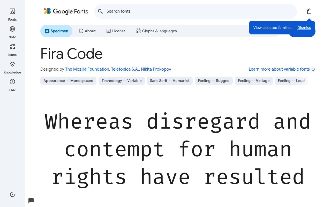
const free = true; // => ok
ABCDEFGHIJKLM abcdefghijklm 0123456789
Programming ligatures are Fira Code’s defining addition to the Mozilla Fira Mono foundation, combining character sequences such as => into coordinated symbols. A code editor or tutorial can retain fixed-width alignment while presenting operators more smoothly.
The ligatures are a specific coding feature, not a substitute for an italic style. The Mozilla Foundation, Telefonica S.A., and Nikita Prokopov designed Fira Code; its free Google Fonts download includes 5 styles spanning weights 300–700, without italics.
Fira Code’s axes cover Weight 300–700. Fira Code’s listed subsets cover Cyrillic, extended Cyrillic, Greek, extended Greek, Latin, extended Latin, and additional symbols (symbols2). Fira Code’s Open Font License permits commercial code editors projects.
- Style
- Ligature mono
- Best for
- Code editors
- License
- SIL Open Font License
- Price
- 100% free
Source Code Pro
Clean mono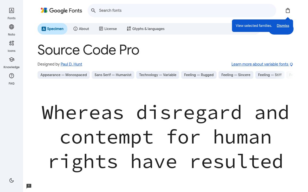
const free = true; // => ok
ABCDEFGHIJKLM abcdefghijklm 0123456789
Adobe’s Source Code Pro gives terminal output and technical documentation a balanced, relatively quiet monospace texture. Its broad weight selection lets code examples, inline identifiers, and explanatory comments share a family without identical emphasis.
Matching italics offer a genuine alternative voice for comments rather than simply leaning the upright letters. The free Google Fonts selection for Source Code Pro, by Paul D. Hunt, contains 16 styles spanning weights 200–900, with matching italics.
Source Code Pro’s axes cover Weight 200–900. Script coverage for Source Code Pro includes Cyrillic, extended Cyrillic, Greek, extended Greek, Latin, extended Latin, and Vietnamese. Source Code Pro’s Open Font License permits commercial terminals and docs projects.
- Style
- Clean mono
- Best for
- Terminals and docs
- License
- SIL Open Font License
- Price
- 100% free
IBM Plex Mono
Corporate mono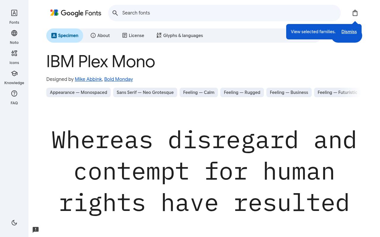
const free = true; // => ok
ABCDEFGHIJKLM abcdefghijklm 0123456789
A disciplined fixed-width rhythm meets unusually expressive italics in IBM Plex Mono. Developer-brand pages can use the upright cuts for snippets and the more handwritten-feeling italics for short annotations, keeping technical material recognizable while adding personality. Unlike some other Plex families, this one ships as static styles rather than a variable font.
For IBM Plex Mono, Google Fonts supplies 14 styles spanning weights 100–700, with matching italics free, crediting Mike Abbink and Bold Monday. The IBM Plex Mono download supports Cyrillic, extended Cyrillic, Latin, extended Latin, additional symbols (symbols2), and Vietnamese. IBM Plex Mono’s Open Font License permits commercial developer brands projects.
- Style
- Corporate mono
- Best for
- Developer brands
- License
- SIL Open Font License
- Price
- 100% free
Roboto Mono
Neutral mono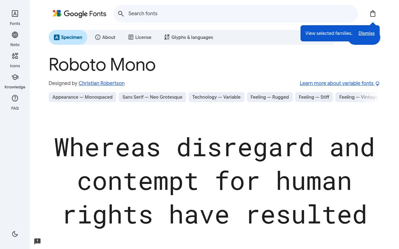
const free = true; // => ok
ABCDEFGHIJKLM abcdefghijklm 0123456789
As Roboto’s monospaced companion, Roboto Mono brings a neutral, modern rhythm to code samples and Material-style dashboards. It can sit beside proportional Roboto navigation and prose without making the technical panels look unrelated. Light readouts, regular code blocks, and bold status values all fit within its listed weight span.
Credited to Christian Robertson, Roboto Mono comes free from Google Fonts in 14 styles spanning weights 100–700, with matching italics. Roboto Mono’s axes cover Weight 100–700. Included subsets in Roboto Mono span Cyrillic, extended Cyrillic, Greek, Latin, extended Latin, and Vietnamese.
Roboto Mono’s Open Font License permits commercial android and material uis projects.Like every free font in this list, it ships under the SIL Open Font License, so it is free for personal and commercial projects alike.
- Style
- Neutral mono
- Best for
- Android and Material UIs
- License
- SIL Open Font License
- Price
- 100% free
Space Mono
Retro-future mono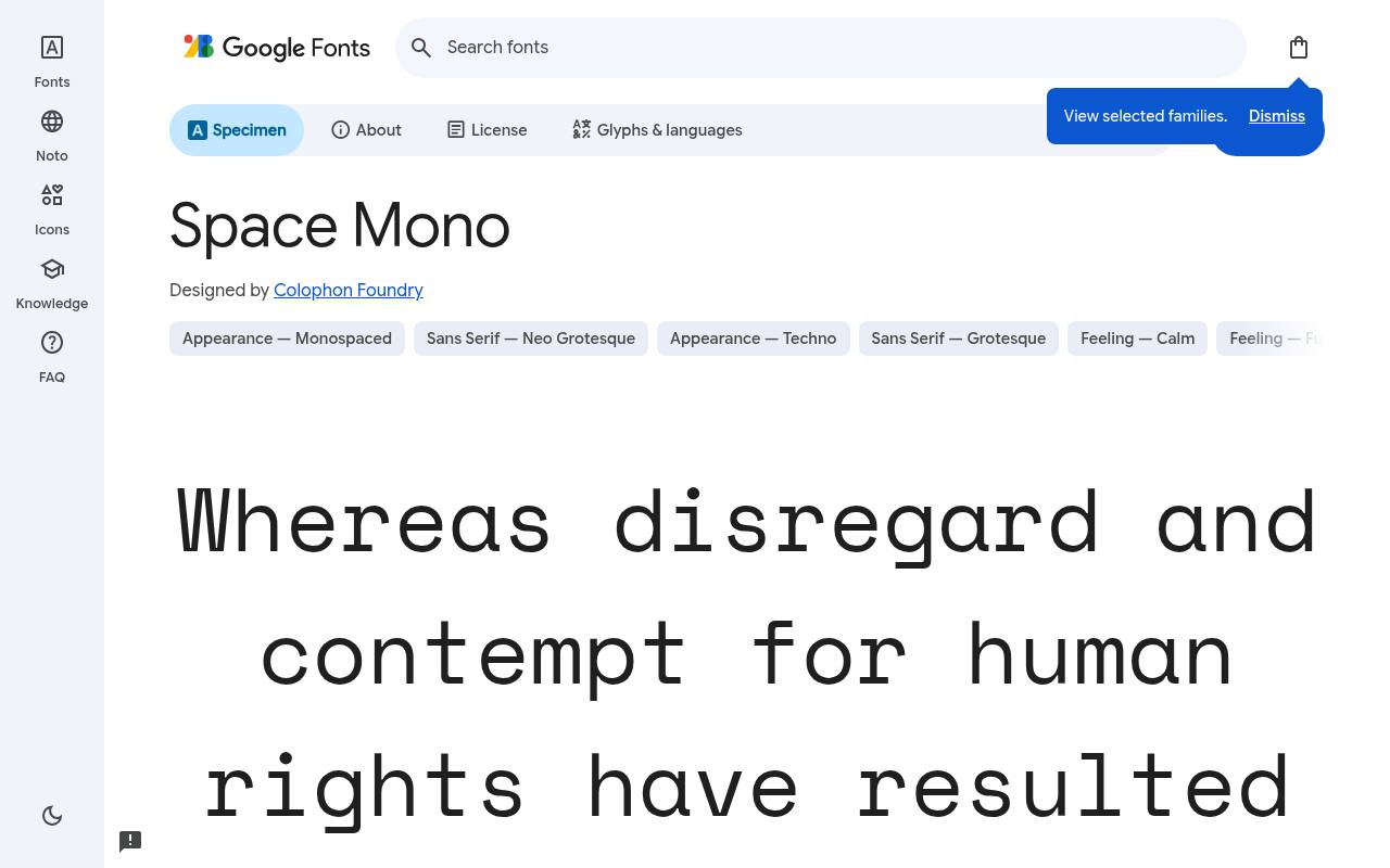
const free = true; // => ok
ABCDEFGHIJKLM abcdefghijklm 0123456789
Retro-futuristic geometry makes Space Mono feel more like an editorial voice than an invisible code-editor default. A technology magazine can use it for a headline, issue number, or short pull quote, where its unusual shapes become part of the composition. Regular and bold each have matching italics for controlled contrast.
Google Fonts lists Colophon Foundry as Space Mono’s designer credits and offers 4 styles spanning weights 400–700, with matching italics in the free download. Space Mono’s listed subsets cover Latin, extended Latin, and Vietnamese. Space Mono’s Open Font License permits commercial editorial tech sites projects.
- Style
- Retro-future mono
- Best for
- Editorial tech sites
- License
- SIL Open Font License
- Price
- 100% free
Inconsolata
Humanist mono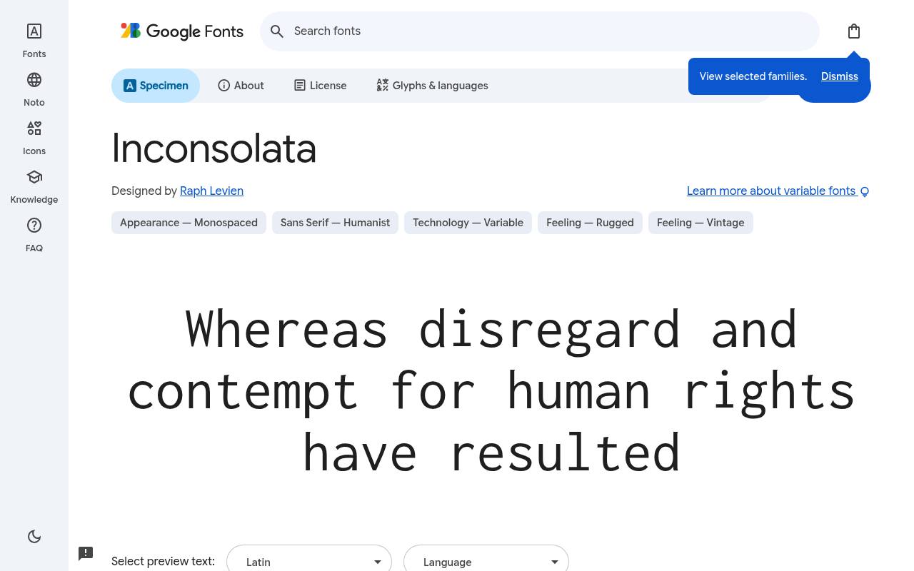
const free = true; // => ok
ABCDEFGHIJKLM abcdefghijklm 0123456789
Consolas-inspired clarity gives Inconsolata a humanist alternative to rigidly mechanical programming faces. Long code listings benefit from its clean forms, while the unusually large width range allows distinctly compressed or expanded settings. That width control is part of the supplied variable design, not a request to distort a static font.
Raph Levien designed Inconsolata; its free Google Fonts download includes 8 styles spanning weights 200–900, without italics. Inconsolata’s axes cover Width 50–200 and Weight 200–900. Script coverage for Inconsolata includes Latin, extended Latin, and Vietnamese. Inconsolata’s Open Font License permits commercial long coding sessions projects.
- Style
- Humanist mono
- Best for
- Long coding sessions
- License
- SIL Open Font License
- Price
- 100% free
Ubuntu Mono
Rounded mono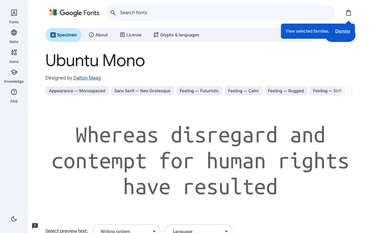
const free = true; // => ok
ABCDEFGHIJKLM abcdefghijklm 0123456789
Friendly rounded shapes connect Ubuntu Mono to the wider Ubuntu visual language. Linux terminal windows, shell tutorials, and command-line documentation can use its fixed-width rhythm without the severe tone of an industrial mono. Its compact four-style selection covers normal text, bold commands, italic notes, and bold italic emphasis without variable controls.
The free Google Fonts selection for Ubuntu Mono, by Dalton Maag, contains 4 styles spanning weights 400–700, with matching italics. The Ubuntu Mono download supports Cyrillic, extended Cyrillic, Greek, extended Greek, Latin, and extended Latin. Ubuntu Mono’s Open Font License permits commercial linux terminals projects.
- Style
- Rounded mono
- Best for
- Linux terminals
- License
- SIL Open Font License
- Price
- 100% free
Red Hat Mono
Open-source mono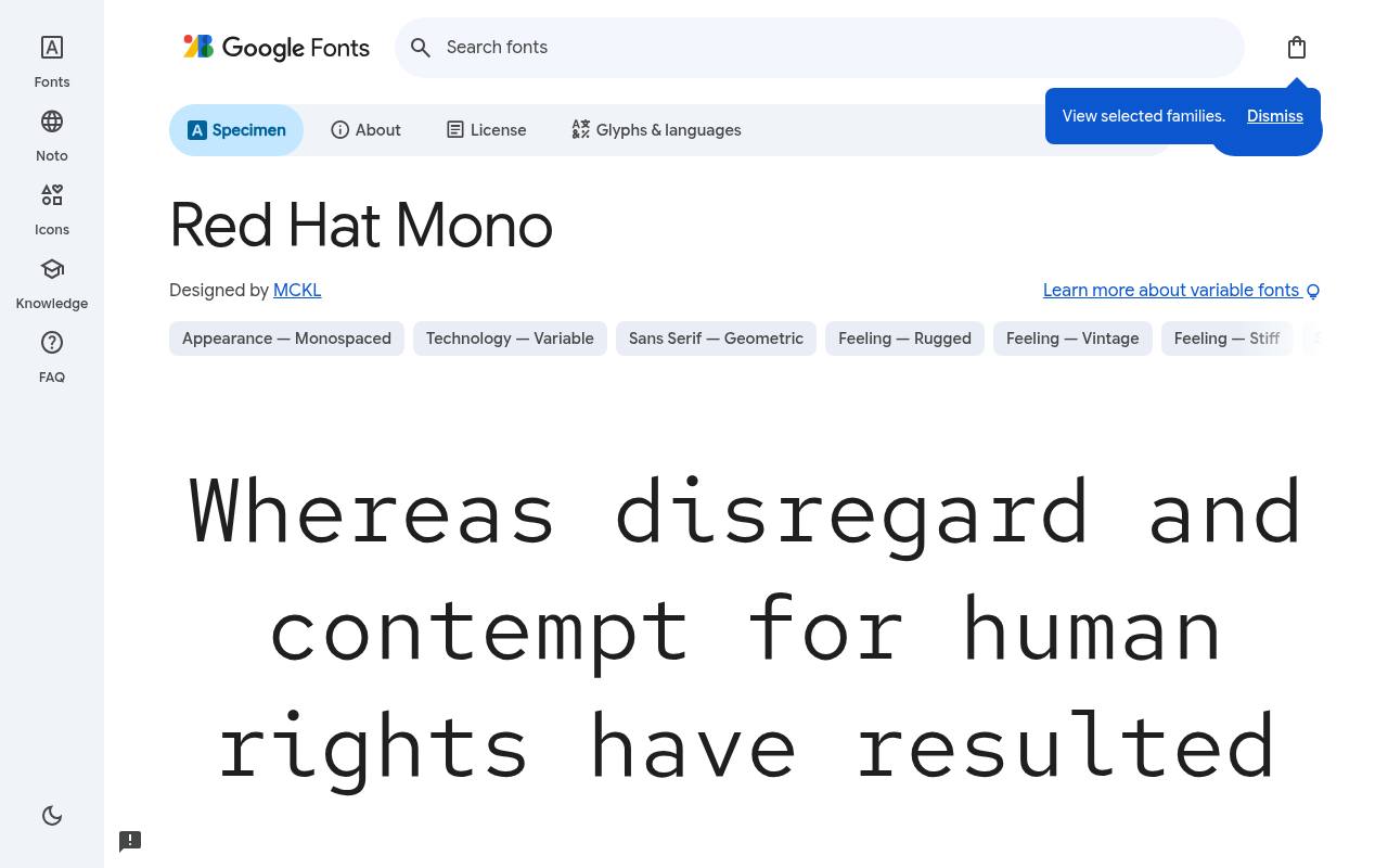
const free = true; // => ok
ABCDEFGHIJKLM abcdefghijklm 0123456789
Designed alongside Red Hat Display and Red Hat Text, Red Hat Mono keeps code samples visually connected to a larger documentation system. Its crisp, open forms suit embedded snippets, while prose and page headings can use its proportional relatives. The downloadable weight progression includes matching italics for differentiated technical commentary.
For Red Hat Mono, Google Fonts supplies 10 styles spanning weights 300–700, with matching italics free, crediting MCKL. Red Hat Mono’s axes cover Weight 300–700. Included subsets in Red Hat Mono span Latin and extended Latin. Red Hat Mono’s Open Font License permits commercial clean code samples projects.
- Style
- Open-source mono
- Best for
- Clean code samples
- License
- SIL Open Font License
- Price
- 100% free
Martian Mono
Wide mono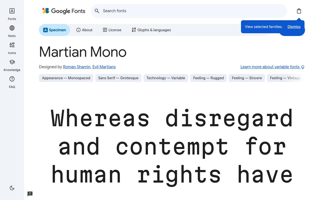
const free = true; // => ok
ABCDEFGHIJKLM abcdefghijklm 0123456789
Broad proportions and an engineered rhythm give Martian Mono a slightly science-fiction character in data-heavy layouts. A dashboard or terminal-style status screen can use the width control to balance roomy numbers against tighter columns. The download’s adjustable dimensions make that choice more nuanced than a single wide monospace cut.
Credited to Roman Shamin and Evil Martians, Martian Mono comes free from Google Fonts in 8 styles spanning weights 100–800, without italics. Martian Mono’s axes cover Width 75–112.5 and Weight 100–800. Martian Mono’s listed subsets cover Cyrillic, extended Cyrillic, Latin, and extended Latin. Martian Mono’s Open Font License permits commercial dashboards and data projects.
- Style
- Wide mono
- Best for
- Dashboards and data
- License
- SIL Open Font License
- Price
- 100% free
Geist Mono
Modern mono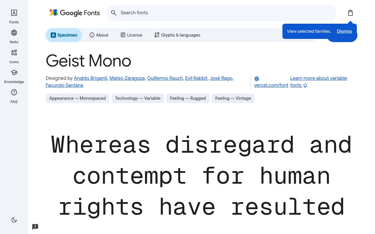
const free = true; // => ok
ABCDEFGHIJKLM abcdefghijklm 0123456789
Vercel’s Geist Mono has a sleek, precise texture suited to developer interfaces rather than nostalgic typewriter effects. Build logs, technical readouts, and command panels can share its controlled rhythm, with italics and a wide weight span supplying emphasis.
Google Fonts credits a six-person design team rather than Vercel alone. Google Fonts lists Andrés Briganti, Mateo Zaragoza, Guillermo Rauch, Evil Rabbit, José Rago, and Facundo Santana as Geist Mono’s designer credits and offers 18 styles spanning weights 100–900, with matching italics in the free download.
Geist Mono’s axes cover Weight 100–900. Script coverage for Geist Mono includes Cyrillic, extended Cyrillic, Latin, extended Latin, additional symbols (symbols2), and Vietnamese. Geist Mono’s Open Font License permits commercial modern developer tools projects.
- Style
- Modern mono
- Best for
- Modern developer tools
- License
- SIL Open Font License
- Price
- 100% free
Choosing a free coding font
Test with your real code: check zero versus capital O, one versus lowercase l, and how brackets and punctuation read at your usual size. Turn ligatures on and off to see which you prefer.
Use the same free monospace font on your blog's code blocks as in your editor, and your screenshots and live code will match perfectly.
What makes a great free coding font
The best programming fonts share a few traits: clearly distinguishable zeros (often slashed or dotted), distinct 1/l/I shapes, generous punctuation for brackets and semicolons, and a comfortable x-height. Ligatures are a matter of taste — Fira Code popularised them, but many developers prefer plain characters.
Line height matters as much as the font: 1.5 to 1.7 makes code much easier to scan. Most of these free monospace fonts also include bold and italic, which helps syntax highlighting themes.
Installing free coding fonts in your editor
Download the free font from Google Fonts, install it on your system, then set it in your editor.
In VS Code, open Settings, search 'font family' and add the name first in the list; set 'font ligatures' to true for Fira Code. In terminals like iTerm2 or Windows Terminal, choose the font in the profile settings.
On your developer blog, load the same free monospace font for code blocks so readers see exactly what you see.
Frequently asked questions
What is the best free coding font? Fira Code and JetBrains Mono are the most popular; Source Code Pro and Inconsolata are classic choices.
Do monospace fonts help with coding? Yes — equal character widths keep code aligned and make indentation and columns easy to scan.
Build a realistic editor trial
A useful trial goes beyond opening a favourite source file. Assemble a small working set containing nested conditions, a configuration file, a long error message and some comments. Include the language you actually write rather than a polished demonstration snippet.
Compare Source Code Pro, Inconsolata and Geist Mono with the same editor theme and window width. These free coding fonts may create different line breaks and visual densities, so judge how easily you navigate a task rather than how attractive one isolated line appears.
Keep a short record of what you notice during normal work. Perhaps one option makes comments easier to skim, while another leaves more space for a split editor. The best monospace fonts for your workflow are the ones that remain unobtrusive during editing, reviewing and debugging.
Resist changing your theme, zoom and font simultaneously, because you will struggle to identify which change helped. Give each free option a comparable task, then keep the setting that makes the work feel clearest without forcing you to concentrate on the letters.
Make terminal output easier to investigate
Your terminal asks different things from a font than your editor does. You may need to follow wrapped file paths, scan repeated timestamps or spot a failed command among many successful messages. Try Ubuntu Mono and Red Hat Mono using output from a real project.
Include accented names and any symbols your tools normally produce. A free monospace font can organise ordinary text well, but missing symbols may still come from fallback fonts, so check those characters rather than assuming the whole display uses one family.
Test your terminal with the window both narrow and wide. A comfortable font in a full screen session can become awkward when logs share space with an editor or browser. Keep essential status messages understandable without relying on colour alone, and check your theme's contrast separately from the font choice.
If you capture terminal output for colleagues, enlarge it before recording rather than expecting viewers to zoom a compressed image. Free typography is most useful when other people can read the evidence as easily as you can.
Give developer documentation a clear reading order
Documentation usually alternates between explanation and code, so both need a clear place in the layout. Reserve your chosen font for code editor examples, commands and identifiers, then let ordinary prose provide visual relief.
IBM Plex Mono can give product examples a distinctive voice, while Roboto Mono offers a quieter treatment for interface documentation. Keep inline snippets close enough to the surrounding text size that they read naturally. A command should be recognisable without looking like a separate headline dropped into the middle of a sentence.
For longer examples, preserve indentation and provide horizontal scrolling when necessary rather than shrinking everything until it fits. Make sure users can select and copy real text; a screenshot alone is inconvenient for anyone trying your instructions.
If you use line numbers, check that copying a snippet does not insert those numbers into the command. These decisions make free coding fonts genuinely helpful in tutorials, because the typography supports successful use instead of simply decorating the page with a technical appearance.
Keep data displays steady and understandable
Martian Mono is worth testing when a dashboard includes short values, counters or compact status panels. Its wider appearance can give data a deliberate technical character, but it also needs room. Before choosing it, populate your layout with the longest realistic value, a negative result and a missing entry.
Do not judge a dashboard using only tidy sample numbers. Free font previews rarely show the awkward combination of labels and values that appears once a product is connected to real information.
Use alignment to explain relationships rather than treating every item as a terminal readout. Right aligned numeric columns can help comparisons, while descriptive labels usually need their own breathing room. Space Mono may suit a small editorial data feature, but you should separately assess whether it feels comfortable across a dense working screen.
When looking for programming fonts free of purchase costs, remember that your main investment is evaluation time. Choose a smaller, purposeful set of text roles rather than assigning a different technical face to every panel.
Load only the web typography you need
For a documentation website, start by deciding which pages actually contain code. If a free coding font appears only in tutorials, loading it throughout unrelated marketing pages may add an unnecessary download. Use the official embedding guidance or an appropriate self hosted setup, and request only the styles your design uses.
Check the actual files offered by the source rather than assuming every family has the same packaging. A simpler font setup is easier to maintain when the site grows or changes its content system.
Always specify a generic monospace fallback so examples remain usable before the chosen font arrives. Preview a page with slow loading or a blocked font request and look for clipped commands, shifted buttons and suddenly overflowing code blocks.
Allow readers to zoom without losing access to copy controls or explanations. Free fonts do not remove the need for performance checks; they simply let you spend your budget elsewhere. Reliable fallback behaviour often matters more to a reader following instructions than a perfect first impression of your preferred letterforms.
Record font decisions for your team
When a team chooses a font, write down the exact family name, its source and the text roles it serves. Include whether screenshots should show ligatures and whether documentation uses the same setting.
This is especially helpful if different colleagues work on different operating systems, where installed family names and rendering can vary. Fira Code can remain an individual editor preference while the public documentation follows a separate shared standard. You do not need to make every personal workspace identical to achieve consistent published material.
Keep the licence information supplied with your free download alongside the relevant project assets, particularly if you distribute font files with a website or application. Open licences are permissions with conditions, not a reason to discard the accompanying documentation.
Check the source instructions before modifying or redistributing files, and avoid promising clients exclusive ownership of the underlying font. A short handover note covering the download source, installed family and intended use makes your typography easier to reproduce long after the original designer has moved on.