Every October, designers hunt for free Halloween fonts — and every October, they find the same tired, poorly licensed downloads. These ten free horror fonts are a better bet: they are well-crafted, hosted on Google Fonts and free for commercial use, from party invitations to indie horror games.
This collection is spooky by design. You will find dripping blood, haunted-house woodcuts, heavy-metal gothic and cartoonish creepiness that is fun for kids. Each free scary font is shown with a live preview so you can judge its fright factor instantly.
Click a screenshot to visit the free font's page, or hit the download button to grab it free from the source.
Quick picks at a glance
| # | Resource | Style | Best for |
|---|---|---|---|
| 1 | Creepster | Dripping horror | Classic horror titles |
| 2 | Nosifer | Bloody drip | Gory, intense designs |
| 3 | Eater | Distressed display | Zombie and survival themes |
| 4 | Butcherman | Hacked display | Slasher posters |
| 5 | Metal Mania | Heavy metal | Band logos and rock gigs |
| 6 | Frijole | Rough woodcut | Spooky but playful |
| 7 | Griffy | Whimsical creepy | Fairy-tale horror |
| 8 | Henny Penny | Quirky gothic | Family Halloween |
| 9 | Jolly Lodger | Haunted condensed | Vintage horror posters |
| 10 | New Rocker | Blackletter rock | Gothic and tattoo designs |
Creepster
Dripping horror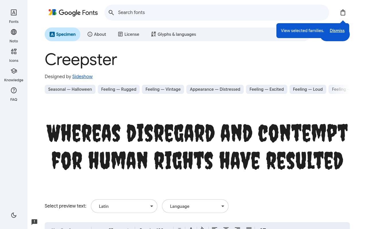
Boo! Free scary fonts
ABCDEFGHIJKLM abcdefghijklm 0123456789
Gooey, dripping forms connect Creepster directly to the monster-movie posters of the 1950s, making the horror reference cheerfully obvious. Google Fonts offers Creepster free with one upright style at weight 400 and no separate italic; the design credit goes to Sideshow. The Creepster character set covers Latin.
A haunted-house flyer could put the attraction's name above a simple address block, allowing the hanging shapes to establish the Halloween mood without spreading drips into every text element. Its comic-monster personality is closer to a playful fright than a restrained gothic identity.
- Style
- Dripping horror
- Best for
- Classic horror titles
- License
- SIL Open Font License
- Price
- 100% free
Nosifer
Bloody drip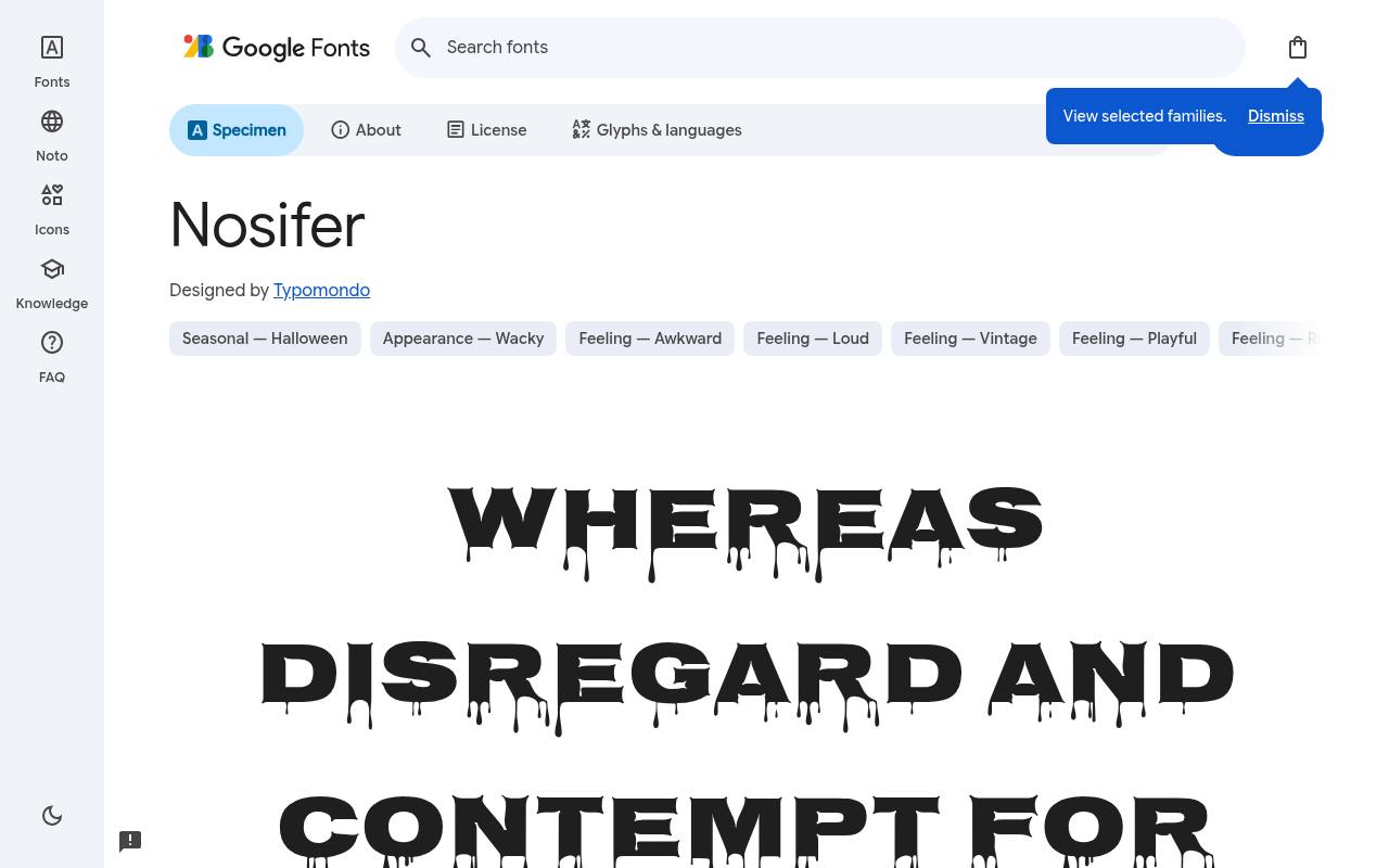
Boo! Free scary fonts
ABCDEFGHIJKLM abcdefghijklm 0123456789
Broad letters bleed below the baseline in Nosifer, creating a more graphic, slasher-style effect than lightly spooky storybook lettering. Typomondo designed the free Google Fonts release of Nosifer, which includes one upright style at weight 400 and no separate italic. Nosifer includes Latin and extended Latin coverage.
For a horror-game title screen, a short name above an open dark area gives the downward drips their own visual space, separate from menu choices and controller prompts. The wide silhouette reinforces the gore effect before viewers even register the hanging details.
- Style
- Bloody drip
- Best for
- Gory, intense designs
- License
- SIL Open Font License
- Price
- 100% free
Eater
Distressed display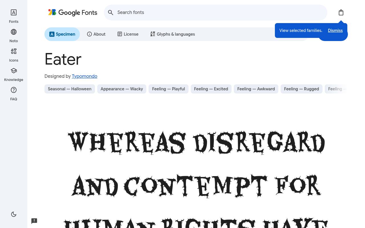
Boo! Free scary fonts
ABCDEFGHIJKLM abcdefghijklm 0123456789
Chewed, torn contours make Eater look as though its lettering has already survived something unpleasant. The free Eater download credits Typomondo and supplies one upright style at weight 400 and no separate italic. Character coverage in Eater extends to Latin and extended Latin.
A zombie escape-room poster could give the scenario title this damaged silhouette, while unbroken supporting typography carries booking information and rules, reinforcing the contrast between fictional destruction and useful visitor details. Its distressed outline supplies the damage directly, without requiring an extra grunge texture overlay.
- Style
- Distressed display
- Best for
- Zombie and survival themes
- License
- SIL Open Font License
- Price
- 100% free
Butcherman
Hacked display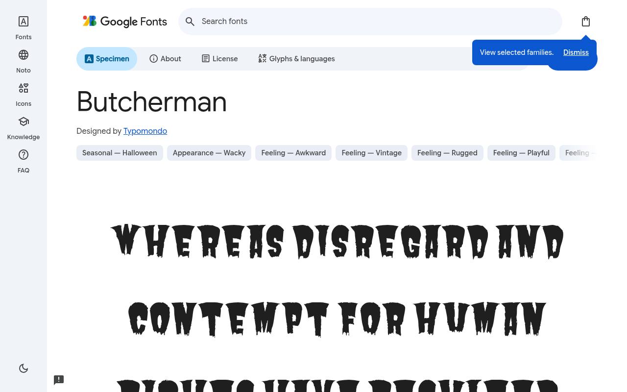
Boo! Free scary fonts
ABCDEFGHIJKLM abcdefghijklm 0123456789
Sharp cuts and broken gaps give Butcherman a hacked, cleaver-like silhouette rather than a smooth gothic form. Google Fonts offers Butcherman free with one upright style at weight 400 and no separate italic; the design credit goes to Typomondo.
The Butcherman character set covers Latin and extended Latin. A Halloween film-night poster could use it for the featured title against a plain background, with orderly credits and showtimes emphasizing how deliberately damaged the main lettering appears.
Those interrupted contours are built into the font rather than supplied as removable effects.Like every free font in this list, it ships under the SIL Open Font License, so it is free for personal and commercial projects alike.
- Style
- Hacked display
- Best for
- Slasher posters
- License
- SIL Open Font License
- Price
- 100% free
Metal Mania
Heavy metal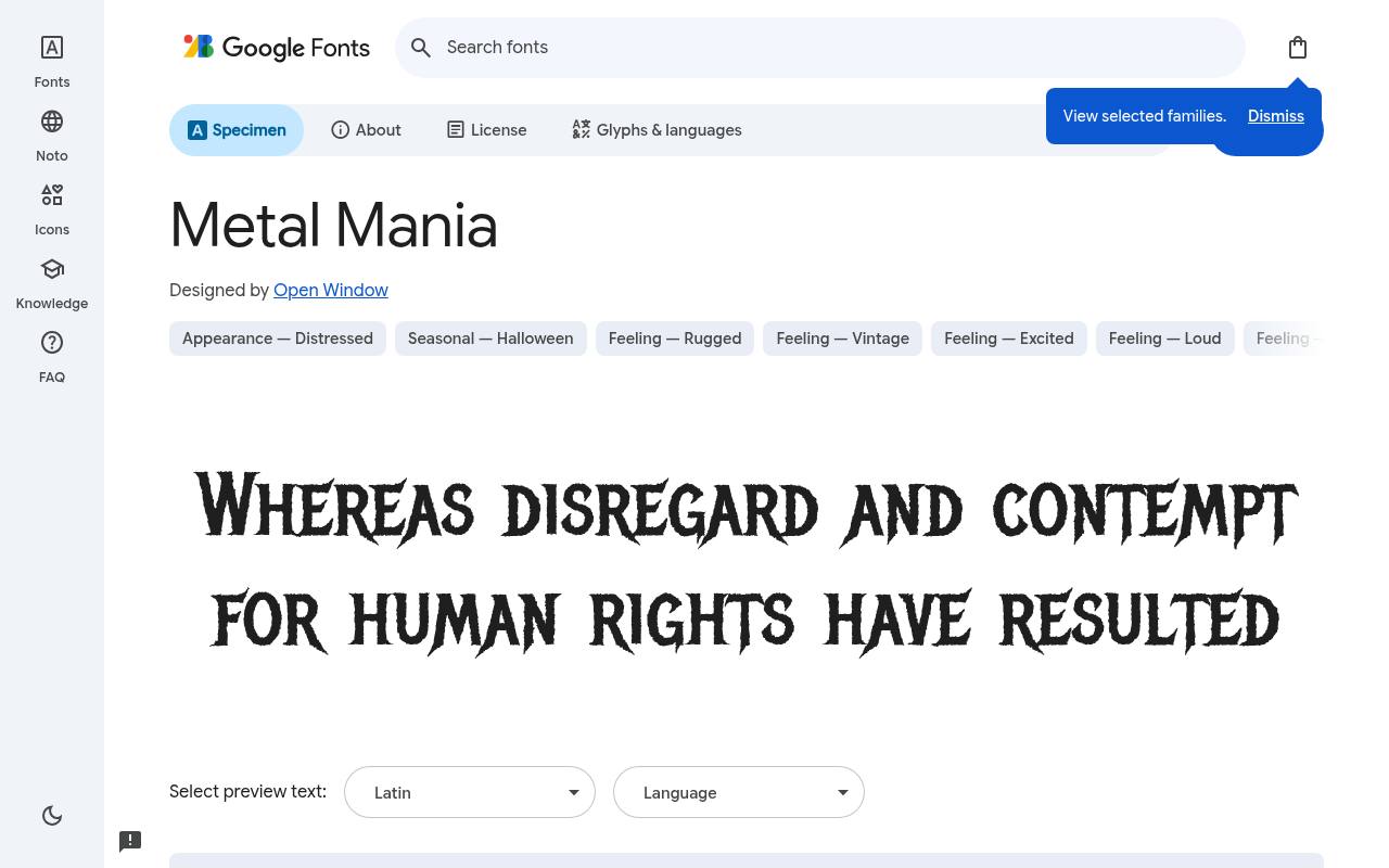
Boo! Free scary fonts
ABCDEFGHIJKLM abcdefghijklm 0123456789
Spiky, flared forms connect Metal Mania to 1980s heavy-metal album art, lending horror graphics a musical edge. Open Window designed the free Google Fonts release of Metal Mania, which includes one upright style at weight 400 and no separate italic. Metal Mania includes Latin and extended Latin coverage.
A Halloween rock-night flyer could put the event name in its aggressive silhouette above a quiet lineup, making the lettering feel like a band identity rather than dripping monster slime. The emphasis is on sharp, flared energy, not the torn texture of zombie lettering.
- Style
- Heavy metal
- Best for
- Band logos and rock gigs
- License
- SIL Open Font License
- Price
- 100% free
Frijole
Rough woodcut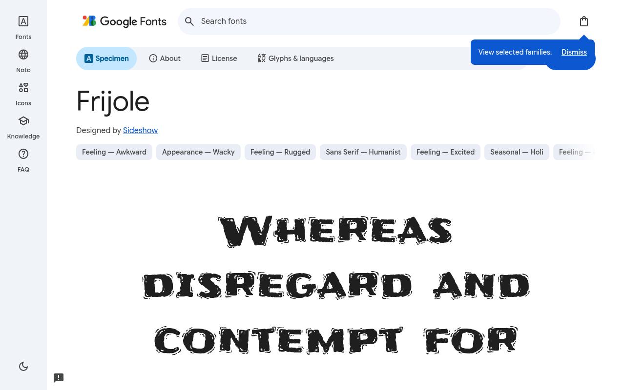
Boo! Free scary fonts
ABCDEFGHIJKLM abcdefghijklm 0123456789
Chunky, rough contours give Frijole the look of hand-cut display lettering, leaning toward playful rustic unease instead of realistic gore. The free Frijole download credits Sideshow and supplies one upright style at weight 400 and no separate italic. Character coverage in Frijole extends to Latin.
A children's fall-festival craft sheet could use it for a pumpkin-themed heading, with small instructions in an ordinary sans so the roughness stays concentrated in the seasonal artwork. Its irregular surface can suggest homemade decorations just as readily as a spooky forest sign.
- Style
- Rough woodcut
- Best for
- Spooky but playful
- License
- SIL Open Font License
- Price
- 100% free
Griffy
Whimsical creepy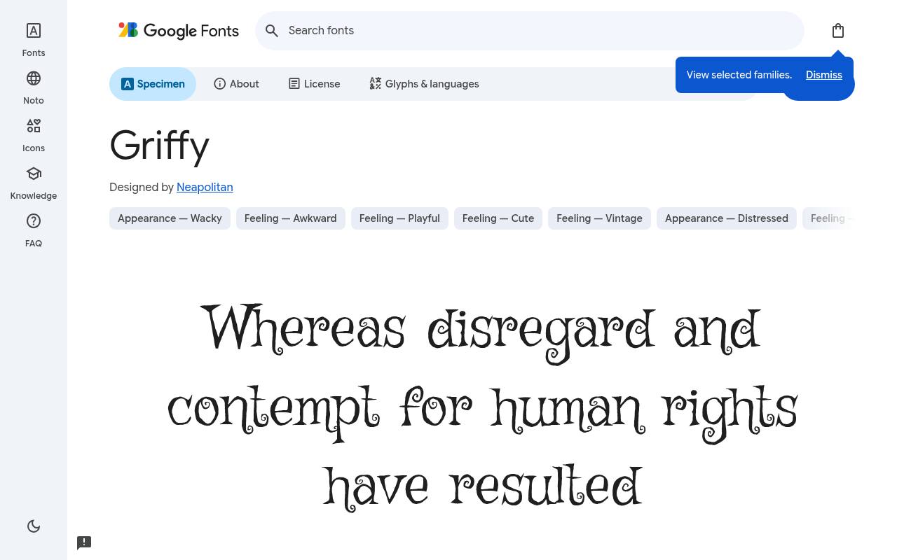
Boo! Free scary fonts
ABCDEFGHIJKLM abcdefghijklm 0123456789
Twisted, sprouting shapes make Griffy resemble lettering from an eccentric witch's storybook rather than a blood-soaked film poster. Google Fonts offers Griffy free with one upright style at weight 400 and no separate italic; the design credit goes to Neapolitan.
The Griffy character set covers Latin and extended Latin. For a fantasy apothecary prop, a short potion name can show off those peculiar forms, with a plainer description below keeping the imaginary ingredients recognizable. The irregular growth-like details give individual words an illustrated quality before any artwork is added.
- Style
- Whimsical creepy
- Best for
- Fairy-tale horror
- License
- SIL Open Font License
- Price
- 100% free
Henny Penny
Quirky gothic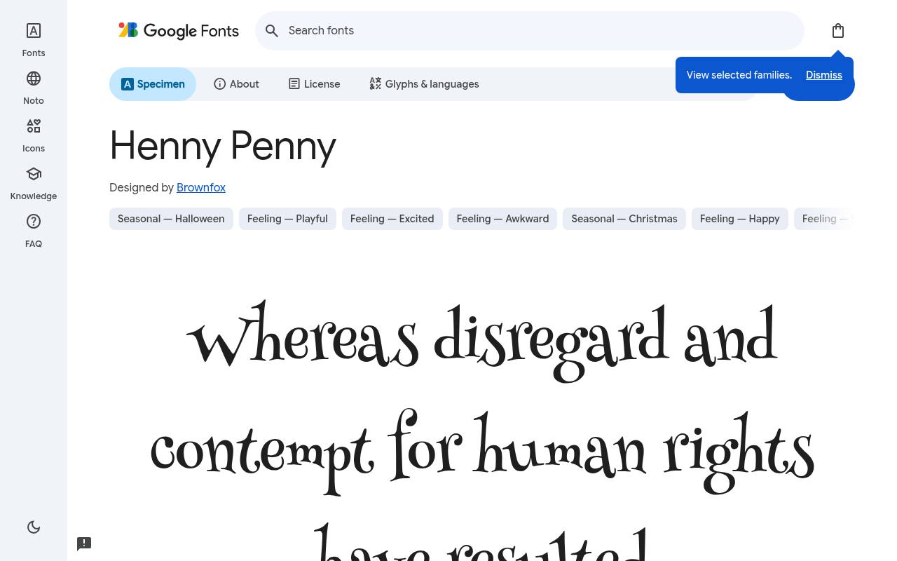
Boo! Free scary fonts
ABCDEFGHIJKLM abcdefghijklm 0123456789
Mismatched forms give Henny Penny a mischievous storybook rhythm, with more playful strangeness than outright menace. Brownfox designed the free Google Fonts release of Henny Penny, which includes one upright style at weight 400 and no separate italic. Henny Penny includes Latin coverage.
A trick-or-treat invitation could feature its uneven lettering in the party heading, then settle into orderly text for the time and address, keeping the spooky personality friendly for younger guests. Its uneven rhythm makes a brief greeting feel like part of an illustrated tale.
- Style
- Quirky gothic
- Best for
- Family Halloween
- License
- SIL Open Font License
- Price
- 100% free
Jolly Lodger
Haunted condensed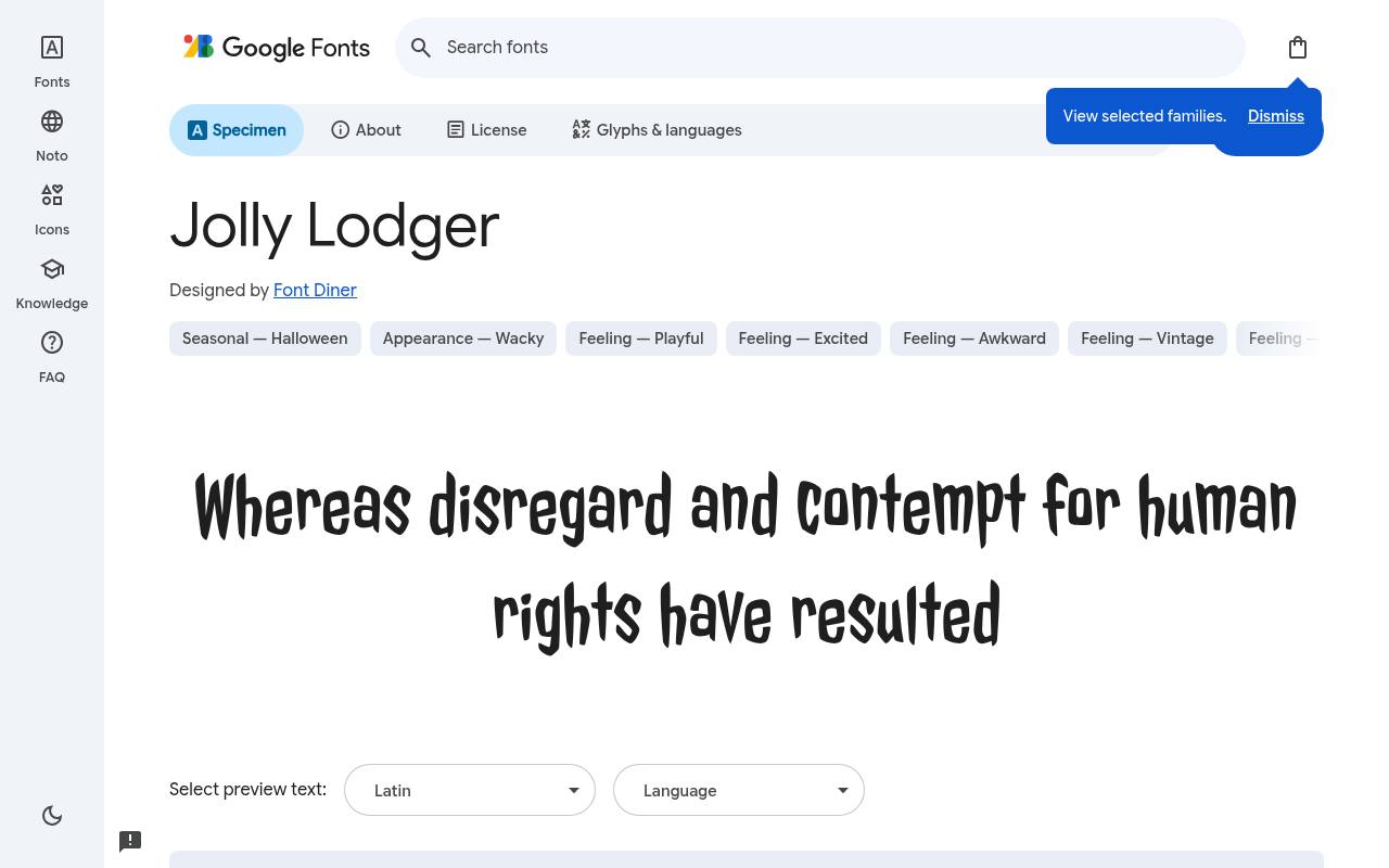
Boo! Free scary fonts
ABCDEFGHIJKLM abcdefghijklm 0123456789
Tall, narrow proportions and wobbly edges place Jolly Lodger near the hand-lettered world of old horror comics. The free Jolly Lodger download credits Font Diner and supplies one upright style at weight 400 and no separate italic. Character coverage in Jolly Lodger extends to Latin and extended Latin.
A retro creature-feature poster could stack a compact title beside an illustration, with enough separation between lines to preserve the nervous, hand-drawn silhouette instead of creating a solid block. The narrow construction distinguishes it from the sprawling, heavily dripping horror display alternatives.
- Style
- Haunted condensed
- Best for
- Vintage horror posters
- License
- SIL Open Font License
- Price
- 100% free
New Rocker
Blackletter rock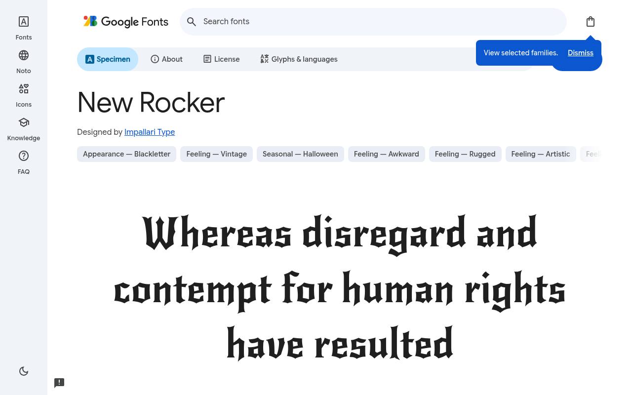
Boo! Free scary fonts
ABCDEFGHIJKLM abcdefghijklm 0123456789
Blackletter angles meet rock-and-roll attitude in New Rocker, making its gothic character feel more like a stage identity than a historical manuscript. Google Fonts offers New Rocker free with one upright style at weight 400 and no separate italic; the design credit goes to Impallari Type.
The New Rocker character set covers Latin and extended Latin. A dark-fantasy event could set its name in these pointed forms and use plain supporting text for booking, letting the main lettering establish the theatrical mood.
- Style
- Blackletter rock
- Best for
- Gothic and tattoo designs
- License
- SIL Open Font License
- Price
- 100% free
Designing with free horror fonts
Contrast is your friend: pale green, blood red or bone white type on near-black looks spooky without hurting readability. Add plenty of empty space — fear lives in what you cannot see.
Pair a dramatic free horror font headline with a simple serif or sans for the date, time and details. Your guests should be scared by the design, not by trying to find the address.
Matching the horror font to the mood
Not all scary is the same. For gory slasher energy, use Nosifer or Butcherman. For classic monster-movie fun, Creepster and Jolly Lodger feel like vintage posters. For gothic and dark-fantasy moods, New Rocker and Metal Mania bring blackletter and heavy-metal edges. For kids' Halloween, Frijole, Henny Penny and Griffy are spooky without being frightening.
Picking the right free horror font for the audience keeps your design fun instead of off-putting.
Halloween design ideas with free fonts
Try a Creepster headline in acid green on black for a party flyer, with event details in a clean sans. Use Griffy on potion-bottle labels with a parchment texture. Set a haunted-house menu in New Rocker on deep purple. For game titles, combine Nosifer with a subtle red glow and a grainy background.
Because these are free Halloween fonts with open licenses, you can print them on tickets, signage and party favours you sell, as well as use them online.
Frequently asked questions
What is the best free dripping font? Creepster is the most versatile dripping horror font; Nosifer is more extreme.
Can I use these free scary fonts in a horror game? Yes — the open license lets you embed them in commercial games.
Plan the information before the fright
Write a plain version of your invitation or event page before choosing free horror fonts. Include the event name, location, start time, booking instructions and any age guidance.
Rank those details by importance, then decide which single phrase deserves the theatrical treatment. This keeps the spooky styling attached to the atmosphere while the information people need remains easy to locate.
Print or preview that hierarchy without background artwork first. If you cannot tell where to look next, a haunted illustration will not solve the problem.
Leave a clear area for practical details, and avoid placing essential text across uneven scenery. You can make an invitation unsettling without making your guests work to understand what they are being invited to attend.
Compare shapes using your actual title
Creepster and Nosifer both suggest dripping lettering, but their footprints can produce very different compositions. Set your real title in each free font and compare the spaces below the letters, especially over a second line.
Rather than shrinking the entire title to accommodate a drip, try a different line break or give the heading a taller dedicated area.
For a longer name, compare Jolly Lodger with Eater and watch how much room the words occupy. The best scary fonts are not automatically the most distressed ones; they are the ones that communicate your particular title clearly.
If the text already contains unfamiliar place names or invented words, choose the treatment that makes those words easiest to recognise.
Build a connected set of event materials
An event rarely needs just one poster. You may also need a booking banner, wristband graphic, social image and printed ticket.
Set up those formats early so you can see whether your chosen free spooky fonts survive the smallest application. Keep a consistent title treatment, but allow supporting information to change position when a narrow format demands a different arrangement.
Try Henny Penny or Frijole in a simple activity-sheet heading, then review the result beside your main event artwork. Consistency can come from spacing, imagery and a shared colour palette rather than repeating every decorative effect.
When you search for halloween fonts free to use across a campaign, think about the complete set of materials rather than the largest poster alone.
Make dark interfaces usable under pressure
For an escape-room booking screen or horror game menu, reserve elaborate lettering for moments when the player has time to look. Controls, warning messages and purchase information need immediate recognition.
Griffy can add storybook character to a chapter heading without becoming the typeface for every instruction. Test the full experience in ordinary room lighting, not only on a bright design monitor.
Avoid making text recognition depend on flickering, red light or a moving background. Offer a stable presentation and respect reduced-motion preferences when animation is involved.
Free horror fonts can establish a strong mood even when they remain completely still. Keep important website text selectable and available to assistive technology rather than baking the whole interface into decorative images.
Take a safer route from download to delivery
If a creepy fonts download search brings you to an unfamiliar mirror, use the Google Fonts source linked in this article instead. Preview the words you need and download the chosen family from that page.
Extract the files and install the desktop fonts through your operating system, then restart your graphics application if necessary. Avoid installing unrelated software offered alongside a font.
For web use, follow the source’s embedding guidance or configure self-hosted webfonts with an appropriate fallback. Keep the supplied licence with your project assets and read it before distributing font files to collaborators.
These are free, open-licensed families, but retaining their documentation is still a sensible part of a professional handover, particularly when your design becomes a reusable template.
Review the final artwork like a first-time visitor
Can people read the title when the artwork is small? Reduce your finished graphic to the size of a social feed preview and ask someone unfamiliar with the event to read it aloud.
If Metal Mania or New Rocker loses clarity, adjust the wording, scale or surrounding space before adding more effects. A recognisable silhouette is useful only if the message remains understandable.
Will the printed result feel as clear as the screen version? Make an ordinary proof before committing to a larger run, checking thin gaps, dark areas and letters that sit close together.
Butcherman may need different surrounding space from a rounder design. Keep notes on successful settings so next time you can customise the free artwork without repeating the same trial and error.
Keep seasonal updates easy to manage
Build your event artwork so dates, locations and booking information remain editable independently of the decorative title. That makes the free design easier to reuse without accidentally carrying last year’s practical details into a new promotion.
Name your layers clearly and keep a simple checklist of everything that changes between events, including any links or codes printed within the artwork.
Before publishing an update, compare the printed ticket, booking page and social graphic side by side. Confirm that the same information appears everywhere and that none of the smaller formats has lost a crucial line.
This final content check is less theatrical than choosing spooky lettering, but it protects the visitor experience and helps your seasonal campaign feel reliable as well as entertaining.