Futuristic fonts instantly signal technology, innovation and speed. They are everywhere in esports logos, sci-fi film titles, AI startups and hardware brands. A good free futuristic font balances that space-age look with enough legibility to read at a glance.
These ten free sci-fi fonts range from wide, geometric display faces to crisp technical sans-serifs suitable for interfaces. All are free on Google Fonts and licensed for commercial use.
Browse the live previews, click any screenshot to view the source, and download the free font that fits your mission.
Quick picks at a glance
| # | Resource | Style | Best for |
|---|---|---|---|
| 1 | Orbitron | Geometric sci-fi | Space and sci-fi titles |
| 2 | Exo 2 | Technological sans | Tech brands and UIs |
| 3 | Michroma | Wide techno | Automotive and hardware |
| 4 | Oxanium | Angular display | Esports and gaming |
| 5 | Rajdhani | Squared condensed | Dashboards and data |
| 6 | Quantico | Military tech | Tactical and defence themes |
| 7 | Saira | Variable techno sans | Flexible tech branding |
| 8 | Chakra Petch | Angular techno | Cyberpunk designs |
| 9 | Aldrich | Rounded square | Clean tech logos |
| 10 | Tektur | Variable sci-fi | Futuristic headlines |
Orbitron
Geometric sci-fi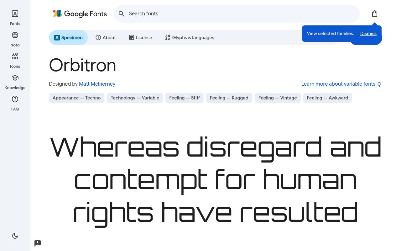
Launch sequence: free
ABCDEFGHIJKLM abcdefghijklm 0123456789
Wide geometric forms make Orbitron look at home on a fictional spacecraft control panel. A science-fiction title card or technology-event logo can use its squared construction as a central graphic motif, with heavier settings increasing impact. The weight range starts at regular, so this download emphasizes solid display lettering rather than hairline options.
Matt McInerney designed Orbitron; its free Google Fonts download includes 6 styles spanning weights 400–900, without italics. Orbitron’s axes cover Weight 400–900. The Orbitron download supports Latin. Orbitron’s Open Font License permits commercial space and sci-fi titles projects.
- Style
- Geometric sci-fi
- Best for
- Space and sci-fi titles
- License
- SIL Open Font License
- Price
- 100% free
Exo 2
Technological sans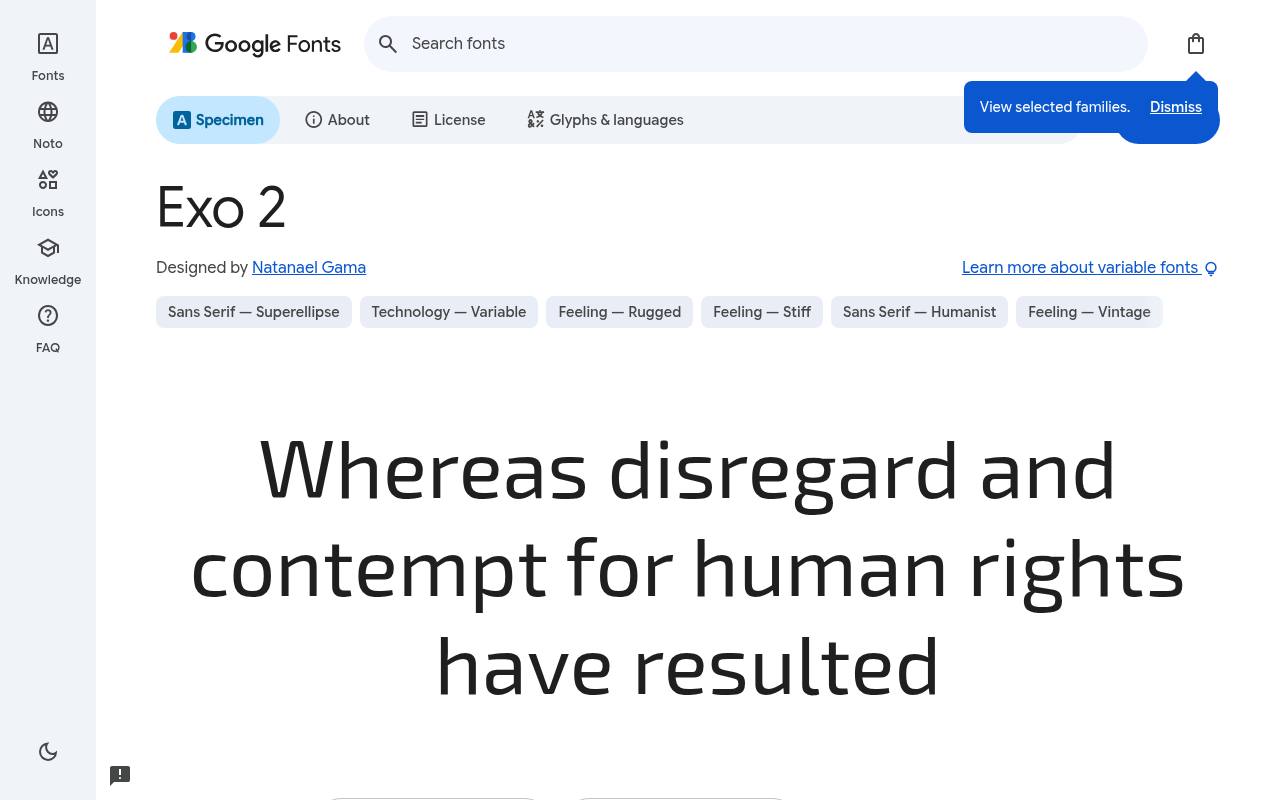
Launch sequence: free
ABCDEFGHIJKLM abcdefghijklm 0123456789
Technological geometry gives Exo 2 a futuristic tone without restricting it to isolated game titles. A software brand can carry the family from a bold product heading into navigation and short interface explanations, using italics for distinct supporting material.
Its broad range makes it a more complete system than a one-weight techno face. The free Google Fonts selection for Exo 2, by Natanael Gama, contains 18 styles spanning weights 100–900, with matching italics.
Exo 2’s axes cover Weight 100–900. Included subsets in Exo 2 span Cyrillic, extended Cyrillic, Latin, extended Latin, and Vietnamese. Exo 2’s Open Font License permits commercial tech brands and uis projects.
- Style
- Technological sans
- Best for
- Tech brands and UIs
- License
- SIL Open Font License
- Price
- 100% free
Michroma
Wide techno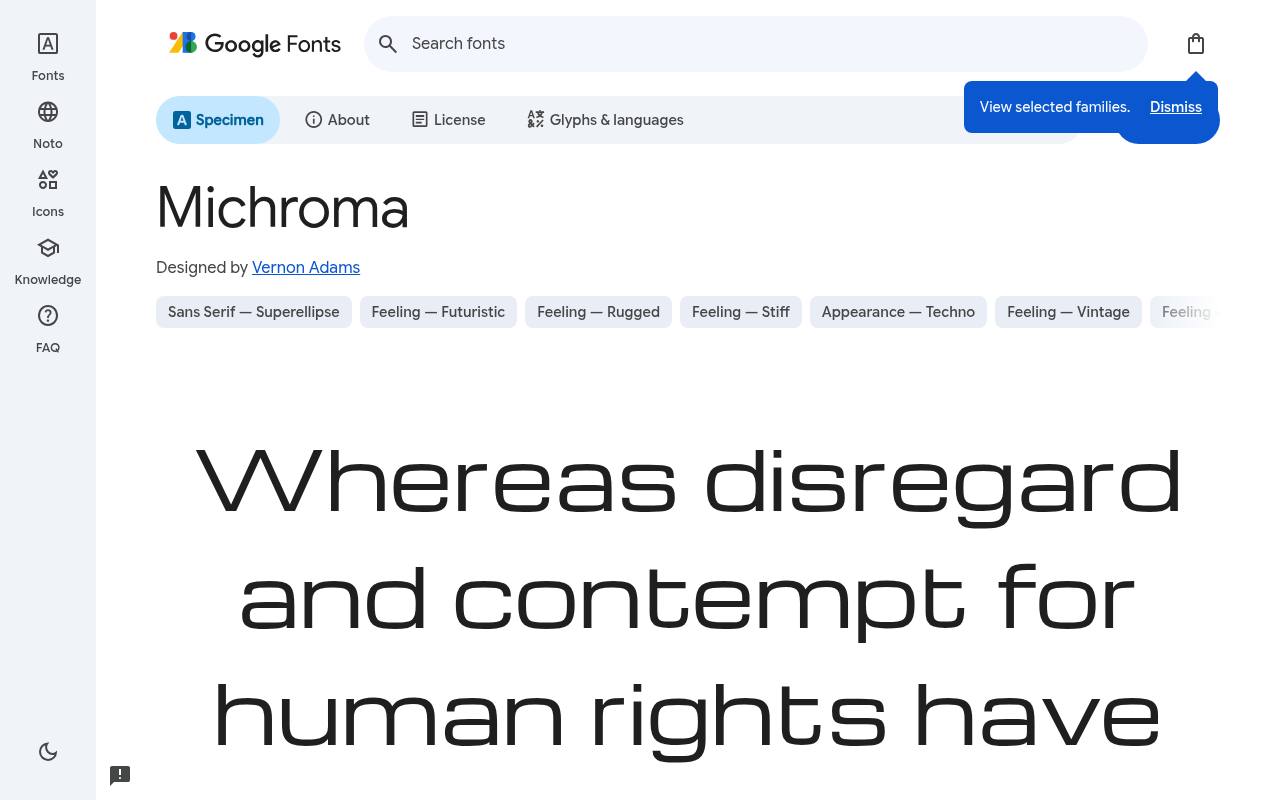
Launch sequence: free
ABCDEFGHIJKLM abcdefghijklm 0123456789
Microgramma-inspired proportions give Michroma its wide, squared appearance and association with midcentury science-fiction styling. Automotive badges, hardware product names, and short equipment headings can exploit that horizontal sweep. The download offers one regular design, so the engineered character comes from the letter shapes rather than a choice of condensed or heavy variants.
For Michroma, Google Fonts supplies 1 style at weight 400, without italics free, crediting Vernon Adams. Michroma’s listed subsets cover Latin and extended Latin. Michroma’s Open Font License permits commercial automotive and hardware projects.
- Style
- Wide techno
- Best for
- Automotive and hardware
- License
- SIL Open Font License
- Price
- 100% free
Oxanium
Angular display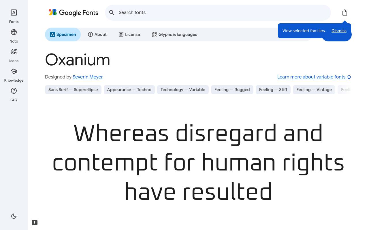
Launch sequence: free
ABCDEFGHIJKLM abcdefghijklm 0123456789
Angled cuts and squared curves make Oxanium feel quick and competitive. Esports overlays can use stronger settings for team names and lighter ones for supporting game information, creating hierarchy without abandoning the angular design language.
Its variable control adjusts weight only; there is no italic or width axis. Credited to Severin Meyer, Oxanium comes free from Google Fonts in 7 styles spanning weights 200–800, without italics. Oxanium’s axes cover Weight 200–800. Script coverage for Oxanium includes Latin and extended Latin.
Oxanium’s Open Font License permits commercial esports and gaming projects.Like every free font in this list, it ships under the SIL Open Font License, so it is free for personal and commercial projects alike.
- Style
- Angular display
- Best for
- Esports and gaming
- License
- SIL Open Font License
- Price
- 100% free
Rajdhani
Squared condensed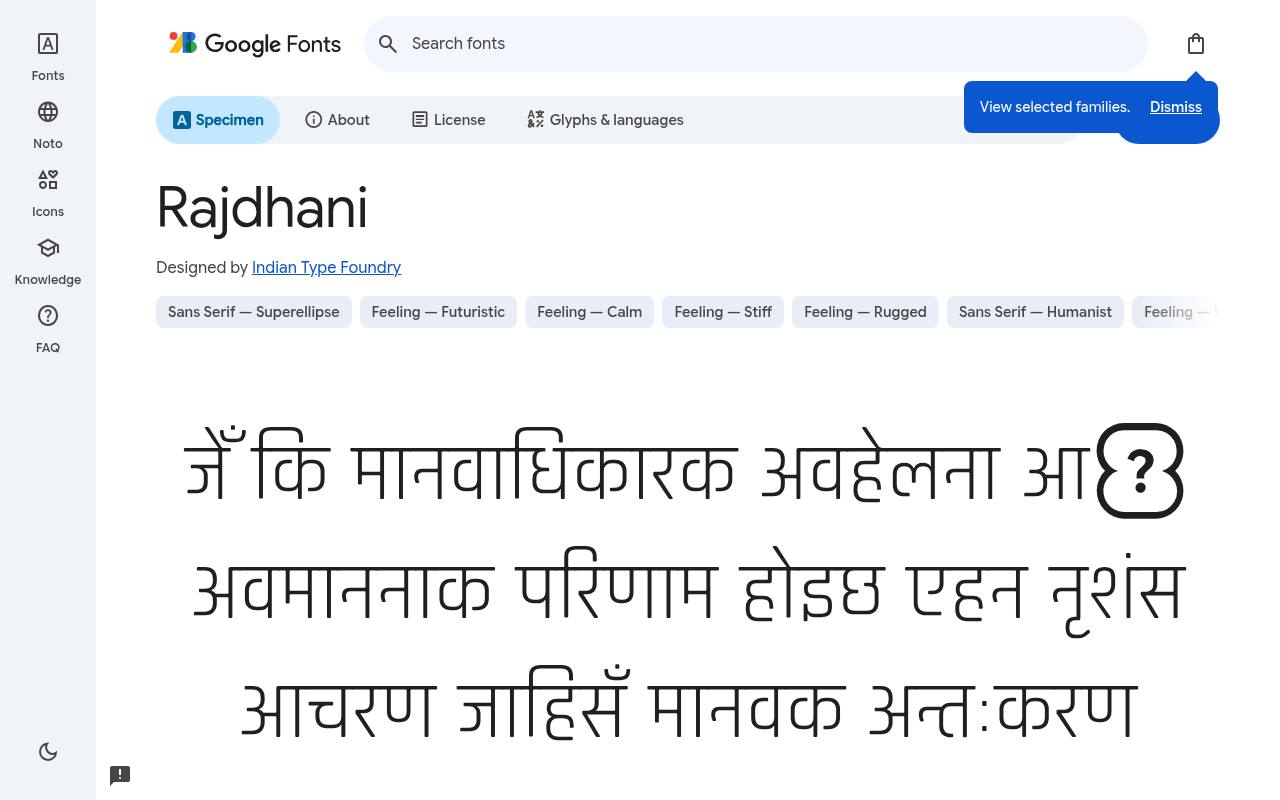
Launch sequence: free
ABCDEFGHIJKLM abcdefghijklm 0123456789
Squared, slightly condensed letters give Rajdhani a technical rhythm that suits dashboard labels and sports graphics. A bilingual data display can use its Devanagari and Latin coverage to keep related headings in one family. Five upright weights provide hierarchy, with no variable axes or italic counterparts.
Google Fonts lists Indian Type Foundry as Rajdhani’s designer credits and offers 5 styles spanning weights 300–700, without italics in the free download. The Rajdhani download supports Devanagari, Latin, and extended Latin. Rajdhani’s Open Font License permits commercial dashboards and data projects.
- Style
- Squared condensed
- Best for
- Dashboards and data
- License
- SIL Open Font License
- Price
- 100% free
Quantico
Military tech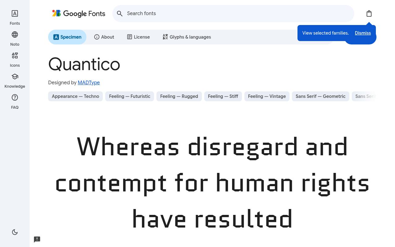
Launch sequence: free
ABCDEFGHIJKLM abcdefghijklm 0123456789
Military-vehicle lettering inspires Quantico’s angular technical structure. A tactical-game briefing or industrial campaign can use the regular and bold designs for mission headings and supporting labels, with matching italics adding a distinct slant. The military association is carried by the outlines themselves, without stencil gaps being necessary to establish the theme.
MADType designed Quantico; its free Google Fonts download includes 4 styles spanning weights 400–700, with matching italics. Included subsets in Quantico span Latin. Quantico’s Open Font License permits commercial tactical and defence themes projects.
- Style
- Military tech
- Best for
- Tactical and defence themes
- License
- SIL Open Font License
- Price
- 100% free
Saira
Variable techno sans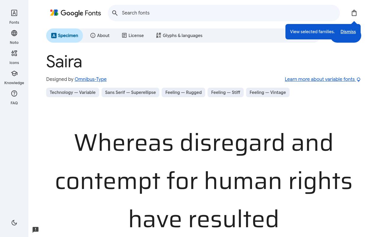
Launch sequence: free
ABCDEFGHIJKLM abcdefghijklm 0123456789
A genuinely broad width range makes Saira especially adaptable across a futuristic brand system. Condensed navigation, normal-width explanations, and expanded campaign titles can share its technological sans-serif character. Alongside weight variation, that width control is a practical distinction from techno families that offer only a handful of fixed upright cuts.
The free Google Fonts selection for Saira, by Omnibus-Type, contains 18 styles spanning weights 100–900, with matching italics. Saira’s axes cover Width 50–125 and Weight 100–900. Saira’s listed subsets cover Latin, extended Latin, and Vietnamese. Saira’s Open Font License permits commercial flexible tech branding projects.
- Style
- Variable techno sans
- Best for
- Flexible tech branding
- License
- SIL Open Font License
- Price
- 100% free
Chakra Petch
Angular techno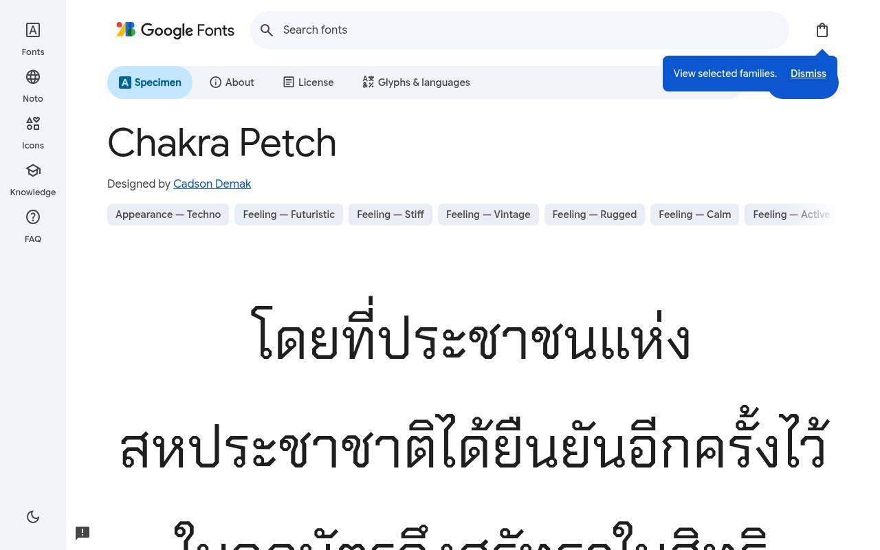
Launch sequence: free
ABCDEFGHIJKLM abcdefghijklm 0123456789
Chamfered corners give Chakra Petch a cyberpunk edge that remains visible without glow effects. A game interface or technology-merchandise design can use its angular headings alongside shorter supporting text, with italics available for a contrasting voice. Thai and Latin coverage make bilingual projects a natural application for this particular family.
For Chakra Petch, Google Fonts supplies 10 styles spanning weights 300–700, with matching italics free, crediting Cadson Demak. Script coverage for Chakra Petch includes Latin, extended Latin, Thai, and Vietnamese. Chakra Petch’s Open Font License permits commercial cyberpunk designs projects.
- Style
- Angular techno
- Best for
- Cyberpunk designs
- License
- SIL Open Font License
- Price
- 100% free
Aldrich
Rounded square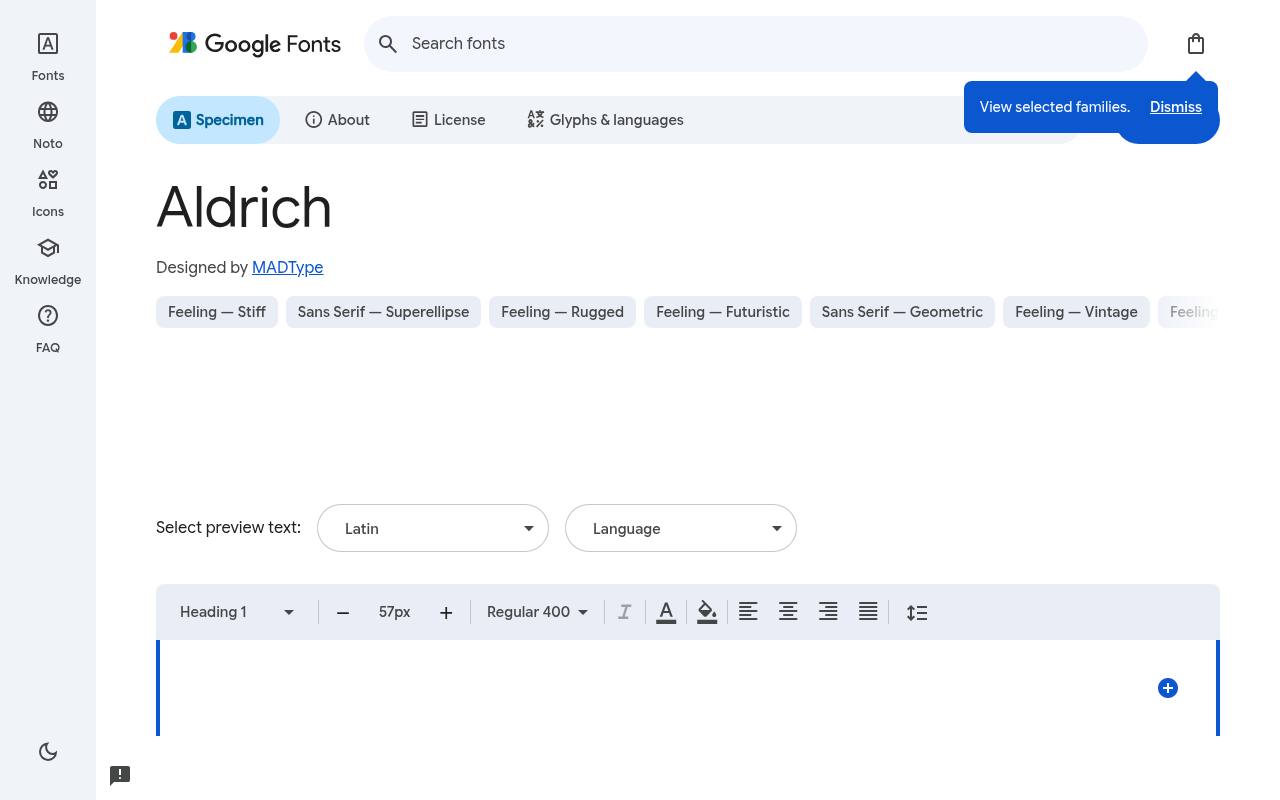
Launch sequence: free
ABCDEFGHIJKLM abcdefghijklm 0123456789
Gently rounded corners temper Aldrich’s squarish outlines, connecting early digital typography with a clean technology-brand voice. A hardware product name or compact software logo can emphasize that engineered shape without the aggressive angles of an esports face.
Its single regular cut favors deliberate wordmark spacing over a hierarchy built from multiple weights. Credited to MADType, Aldrich comes free from Google Fonts in 1 style at weight 400, without italics. The Aldrich download supports Latin. Aldrich’s Open Font License permits commercial clean tech logos projects.
- Style
- Rounded square
- Best for
- Clean tech logos
- License
- SIL Open Font License
- Price
- 100% free
Tektur
Variable sci-fi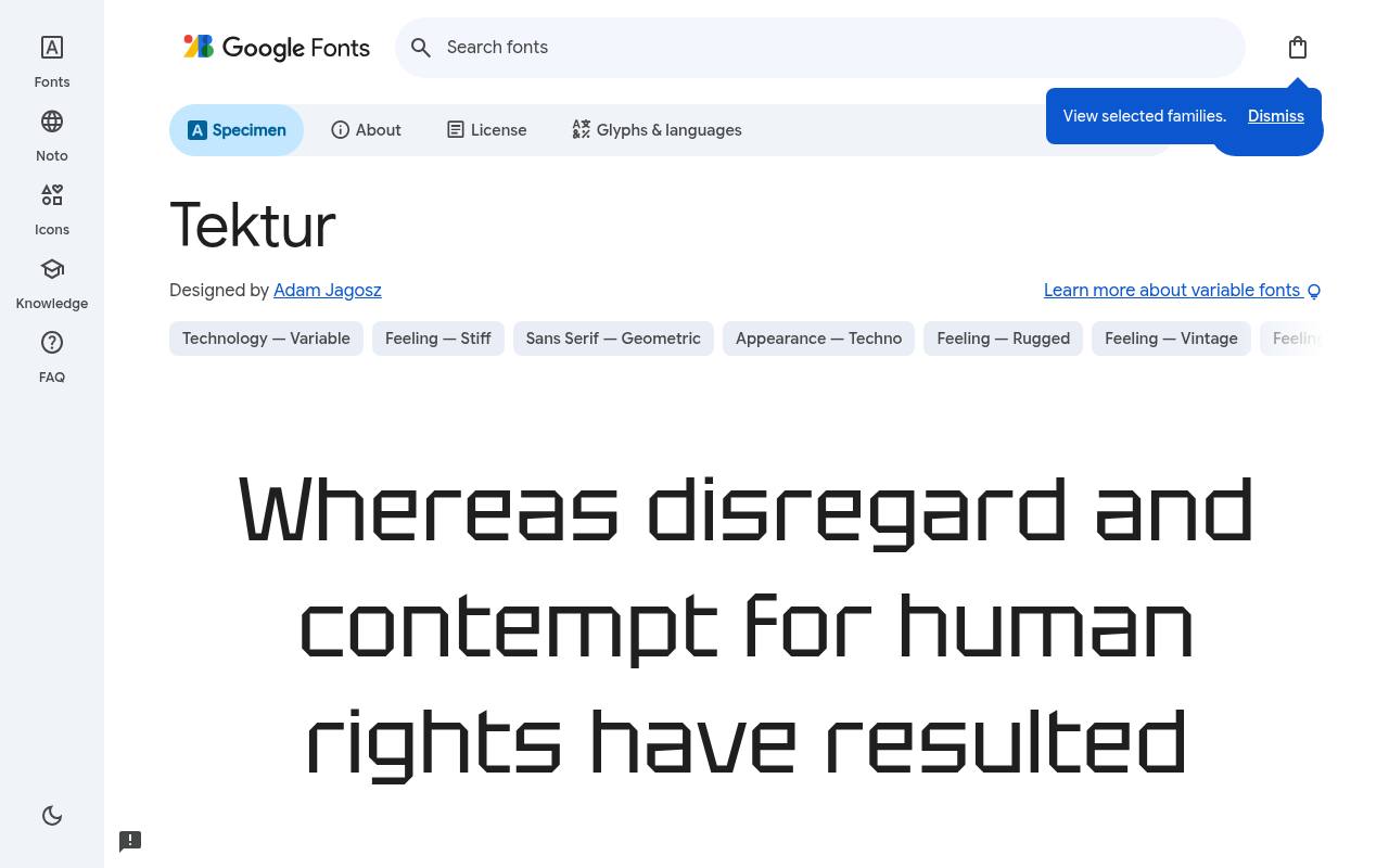
Launch sequence: free
ABCDEFGHIJKLM abcdefghijklm 0123456789
Sharp details give Tektur a forceful science-fiction presence, while its width control offers actual condensed-to-normal adjustment. A futuristic event poster can keep the main title compact and give a secondary line more room, changing weight independently. The listed weight span begins at regular rather than including thin or light variants.
Google Fonts lists Adam Jagosz as Tektur’s designer credits and offers 6 styles spanning weights 400–900, without italics in the free download. Tektur’s axes cover Width 75–100 and Weight 400–900. Included subsets in Tektur span Cyrillic, extended Cyrillic, Greek, Latin, extended Latin, and Vietnamese. Tektur’s Open Font License permits commercial futuristic headlines projects.
- Style
- Variable sci-fi
- Best for
- Futuristic headlines
- License
- SIL Open Font License
- Price
- 100% free
Designing with free futuristic fonts
Futuristic fonts look best with plenty of dark space, glowing accent colours and generous letter-spacing. Use wide display faces like Orbitron and Michroma for short titles and logos, and more readable faces like Exo 2 or Rajdhani for interface text.
Avoid stacking several futuristic fonts together — one strong sci-fi headline font plus a neutral sans keeps designs clean.
Where futuristic fonts shine
Esports and gaming brands, AI and robotics startups, automotive and EV companies, electronic music events and sci-fi book covers all benefit from a free tech font. They also work well for product launch pages that need to feel ahead of their time.
Every font in this list is free under the Open Font License, so you can use it in games, logos and commercial products.
Frequently asked questions
What is the best free sci-fi font? Orbitron is the most iconic; Exo 2 is the most versatile.
Can I use these free futuristic fonts in a video game? Yes, the Open Font License allows embedding in commercial games.
Define the kind of future your project imagines
Futuristic does not have to mean a single visual language. A scientific exhibition, a tactical game and a consumer device may all need tech fonts, yet each communicates a different relationship with technology. Start by describing your project in practical terms: precise, experimental, competitive, optimistic or restrained.
Then test a few choices against that description. Quantico might help explore a tactical direction, while Aldrich can support a cleaner product identity. Free futuristic fonts become easier to choose when you know what the imagined future is supposed to feel like.
Build your comparison around the actual product name and a short supporting sentence. A font that suits an energetic event title may be distracting on a device warranty screen or an account page. Do not let a dramatic specimen make those decisions for you.
If your research includes the phrase sci-fi fonts free, treat the search results as a starting collection rather than a style specification. The final choice should explain your project clearly, not merely prove that you can make a familiar word look more technological than it did before.
Prototype the busiest moment in a game
A game interface must work when the player is occupied, not just when a designer is studying a still image. Put Oxanium, Rajdhani or Chakra Petch into a representative gameplay frame containing objectives, resource values and a temporary notification.
View it at the intended output size rather than zooming into a design canvas. Your free gaming fonts need to survive movement, background detail and competing information. A title treatment that works on a loading screen may need a separate, quieter solution for urgent messages during play.
Check the least convenient situation: a long player name, an unexpectedly large score or a translated objective that takes another line. Provide enough contrast through the interface design itself rather than relying on the font's angular character to make text visible.
If you add motion, preserve a stable moment in which people can read important instructions. Decorative transitions should not obscure an action the player needs immediately. Record these tests alongside your visual guidelines so future updates do not gradually turn a clear interface into a collection of competing futuristic effects.
Let hardware information remain precise
For a hardware launch, the product name can carry more personality than the specifications surrounding it. Michroma may be worth exploring for a short device title, while Exo 2 can be tested across the practical supporting content.
Build a realistic panel with dimensions, connection labels, a model identifier and a short compatibility note. Your typography should help people distinguish the exciting promise of the product from the details they need before buying it. Free fonts are useful here because you can prototype both roles before finalising the visual system.
Pay particular attention to capital letters, numerals and punctuation within model codes. A beautiful heading is little help if customers cannot tell which accessory fits their equipment. Avoid compressing a wide title treatment to make a specification table fit; change the layout or assign a more suitable text role instead.
Test the result in product photographs and small retail thumbnails as well as on the full page. Technical clarity can make the identity feel more convincing than an extra layer of futuristic styling applied uniformly to every piece of information.
Use space themed lettering without losing the message
When you explore space fonts, separate atmosphere from information. Orbitron can provide a recognisable science fiction mood for a short exhibition title, but your visitor still needs readable opening hours, directions and ticket instructions.
Set these pieces together early so the visual system works as a complete communication rather than a poster with practical details added later. You can create an imaginative setting through composition and imagery while keeping essential text straightforward. A clear hierarchy gives the expressive free lettering a stronger role because it is not competing with everything else.
Check how the layout works without its supporting illustration. If the heading becomes confusing once the background is removed, the lettering may be depending too heavily on context. Conversely, a busy astronomical image can reduce clarity even when the text is excellent on its own.
Test light and dark treatments against the real imagery and crop, then review the design at a distance. For signage, ask someone unfamiliar with the project to identify the destination quickly. Their hesitation can reveal a practical problem that repeated close inspection has made difficult for you to notice.
Build responsive layouts around the files you actually have
Before specifying a font throughout a website, inspect the styles and files available from the official source. Choose weights that correspond to real design needs, and verify any variable controls in the particular download you will use.
Saira and Tektur invite experimentation, but your implementation should be based on the capabilities of the chosen files rather than assumptions about a family name. Keep a record of the settings used in approved mockups so a developer can reproduce the intended appearance without guessing or visually approximating the result.
Wide futuristic headings need particular care on narrow screens. Allow sensible wrapping and review the longest expected title instead of reducing text indefinitely to maintain a single line. Include a generic fallback, check the page before the webfont loads and make sure important controls remain visible if the download fails.
Free futuristic fonts can give a website a distinctive first impression, but performance and resilience determine whether that impression lasts. Request only what you use and revisit the setup when campaigns change, rather than accumulating unused font files with every new landing page.
Prepare a practical asset and permissions handover
A finished technology identity often travels across websites, videos, game builds and presentation files. List where your chosen family appears and distinguish editable text from artwork that has been converted into shapes. Colleagues need to know whether they must install the free font to revise an asset or whether the lettering is already fixed in the exported artwork.
Include the official source and keep a visual reference for the intended spacing. This reduces the risk of a replacement font slipping into a launch asset simply because a file opens without an obvious warning.
Keep the supplied open licence documentation with the relevant resources and check its conditions before bundling or modifying font files. Using a font in finished artwork and redistributing the font itself are different activities, so avoid treating a general permission to use it as a complete answer to every packaging question.
If a supplier handles the implementation, ask them to preserve the necessary notices and source records. A straightforward handover lets you enjoy free typography across a growing project while making future maintenance less dependent on one person's memory or personal download folder.