
The best free condensed fonts make room for a strong headline without forcing you to shrink it into the background. Narrow letterforms can turn a long event name into a confident poster title, keep a campaign slogan on one line, or create a dramatic vertical rhythm.
The trick is choosing a family whose proportions suit the message, rather than treating condensed type as an emergency space-saving setting at the end of the layout process.
This selection focuses on Google Fonts families with naturally compact proportions, from approachable humanist sans serifs to especially narrow display options. Some offer many upright and italic cuts; others give you a simpler menu that makes decisions quicker.
The entries distinguish listed styles from variable axes, because a family with numerous static weights is not automatically a variable font. Pick the level of flexibility your actual poster system needs before downloading everything available.
Use these free narrow fonts for headlines, not as permission to crowd every part of a composition. A title can be tight while the surrounding margins remain generous and the venue details stay comfortably readable.
Start with the real wording, test the longest line, and compare the strongest candidates at the final size. That process usually reveals more than a sample alphabet, especially when punctuation, accents, sponsor names, or multiple languages enter the design.
Quick picks at a glance
| # | Resource | Style | Best for |
|---|---|---|---|
| 1 | Antonio | Tall condensed sans | Oversized poster titles with a lean vertical rhythm |
| 2 | Archivo Narrow | Condensed grotesque sans | Editorial posters balancing headlines and practical supporting text |
| 3 | Asap Condensed | Friendly condensed sans | Approachable campaigns needing compact titles and italic accents |
| 4 | Barlow Condensed | Condensed contemporary sans | Event identities with multiple levels of condensed type |
| 5 | Cabin Condensed | Humanist condensed sans | Warm headlines for food culture and local events |
| 6 | Encode Sans Condensed | Condensed sans | Clean campaigns requiring many upright headline weights |
| 7 | Fira Sans Condensed | Humanist condensed sans | Multiscript event posters with compact supporting information |
| 8 | Fira Sans Extra Condensed | Extra condensed sans | Very narrow columns and short high impact titles |
| 9 | IBM Plex Sans Condensed | Technical condensed sans | Structured exhibition posters and technology event identities |
| 10 | PT Sans Narrow | Narrow humanist sans | Straightforward bilingual posters with simple regular bold hierarchy |
Antonio
Tall condensed sans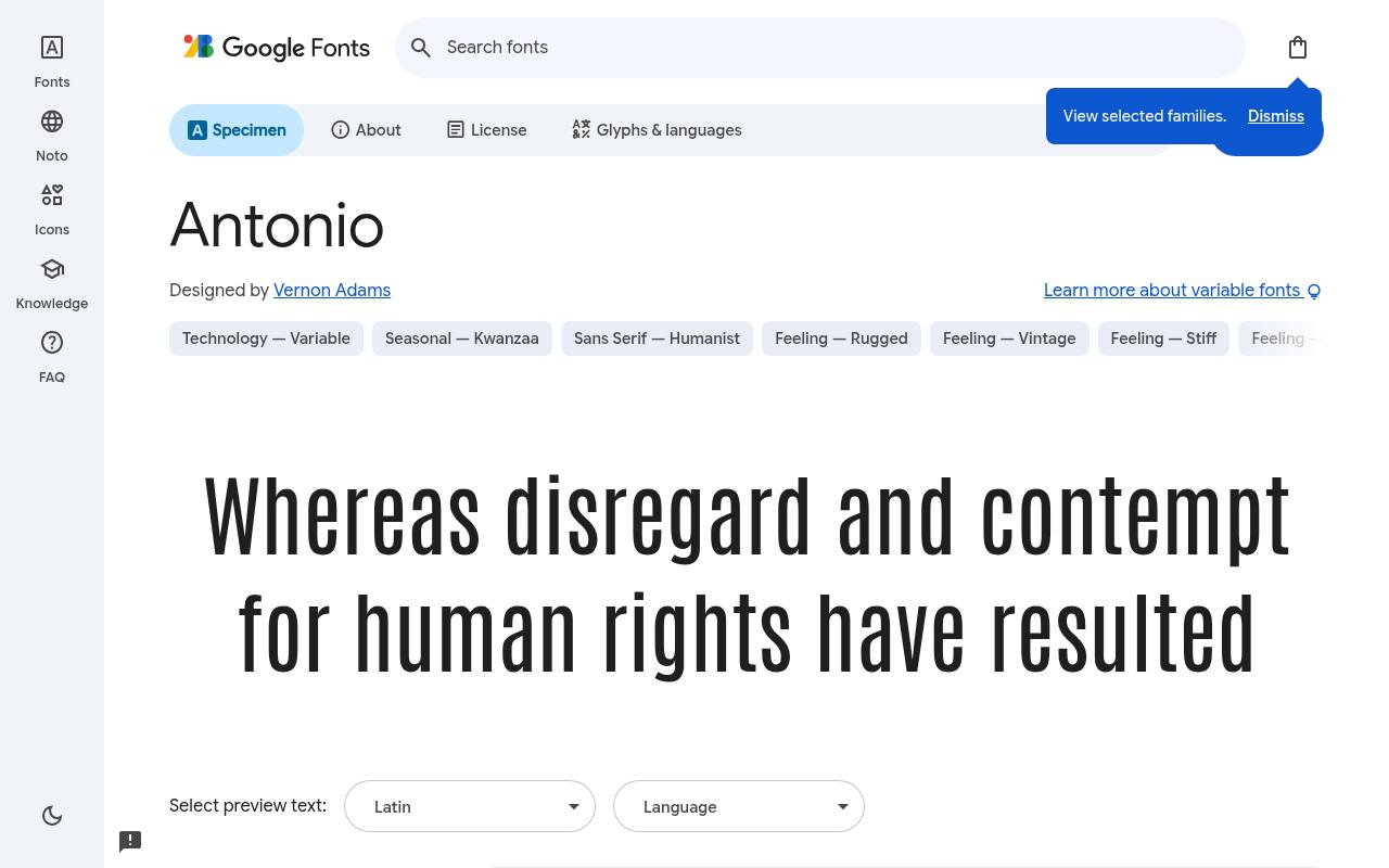
Narrow lines. Big ideas.
ABCDEFGHIJKLM abcdefghijklm 0123456789
Antonio gives short titles towering proportions without the width of a conventional display sans. Its spare, upright construction suits music posters, exhibition names, and oversized numbers beside small supporting text. Try generous line spacing when stacking several words, because narrow letters can tempt you into packing the whole composition too tightly.
The family is especially useful when the headline needs to feel imposing rather than playful. Designed by Vernon Adams, Antonio has 7 listed styles, with weights 100–700. Its variable wght axis spans 100–700. Character support in Antonio spans Latin and extended Latin.
- Style
- Tall condensed sans
- Best for
- Oversized poster titles with a lean vertical rhythm
- License
- SIL Open Font License
- Price
- 100% free
Archivo Narrow
Condensed grotesque sans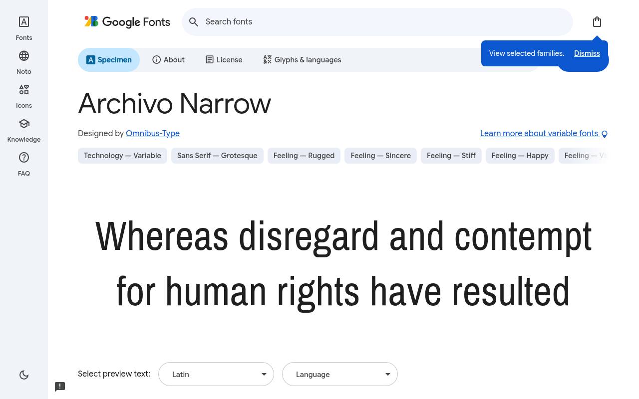
Narrow lines. Big ideas.
ABCDEFGHIJKLM abcdefghijklm 0123456789
Archivo Narrow is a practical choice for information rich posters: it can carry a title and still feel related to the smaller venue details beneath it. The upright and italic styles offer more hierarchy than a single display cut. Use selective italic emphasis for a date or quotation, rather than slanting every line.
Its relatively restrained character works well when photography or illustration should remain the main source of personality. Designed by Omnibus-Type, Archivo Narrow has 8 listed styles, with weights 400–700. Its variable wght axis spans 400–700. Character support in Archivo Narrow spans Latin, extended Latin and Vietnamese.
- Style
- Condensed grotesque sans
- Best for
- Editorial posters balancing headlines and practical supporting text
- License
- SIL Open Font License
- Price
- 100% free
Asap Condensed
Friendly condensed sans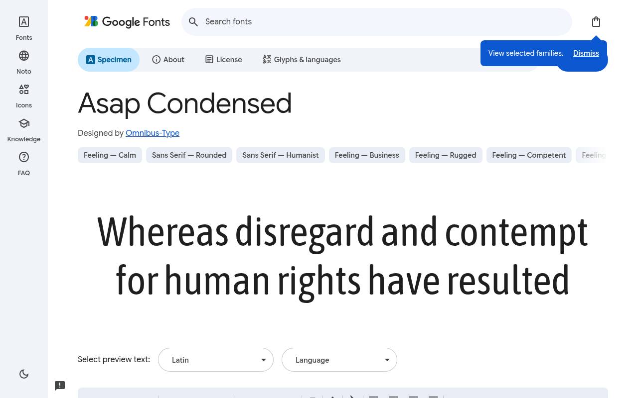
Narrow lines. Big ideas.
ABCDEFGHIJKLM abcdefghijklm 0123456789
Asap Condensed brings an approachable tone to compact campaign headlines, making it useful for community events, educational posters, and friendly product announcements. Its range of upright and italic cuts lets you distinguish a main message from a supporting invitation without introducing another family.
Start with a stronger weight for small format posters, then check that the narrower counters remain open after printing. Use sentence case when an all-capital treatment feels unnecessarily forceful. Designed by Omnibus-Type, Asap Condensed has 16 listed styles, with weights 200–900. No variable axes are listed. Character support in Asap Condensed spans Latin, extended Latin and Vietnamese.
- Style
- Friendly condensed sans
- Best for
- Approachable campaigns needing compact titles and italic accents
- License
- SIL Open Font License
- Price
- 100% free
Barlow Condensed
Condensed contemporary sans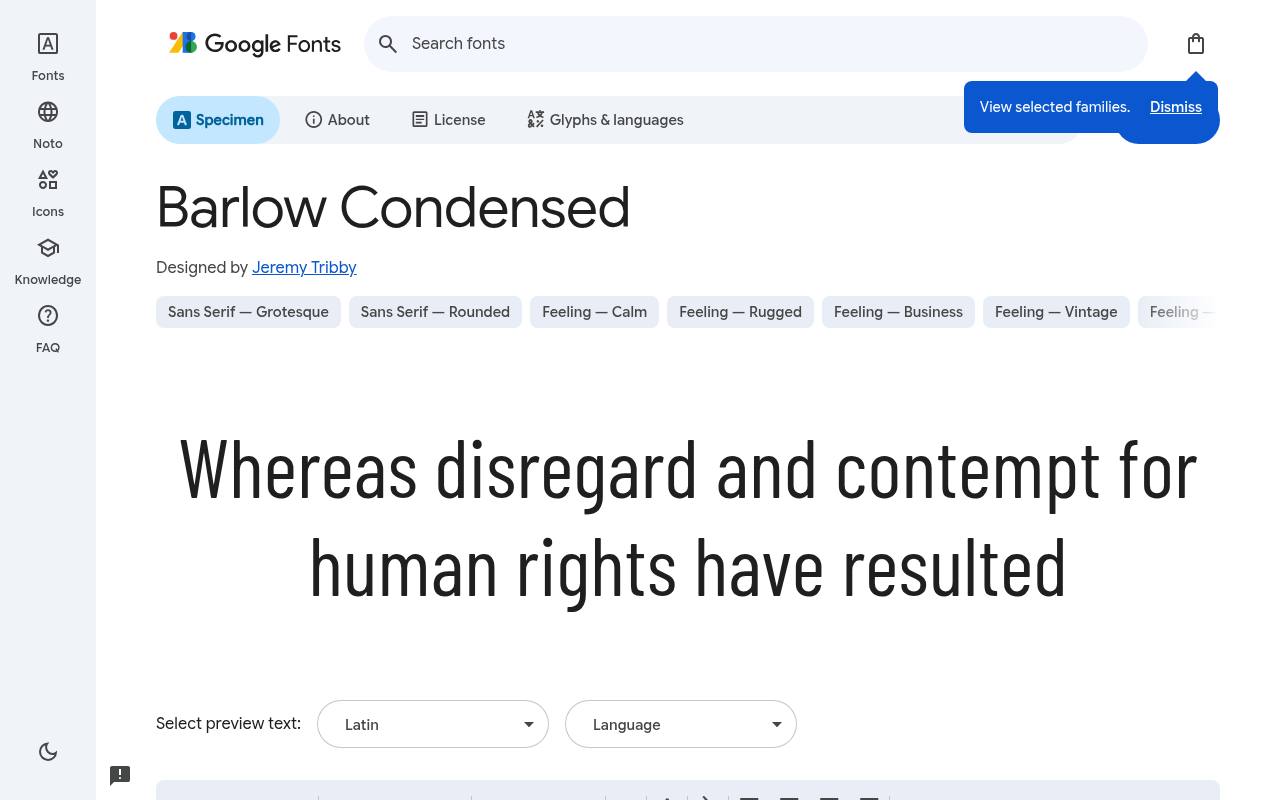
Narrow lines. Big ideas.
ABCDEFGHIJKLM abcdefghijklm 0123456789
Barlow Condensed offers flexible headline hierarchy for event identities that need several weights, not just one dramatic wordmark. A heavier title can sit above lighter schedules and captions while retaining a coherent voice. Its relatively uncomplicated forms are helpful beside dense photography.
Compare neighboring weights at actual output size before choosing: the right contrast on a large monitor may become much subtler on a small flyer or social preview. Designed by Jeremy Tribby, Barlow Condensed has 18 listed styles, with weights 100–900. No variable axes are listed. Character support in Barlow Condensed spans Latin, extended Latin and Vietnamese.
- Style
- Condensed contemporary sans
- Best for
- Event identities with multiple levels of condensed type
- License
- SIL Open Font License
- Price
- 100% free
Cabin Condensed
Humanist condensed sans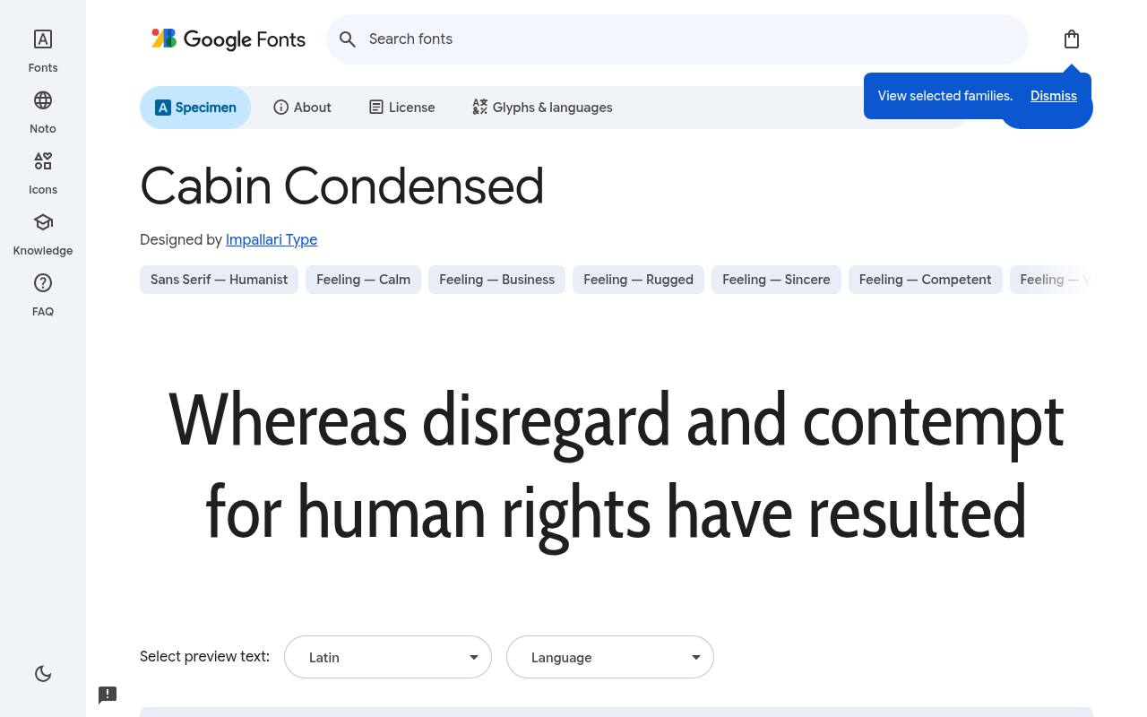
Narrow lines. Big ideas.
ABCDEFGHIJKLM abcdefghijklm 0123456789
Cabin Condensed is worth considering when narrow typography needs warmth rather than an industrial edge. Its humanist character suits food events, independent publishing, and cultural posters where an aggressive display face would fight the subject. The upright-only selection encourages hierarchy through size and weight instead of italics.
Give rounded letter combinations a careful spacing check in large titles; a comfortable default setting can still benefit from small optical adjustments in a prominent word. Designed by Impallari Type, Cabin Condensed has 4 listed styles, with weights 400–700. No variable axes are listed. Character support in Cabin Condensed spans Latin, extended Latin and Vietnamese.
- Style
- Humanist condensed sans
- Best for
- Warm headlines for food culture and local events
- License
- SIL Open Font License
- Price
- 100% free
Encode Sans Condensed
Condensed sans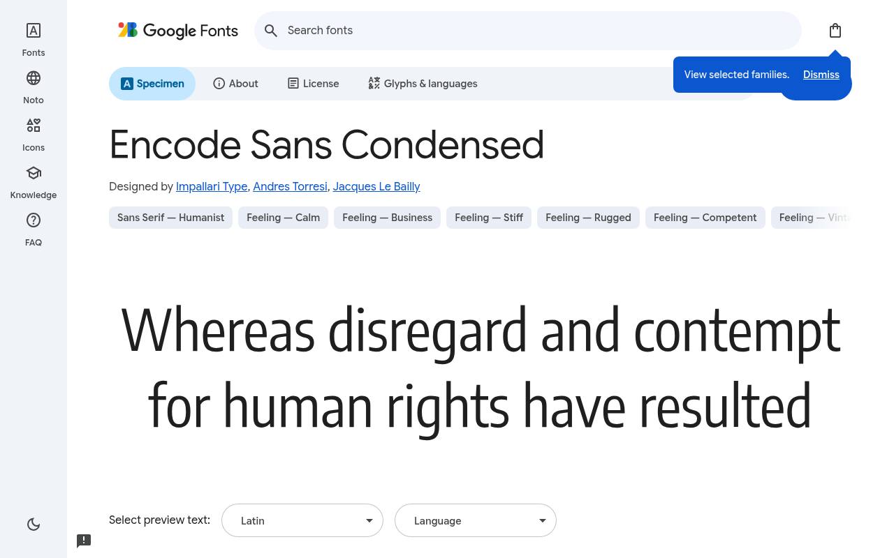
Narrow lines. Big ideas.
ABCDEFGHIJKLM abcdefghijklm 0123456789
Encode Sans Condensed provides a broad upright weight selection for systematic poster layouts. You can keep a campaign consistent while moving from delicate introductory words to emphatic headline blocks.
It is a useful alternative to relying on artificially compressed ordinary type, which distorts strokes and spacing. Treat weight as hierarchy rather than using every available cut: two well-separated choices usually produce a cleaner event poster than a ladder of almost identical weights.
Designed by Impallari Type, Andres Torresi, Jacques Le Bailly, Encode Sans Condensed has 9 listed styles, with weights 100–900. No variable axes are listed. Character support in Encode Sans Condensed spans Latin, extended Latin and Vietnamese.
- Style
- Condensed sans
- Best for
- Clean campaigns requiring many upright headline weights
- License
- SIL Open Font License
- Price
- 100% free
Fira Sans Condensed
Humanist condensed sans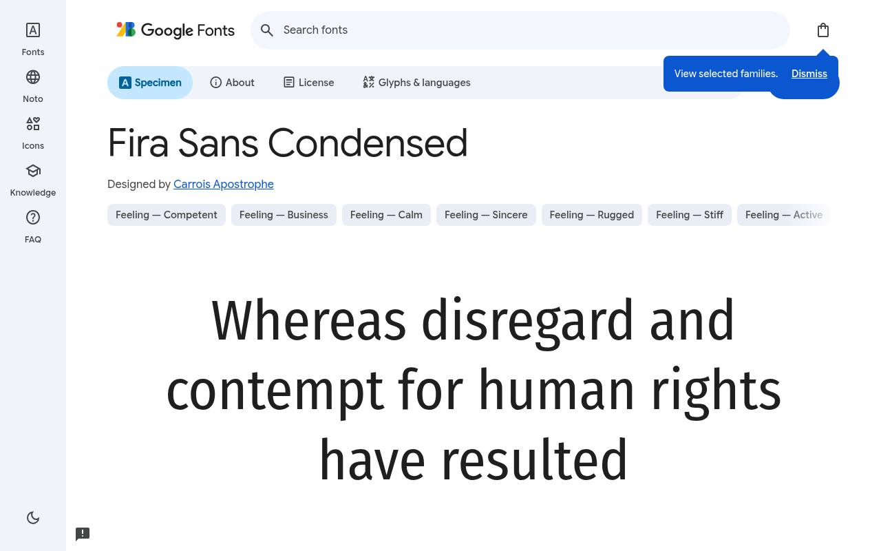
Narrow lines. Big ideas.
ABCDEFGHIJKLM abcdefghijklm 0123456789
Fira Sans Condensed combines space saving proportions with a substantial style selection, making it useful for posters that contain more than a slogan. Its listed Greek and Cyrillic coverage also makes it a promising candidate for multilingual event systems.
That is a reason to test your real translations early, not a guarantee that every language requirement is covered. Keep secondary text readable by allowing supporting details more size than you might initially expect.
Designed by Carrois Apostrophe, Fira Sans Condensed has 18 listed styles, with weights 100–900. No variable axes are listed. Character support in Fira Sans Condensed spans Cyrillic, extended Cyrillic, Greek, extended Greek, Latin, extended Latin and Vietnamese.
- Style
- Humanist condensed sans
- Best for
- Multiscript event posters with compact supporting information
- License
- SIL Open Font License
- Price
- 100% free
Fira Sans Extra Condensed
Extra condensed sans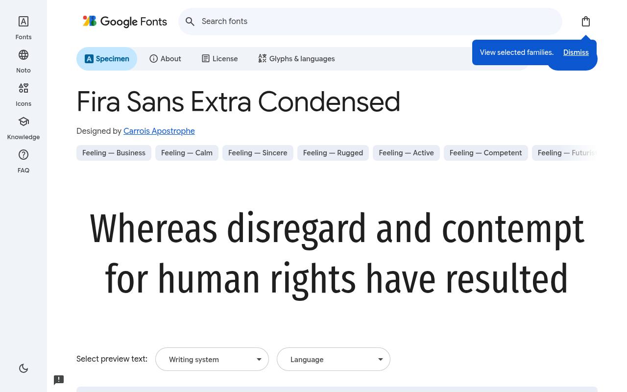
Narrow lines. Big ideas.
ABCDEFGHIJKLM abcdefghijklm 0123456789
Fira Sans Extra Condensed is the more space-conscious Fira option here, suited to especially tight headlines and slim vertical panels. Compare it directly with Fira Sans Condensed using the same words before deciding whether the extra compression earns its keep.
The narrower footprint can make a long event name fit, but it also reduces the room inside letters. Favor short display settings over dense paragraphs, especially when using heavier weights on a dark background.
Designed by Carrois Apostrophe, Fira Sans Extra Condensed has 18 listed styles, with weights 100–900. No variable axes are listed. Character support in Fira Sans Extra Condensed spans Cyrillic, extended Cyrillic, Greek, extended Greek, Latin, extended Latin and Vietnamese.
- Style
- Extra condensed sans
- Best for
- Very narrow columns and short high impact titles
- License
- SIL Open Font License
- Price
- 100% free
IBM Plex Sans Condensed
Technical condensed sans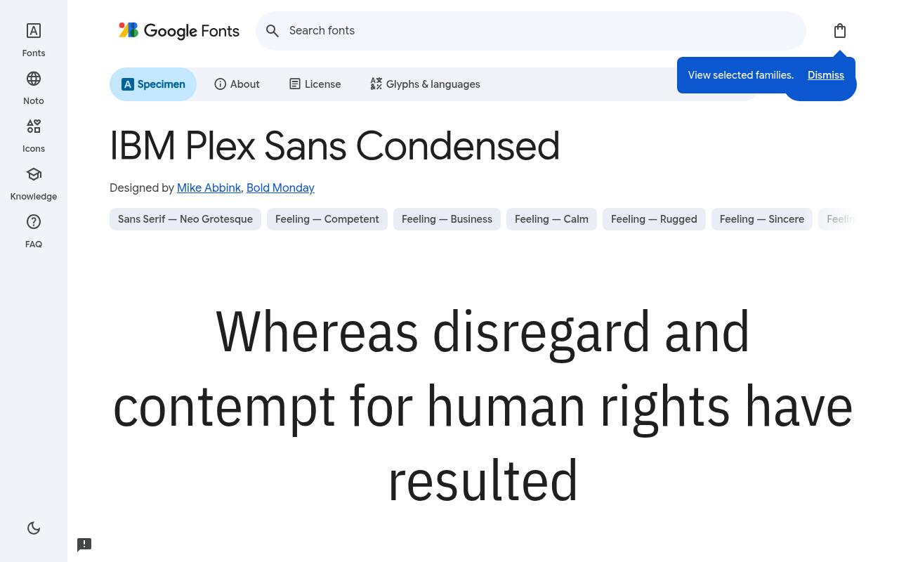
Narrow lines. Big ideas.
ABCDEFGHIJKLM abcdefghijklm 0123456789
IBM Plex Sans Condensed has a technical editorial voice that works well for architecture exhibitions, science events, and structured cultural programmes. Its upright and italic selection supports deliberate shifts between titles, annotations, and quoted material.
Pair its condensed headings with a less compressed reading face when the poster contains substantial explanatory copy. Use consistent alignment rules for dates, speaker names, and labels so the font's precision becomes part of the layout rather than mere decoration.
Designed by Mike Abbink, Bold Monday, IBM Plex Sans Condensed has 14 listed styles, with weights 100–700. No variable axes are listed. Character support in IBM Plex Sans Condensed spans extended Cyrillic, Latin, extended Latin and Vietnamese.
- Style
- Technical condensed sans
- Best for
- Structured exhibition posters and technology event identities
- License
- SIL Open Font License
- Price
- 100% free
PT Sans Narrow
Narrow humanist sans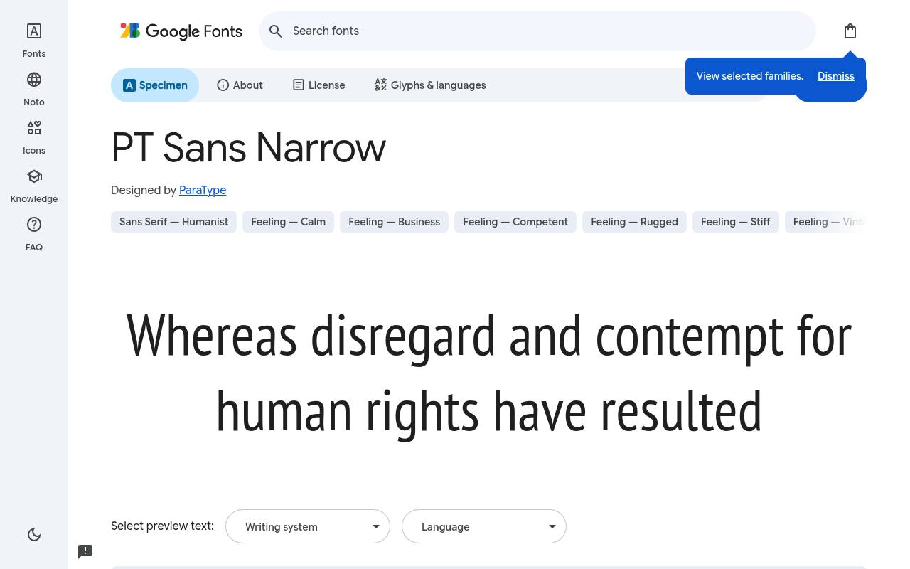
Narrow lines. Big ideas.
ABCDEFGHIJKLM abcdefghijklm 0123456789
PT Sans Narrow is a focused option for straightforward poster typography when an extensive weight menu would add more decisions than value. Regular and bold give you a clear two-level starting point for titles and event details.
The listed Cyrillic coverage is useful for projects that need both Latin and Cyrillic text. Check mixed script headlines together, including punctuation and numerals, rather than approving the English mockup first and treating translated text as an afterthought.
Designed by ParaType, PT Sans Narrow has 2 listed styles, with weights 400–700. No variable axes are listed. Character support in PT Sans Narrow spans Cyrillic, extended Cyrillic, Latin and extended Latin.
- Style
- Narrow humanist sans
- Best for
- Straightforward bilingual posters with simple regular bold hierarchy
- License
- SIL Open Font License
- Price
- 100% free
Choose width before squeezing the layout
Begin with the longest headline, not the neatest two-word sample. Set it in three candidates at the same cap height and compare how much room each needs.
Fira Sans Extra Condensed can solve a genuinely narrow panel, while Cabin Condensed may be more comfortable when you only need modest space savings. Do not horizontally scale a normal font to imitate these proportions: that changes stroke relationships as well as width.
Build a restrained weight hierarchy
Use two clear weights as a starting point, then add another only if it has a defined role. A strong title and quieter event details usually outperform a poster that uses a different cut on every line.
Families such as Barlow Condensed and Encode Sans Condensed offer many choices, but the range is a toolkit rather than a checklist. Establish size, alignment, and spacing before asking subtle weight differences to do all the organizational work.
Protect small text and reversed lettering
A narrow headline face can become difficult in small supporting text, particularly when white letters sit on a dark photograph. Test your details on the actual background and at a realistic viewing distance.
Increase size, simplify the background, or move the information into a separate panel before tightening tracking further. For printed posters, make a reduced proof as well as a full-size detail crop; each exposes different spacing and legibility problems.
Check language coverage with real copy
Listed script subset coverage is a starting point for testing, not a substitute for checking every required character. Fira Sans Condensed has different coverage from PT Sans Narrow, and neither should be selected solely because the English title looks good.
Paste translated copy, names, currencies, punctuation, and numerals into the same proof. Keep an eye on fallback characters that silently appear in another font and disrupt the otherwise consistent narrow rhythm.
Understand styles, axes, and licensing
A variable weight axis permits intermediate values within its stated range; a long static style list does not imply that capability. Antonio and Archivo Narrow provide listed weight axes, while several other families here use static cuts.
Download fonts from Google Fonts and keep the supplied license with your project archive. Free availability does not remove license obligations, so consult the included text before redistributing font files or modifying a family for a client.
Prepare web and print deliverables carefully
For a web campaign, load only required fonts and styles rather than the entire poster identity by default. Use a sensible sans-serif fallback, reserve enough headline space, and check line wrapping before and after the webfont arrives.
For print, confirm embedding with the printer and inspect the exported PDF. Keep an editable source document; if outlined lettering is requested, create it in a delivery copy so future corrections remain straightforward.
Can condensed headlines still be accessible?
Yes, provided readability stays primary. Keep essential wording as real text on the web, use sufficient contrast, and avoid hiding practical information inside a decorative image. Condensed typography does not excuse tiny text or excessively tight spacing.
Ask someone unfamiliar with the event to read the title and find the date quickly. If they hesitate, simplify the setting before blaming the wording or adding even more visual emphasis.