
A good collection of free blackletter fonts should offer more than ten versions of the same dense gothic texture. Historical-looking mastheads, fantasy invitations, illustrated maps, and medieval-themed posters all need different levels of ornament and readability.
This selection includes recognizable blackletter directions alongside softer manuscript-inspired alternatives, so you can choose the right mood without pretending every decorative face belongs to the same historical tradition or serves the same practical purpose.
All ten options are Google Fonts families, but their capabilities differ considerably. Several provide one listed cut, while Almendra includes bold and italic companions and Grenze Gotisch offers a variable weight axis.
Those differences affect how easily you can build a whole identity rather than a single title. The descriptions identify designers, listed style counts, weight ranges, axes, and subset coverage so you can shortlist options on technical suitability as well as visual character.
Treat medieval display lettering as a focal point, not a complete reading system. A dramatic title can establish atmosphere while a restrained companion handles dates, directions, and booking details.
Test the exact event name early, including its capitals and accents, and judge it at the smallest size people will encounter. For an unfamiliar audience, a less ornate font with strong composition often communicates the intended period or fantasy mood more effectively than the most elaborate choice.
Quick picks at a glance
| # | Resource | Style | Best for |
|---|---|---|---|
| 1 | UnifrakturMaguntia | Traditional blackletter | Historical looking mastheads and short ceremonial poster titles |
| 2 | UnifrakturCook | Bold blackletter | Dark compact wordmarks and emphatic blackletter headings |
| 3 | Pirata One | Blackletter inspired display | Adventurous festival posters and fantasy themed branding |
| 4 | Germania One | Modern blackletter display | Contemporary gothic headings with a simplified graphic feel |
| 5 | Grenze Gotisch | Variable gothic display | Gothic identity systems needing light through black weights |
| 6 | MedievalSharp | Medieval inspired display | Readable fantasy maps and tabletop event headings |
| 7 | Almendra | Calligraphic medieval serif | Storytelling titles with coordinated regular bold and italics |
| 8 | Almendra Display | Decorative medieval display | Large fairy tale titles and ornamental cover lettering |
| 9 | Almendra SC | Small caps medieval serif | Ceremonial labels and compact fantasy chapter style headings |
| 10 | Eagle Lake | Calligraphic handwriting | Elegant fantasy invitations and manuscript inspired display lines |
UnifrakturMaguntia
Traditional blackletter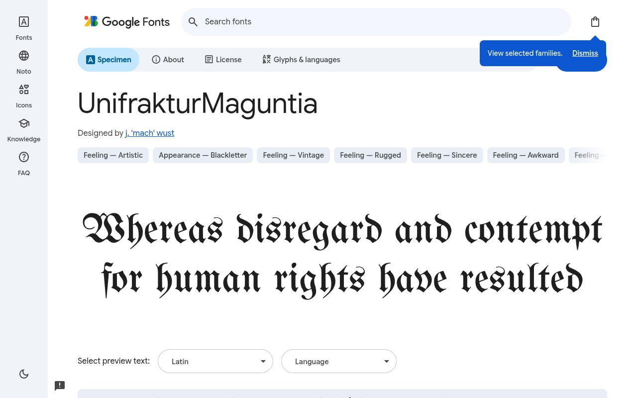
Stories from another age
ABCDEFGHIJKLM abcdefghijklm 0123456789
UnifrakturMaguntia delivers a distinctly traditional blackletter texture, with the dense rhythm that makes this style so striking in a short masthead. It suits historical-themed events and ceremonial graphics better than everyday interface labels.
Set a few actual words before committing, since unfamiliar letter shapes can slow recognition even at large sizes. Preserve clear surrounding space and pair the display line with plain supporting text rather than surrounding it with competing ornamental lettering.
Designed by j. 'mach' wust, UnifrakturMaguntia has 1 listed style, with weight 400. No variable axes are listed. Character support in UnifrakturMaguntia is limited to basic Latin, so test accented names before committing.
- Style
- Traditional blackletter
- Best for
- Historical looking mastheads and short ceremonial poster titles
- License
- SIL Open Font License
- Price
- 100% free
UnifrakturCook
Bold blackletter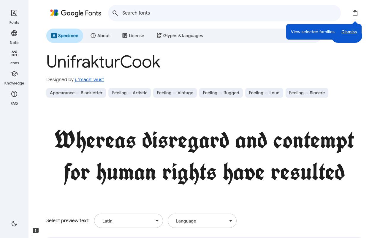
Stories from another age
ABCDEFGHIJKLM abcdefghijklm 0123456789
UnifrakturCook gives a title heavy blackletter presence without requiring an artificial bold effect. The listed cut is already bold, which matters when choosing CSS weights or exporting artwork for a printer.
Its strong texture is useful for short names, badges, and a single emphatic line. Test interior white spaces at the smallest reproduction size: intricate blackletter can become a dark band when reduced, particularly on absorbent paper or against a busy illustration.
Designed by j. 'mach' wust, UnifrakturCook has 1 listed style, with weight 700. No variable axes are listed. Character support in UnifrakturCook is limited to basic Latin, so test accented names before committing.
- Style
- Bold blackletter
- Best for
- Dark compact wordmarks and emphatic blackletter headings
- License
- SIL Open Font License
- Price
- 100% free
Pirata One
Blackletter inspired display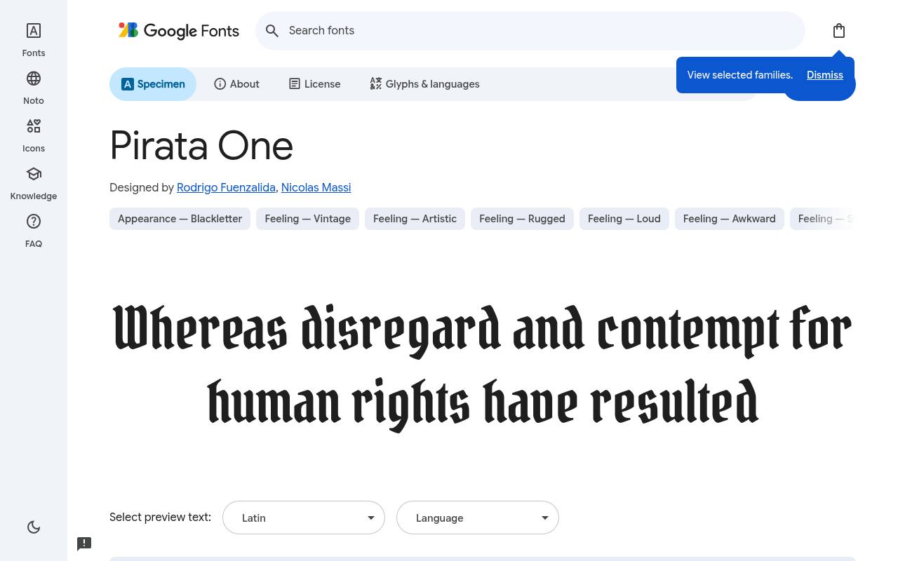
Stories from another age
ABCDEFGHIJKLM abcdefghijklm 0123456789
Pirata One provides blackletter inspired drama for fantasy events, theatrical posters, and adventurous brand concepts. Its lively shapes can carry a brief title without needing a border full of medieval ornament. Keep the rest of the composition controlled so the lettering remains the focal point.
Try mixed case words alongside capitals before choosing a setting; decorative capitals have considerable personality, but a whole line of them may be harder to scan than expected. Designed by Rodrigo Fuenzalida, Nicolas Massi, Pirata One has 1 listed style, with weight 400. No variable axes are listed. Character support in Pirata One spans Latin and extended Latin.
- Style
- Blackletter inspired display
- Best for
- Adventurous festival posters and fantasy themed branding
- License
- SIL Open Font License
- Price
- 100% free
Germania One
Modern blackletter display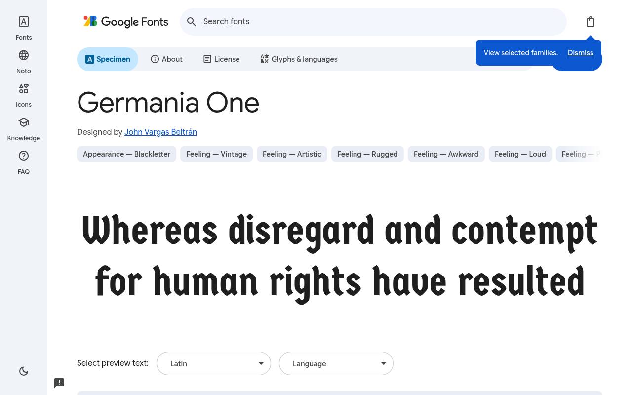
Stories from another age
ABCDEFGHIJKLM abcdefghijklm 0123456789
Germania One is useful when you want gothic visual cues without presenting the entire layout as a historical reproduction. Its graphic character can connect a contemporary poster to blackletter traditions while leaving room for modern photography and clean grids.
The limited listed style selection makes scale and placement especially important. Use one dominant heading with calmer secondary type, and inspect the actual accented characters your title needs before approving a multilingual identity.
Designed by John Vargas Beltrán, Germania One has 1 listed style, with weight 400. No variable axes are listed. Character support in Germania One is limited to basic Latin, so test accented names before committing.
- Style
- Modern blackletter display
- Best for
- Contemporary gothic headings with a simplified graphic feel
- License
- SIL Open Font License
- Price
- 100% free
Grenze Gotisch
Variable gothic display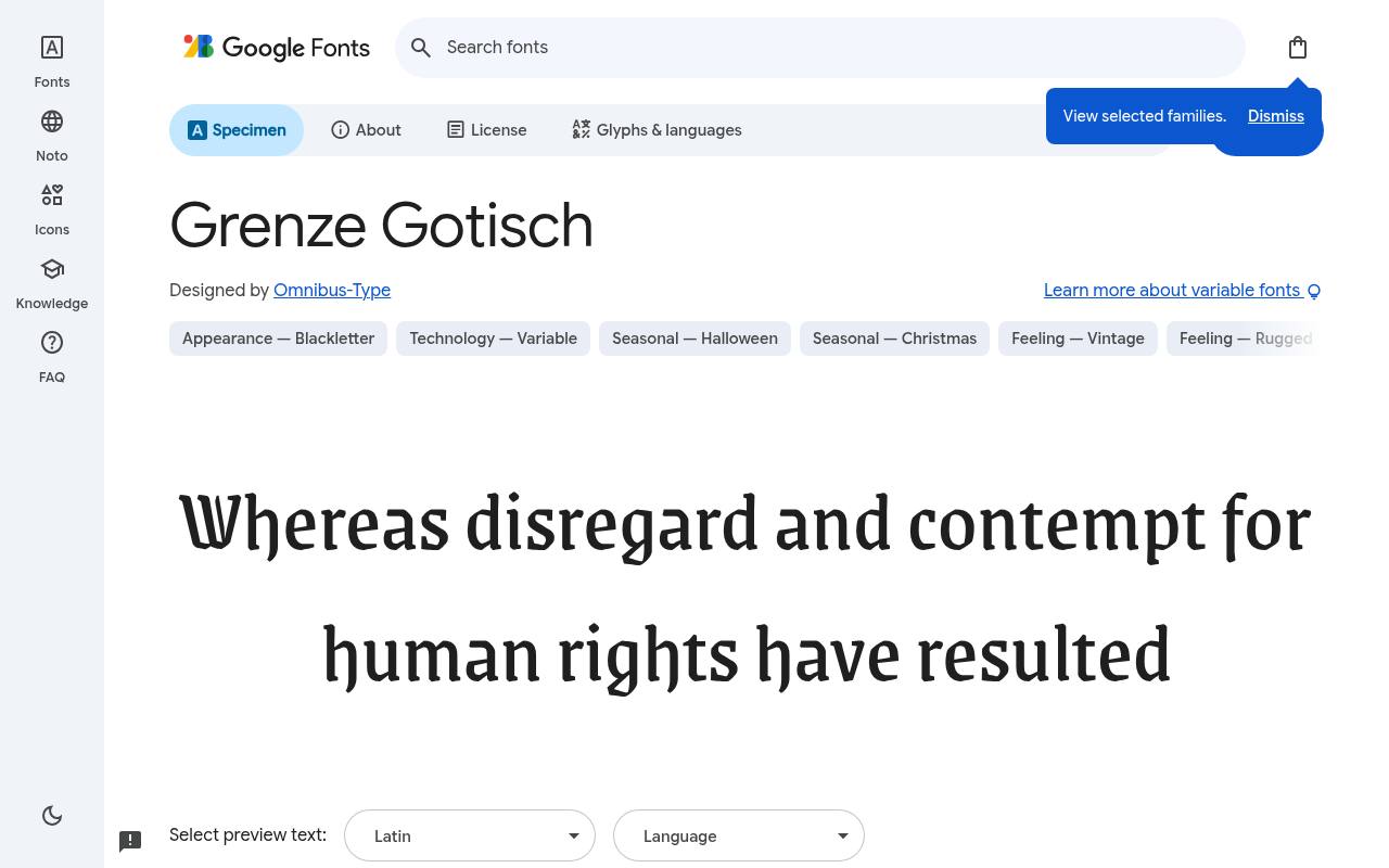
Stories from another age
ABCDEFGHIJKLM abcdefghijklm 0123456789
Grenze Gotisch stands out here for its variable weight range, allowing gothic-flavored headlines to move from delicate to emphatic within one family. That flexibility is useful for a festival identity spanning large banners, programme covers, and compact digital cards. Compare weights with the same title rather than assuming the heaviest option is always the most atmospheric.
Preserve consistent title treatment across applications, then use weight changes to solve specific size and contrast problems. Designed by Omnibus-Type, Grenze Gotisch has 9 listed styles, with weights 100–900. Its variable wght axis spans 100–900. Character support in Grenze Gotisch spans Latin, extended Latin and Vietnamese.
- Style
- Variable gothic display
- Best for
- Gothic identity systems needing light through black weights
- License
- SIL Open Font License
- Price
- 100% free
MedievalSharp
Medieval inspired display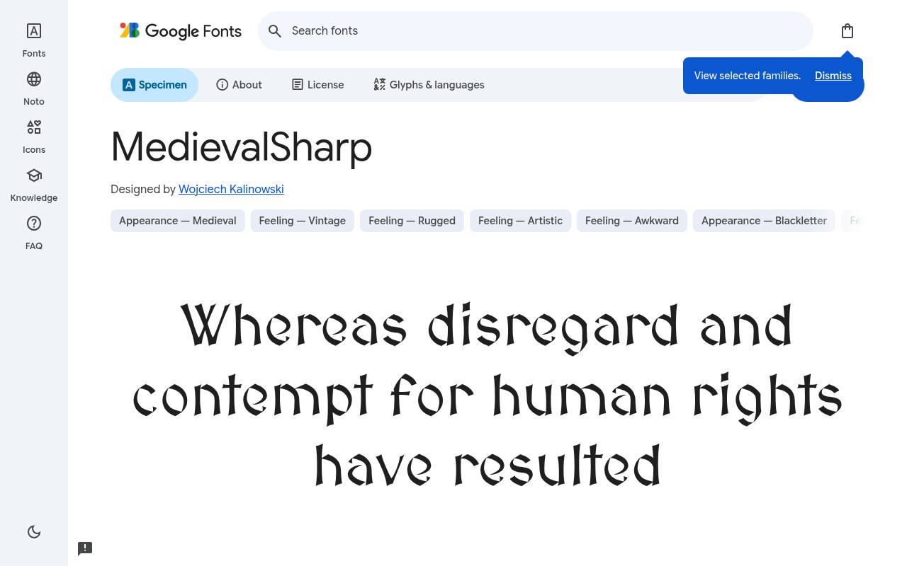
Stories from another age
ABCDEFGHIJKLM abcdefghijklm 0123456789
MedievalSharp suggests fantasy manuscript lettering rather than a dense traditional blackletter page. That makes it a useful direction for tabletop event posters, game-related announcements, and headings on illustrated maps. Its angular personality works best when the content needs atmosphere but still has to be recognized quickly.
Avoid adding extra distressed effects automatically; texture from a parchment background or illustration may already provide enough age, leaving the letterforms cleaner and easier to read. Designed by Wojciech Kalinowski, MedievalSharp has 1 listed style, with weight 400. No variable axes are listed. Character support in MedievalSharp spans Latin and extended Latin.
- Style
- Medieval inspired display
- Best for
- Readable fantasy maps and tabletop event headings
- License
- SIL Open Font License
- Price
- 100% free
Almendra
Calligraphic medieval serif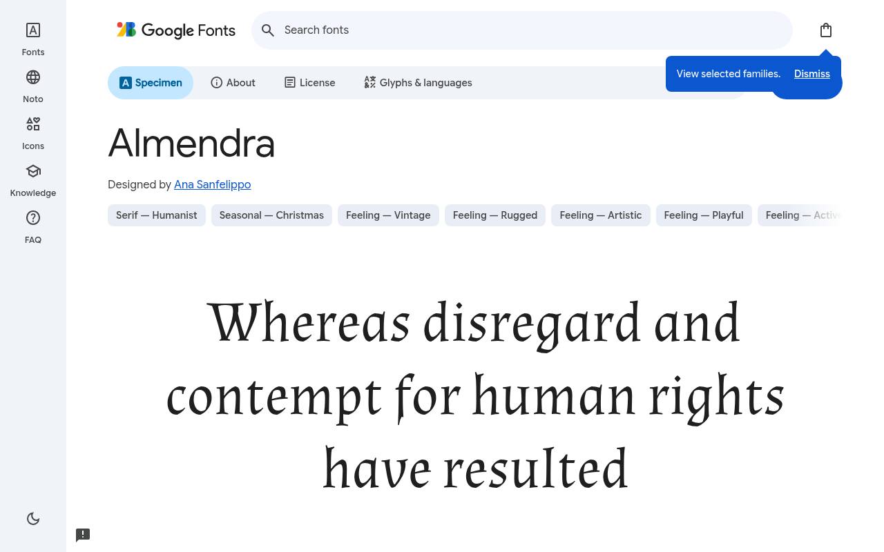
Stories from another age
ABCDEFGHIJKLM abcdefghijklm 0123456789
Almendra offers a softer route into medieval inspired typography, with a calligraphic serif character that can support storytelling rather than pure gothic impact. Unlike many single-cut display choices, it includes coordinated bold and italic options. Those are useful for chapter-style titles, short quotations, and supporting lines in an illustrated event identity.
Use restrained ornamentation around it: a simple rule or small emblem can complement the lettering without turning every part of the composition into decoration. Designed by Ana Sanfelippo, Almendra has 4 listed styles, with weights 400–700. No variable axes are listed. Character support in Almendra spans Latin and extended Latin.
- Style
- Calligraphic medieval serif
- Best for
- Storytelling titles with coordinated regular bold and italics
- License
- SIL Open Font License
- Price
- 100% free
Almendra Display
Decorative medieval display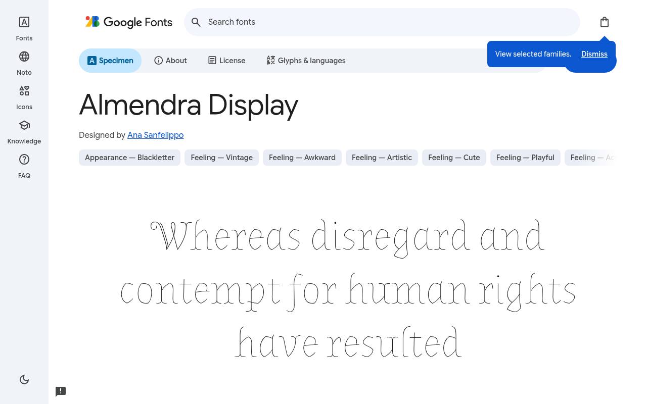
Stories from another age
ABCDEFGHIJKLM abcdefghijklm 0123456789
Almendra Display belongs on the shortlist for decorative storybook titles that need more flourish than a practical text face. It is a display choice, so give it enough scale for its unusual details to register instead of shrinking it into captions. Compare it with Almendra using the same phrase to judge whether the extra personality supports your subject.
Leave room around flourishes and check neighboring letters individually when the title becomes a prominent piece of artwork. Designed by Ana Sanfelippo, Almendra Display has 1 listed style, with weight 400. No variable axes are listed. Character support in Almendra Display spans Latin and extended Latin.
- Style
- Decorative medieval display
- Best for
- Large fairy tale titles and ornamental cover lettering
- License
- SIL Open Font License
- Price
- 100% free
Almendra SC
Small caps medieval serif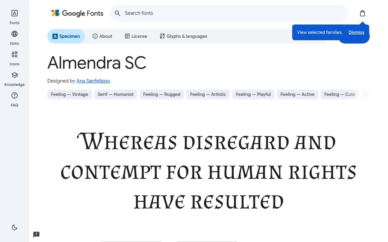
Stories from another age
ABCDEFGHIJKLM abcdefghijklm 0123456789
Almendra SC introduces a small caps character to the medieval palette, useful for ceremonial labels, fantasy chapter headings, and quietly formal poster subtitles. It offers a different rhythm from the more animated capitals in the display alternatives.
Because its listed subset coverage is narrower than that of Almendra, test names and accents explicitly. Use modest letter spacing only after looking at the complete phrase; spreading short capitals too far can weaken their connection to an illustrated scene.
Designed by Ana Sanfelippo, Almendra SC has 1 listed style, with weight 400. No variable axes are listed. Character support in Almendra SC is limited to basic Latin, so test accented names before committing.
- Style
- Small caps medieval serif
- Best for
- Ceremonial labels and compact fantasy chapter style headings
- License
- SIL Open Font License
- Price
- 100% free
Eagle Lake
Calligraphic handwriting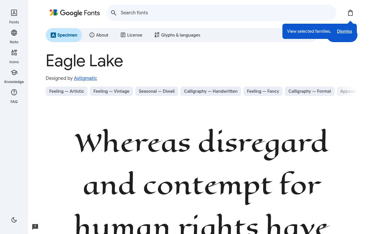
Stories from another age
ABCDEFGHIJKLM abcdefghijklm 0123456789
Eagle Lake rounds out the selection with calligraphic manuscript atmosphere, not strict blackletter construction. It is a useful alternative when a fantasy invitation or cultural poster needs elegance more than a heavy gothic texture. Its expressive pen-like forms deserve a relatively quiet background and a short message.
Choose plain supporting typography for dates, addresses, and booking information so readers can enjoy the decorative heading without having to decipher every practical detail in the same style. Designed by Astigmatic, Eagle Lake has 1 listed style, with weight 400. No variable axes are listed. Character support in Eagle Lake spans Latin and extended Latin.
- Style
- Calligraphic handwriting
- Best for
- Elegant fantasy invitations and manuscript inspired display lines
- License
- SIL Open Font License
- Price
- 100% free
Separate blackletter from medieval atmosphere
Choose a specific visual direction before comparing fonts. UnifrakturMaguntia creates a different texture from the calligraphic Eagle Lake, and neither is interchangeable with Almendra SC. A themed event can borrow manuscript atmosphere without claiming historical accuracy.
If authenticity matters for a museum or academic project, compare letterforms with appropriate historical references and consult a specialist rather than using a decorative family name as evidence of period, region, or writing practice.
Test words instead of isolated capitals
Make a real title proof containing the exact capitalization, punctuation, and accented names you will publish. Decorative capitals can be beautiful on their own yet compete when placed together.
Compare title case with an all-capital version, then ask someone who has not seen the wording to read both. This is especially important for blackletter, where unfamiliar shapes can make an obvious word feel ambiguous to a general audience.
Pair expressive titles with calm information
Give practical event details a simpler companion face and enough space to breathe. Dates, addresses, prices, and access information should not require the same attention as an ornamental title. Try one decorative family and one readable text family before adding anything else.
Use layout and scale to connect them, perhaps through a shared alignment or consistent color, rather than searching for a second font with equally elaborate flourishes and competing historical associations.
Avoid false bold and excessive decoration
Respect the supplied weights. UnifrakturCook is listed at 700, while many other selections have a single 400 cut; changing the CSS number does not create a newly drawn companion. Artificial emboldening can close fine spaces, and aggressive outlines can obscure distinctive shapes.
If you need several strengths, test Grenze Gotisch or Almendra instead. Remove unnecessary shadows and distressing before deciding that a title lacks impact, because clutter often weakens the underlying forms.
Proof backgrounds and physical reproduction
Check fine decorative details against the final background, not only on a clean white canvas. Parchment textures, engraved borders, and illustrated foliage can swallow thin strokes or make dense blackletter feel even heavier.
Print a small proof on a representative stock when possible, and inspect reversed lettering separately. A restrained background often creates a more convincing result than stacking every available medieval motif behind an already expressive headline.
Handle font files and language coverage
Use official font downloads and retain the accompanying license text with your working files. Review that license before redistributing the files in a template or handing over a packaged project.
Subset labels also deserve attention: several families here list Latin only, while others add extended Latin or Vietnamese coverage. Test required glyphs directly, especially personal names, because a missing character can switch into a fallback font and break an otherwise carefully controlled title.
Keep digital headings readable and searchable
Publish headings as text whenever the layout allows it. A decorative webfont can provide atmosphere while preserving selectable words and a meaningful heading structure. Use a serif fallback, check loading behavior, and avoid loading unused styles.
If the title must be an image, provide an appropriate text equivalent and keep navigation in ordinary readable typography. Search visibility comes from useful content and sound structure, not from repeating gothic font keywords in every nearby sentence.