A strong palette does more than put attractive swatches beside each other. It gives a project a recognizable personality and helps different elements feel related.
Free color palette generators make that early exploration faster, whether you already have a brand color or need a completely new direction. The tools below focus on generating combinations, exploring color wheels, and applying harmony rules rather than collecting finished palettes or extracting colors from photographs.
There are two useful starting points. A color scheme generator suggests combinations you might not have chosen yourself, while an interactive wheel builds relationships around a specific hue.
Neither approach replaces judgment: a balanced set of colors can still feel wrong for a particular audience or application. Treat generated results as candidates, then refine their brightness, saturation, and proportions inside an actual layout before presenting a direction to a client.
These free color harmony tools cover quick random exploration, machine-learning suggestions, and more deliberate color-theory exercises. Some are standalone utilities; others belong to larger design platforms with optional paid plans.
The recommendations distinguish the free browser tool from the surrounding service, so you can choose a practical starting point without assuming every export, saved library, or connected design feature is included. Begin with the option that matches your decision, not the longest feature list.
Quick picks at a glance
| # | Resource | License | Best for |
|---|---|---|---|
| 1 | Coolors | Free generator; optional Pro features | Rapidly exploring combinations while keeping favorite colors |
| 2 | Adobe Color | Free color tool; Adobe account for library saving | Building structured harmonies around an existing brand hue |
| 3 | ColorSpace | Free browser tool; site terms apply | Finding several palette directions from one starting color |
| 4 | Huemint | Free browser generator; site terms apply | Evaluating generated colors within brand and layout previews |
| 5 | Colormind | Free browser generator; API terms separate | Generating companion colors around locked starting swatches |
| 6 | Canva | Free color wheel; Canva design plans separate | Learning RGB harmony relationships through a simple wheel |
| 7 | Sessions College | Free educational color calculator | Comparing artistic and digital harmonies with printable results |
| 8 | Color Designer | Free generator; optional paid ad removal | Exploring palettes organized around perceptual color relationships |
| 9 | ColorSpire | Free browser palette tool; site terms apply | Exploring familiar harmony rules without a large platform |
| 10 | Figma Color Wheel | Free public color wheel; Figma plans separate | Comparing harmony examples and copying precise hex values |
Coolors
Web app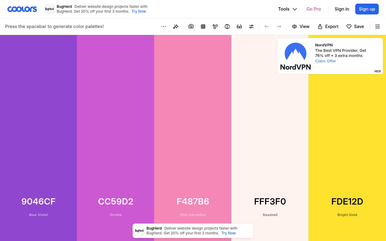
Coolors makes rapid palette exploration straightforward: press the spacebar to generate another combination, then keep the colors you like while exploring alternatives around them. Its generator places editing and export controls beside the working palette, making iteration feel immediate rather than buried in a setup process.
The interface marks selected customization options as Pro, and saved-library access asks you to sign in. Use the free palette generator for initial directions, then check which export settings or organizational features require an upgrade before committing your entire handoff process to it.
- Type
- Web app
- Best for
- Rapidly exploring combinations while keeping favorite colors
- License
- Free generator; optional Pro features
- Price
- Free + Pro
Adobe Color
Web app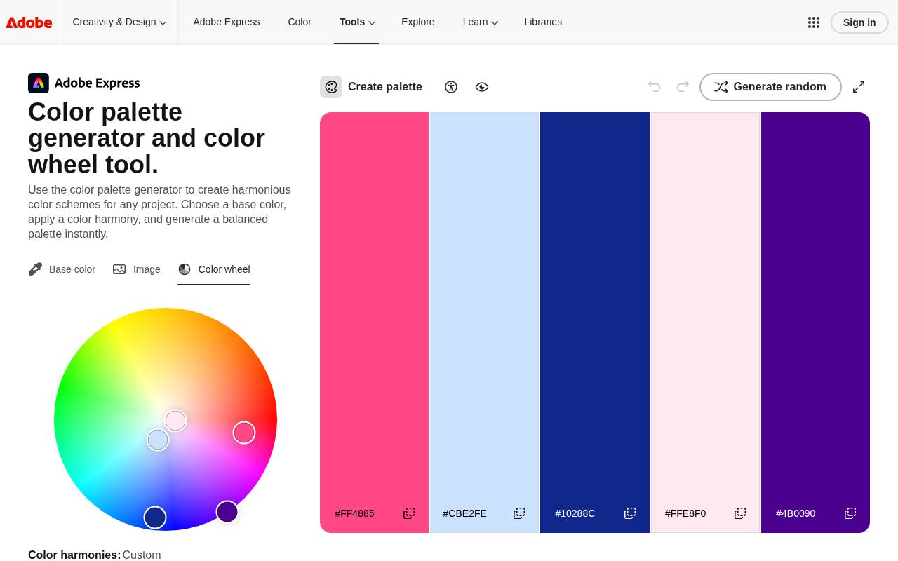
Adobe’s color-wheel address leads to its color palette generator experience, with instructions for choosing a base color and applying a harmony. Monochromatic, complementary, analogous, and triadic relationships provide clear starting structures, while movable color stops let you adjust the result instead of accepting a fixed suggestion.
The page also describes preview and accessibility-related checks, although the main attraction here is wheel-based color harmony. Library saving connects the palette to an Adobe account, so distinguish exploring colors in the browser from maintaining a reusable collection within the wider Adobe ecosystem.
- Type
- Web app
- Best for
- Building structured harmonies around an existing brand hue
- License
- Free color tool; Adobe account for library saving
- Price
- Free tool
ColorSpace
Web app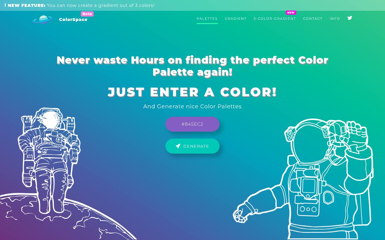
ColorSpace takes a deliberately small input: enter a color, then use Generate to explore companion palettes. That single-color starting point is useful when a logo color is fixed but supporting hues remain undecided. Rather than spending your first session arranging a complex wheel, you can compare different directions and decide which deserves refinement.
The site also offers gradient tools, but its Palettes section is the relevant destination here. Use these generated color combinations to shortlist possibilities, then adjust their balance in your own composition instead of treating every suggested swatch as equally important.
- Type
- Web app
- Best for
- Finding several palette directions from one starting color
- License
- Free browser tool; site terms apply
- Price
- Free tool
Huemint
Web app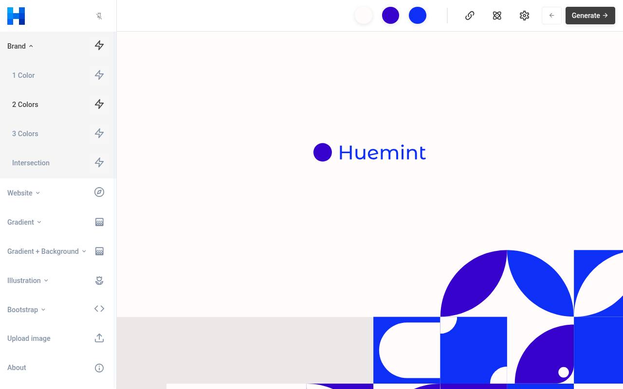
Huemint uses machine learning to generate color schemes for brands, websites, and graphics. Its two-color brand generator is a focused entry point when you want a compact relationship rather than a large set of unrelated options. Navigation separates brand variations from website-oriented examples, encouraging you to consider how colors work in a composition.
This makes contextual palette exploration its practical distinction: judge the relationship between a background and its graphic, not simply the beauty of isolated swatches. Try a restrained brand combination first before moving to layouts with additional color roles.
- Type
- Web app
- Best for
- Evaluating generated colors within brand and layout previews
- License
- Free browser generator; site terms apply
- Price
- Free tool
Colormind
Web app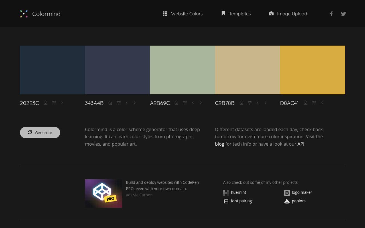
Colormind combines a five-swatch workspace with deep-learning palette generation. Its usage notes explain that unlocked colors produce random suggestions, while locking a starting color lets the generator build around your choice. Placement matters: the site recommends trying complementary colors at opposite ends to encourage intermediate values, or moving contrasting colors closer for more varied results.
That position-sensitive workflow gives you something concrete to adjust when repeated generation feels unproductive. Its datasets change over time, so save useful values yourself rather than expecting to reproduce a promising combination from memory later.
- Type
- Web app
- Best for
- Generating companion colors around locked starting swatches
- License
- Free browser generator; API terms separate
- Price
- Free tool
Canva
Web app
Canva’s RGB color wheel pairs a base-color control with palette-type selection, making it approachable for designers who want the relationship explained as they work. The accompanying material distinguishes complementary, monochromatic, analogous, and other combinations, and clarifies that this wheel is intended for screen-oriented color rather than paint mixing.
Use the color harmony examples to compare a restrained direction with a more energetic one before entering Canva’s broader design environment. The free wheel is the recommendation here; templates, assets, and features reached through Start designing can have their own account or payment requirements.
- Type
- Web app
- Best for
- Learning RGB harmony relationships through a simple wheel
- License
- Free color wheel; Canva design plans separate
- Price
- Free tool
Sessions College
Web app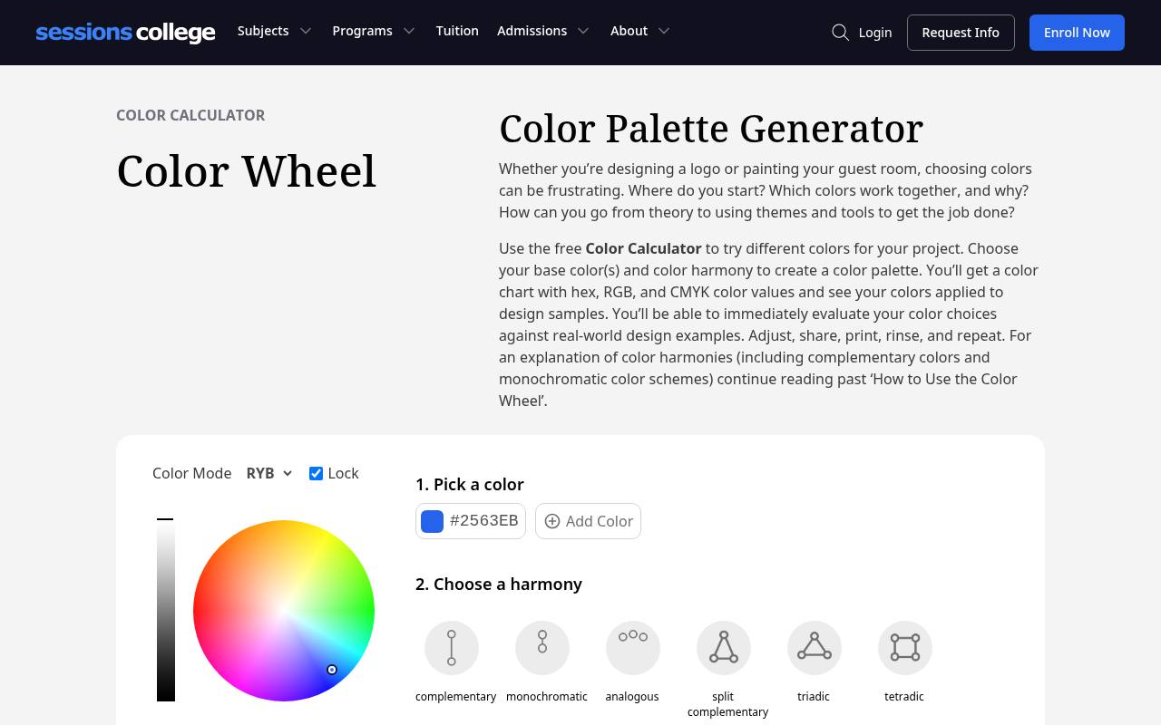
Sessions College offers a free Color Calculator with both RYB and RGB modes, allowing you to explore different approaches to color relationships. Start with up to three base colors and choose among six harmonies, including split complementary, triadic, and tetradic.
The results include hex, RGB, and CMYK values alongside applied design examples. Its printable color report is particularly useful for discussing an early palette with someone who does not use design software: select Get Color Scheme, then print or save the report as a PDF for review.
- Type
- Web app
- Best for
- Comparing artistic and digital harmonies with printable results
- License
- Free educational color calculator
- Price
- Free tool
Color Designer
Web app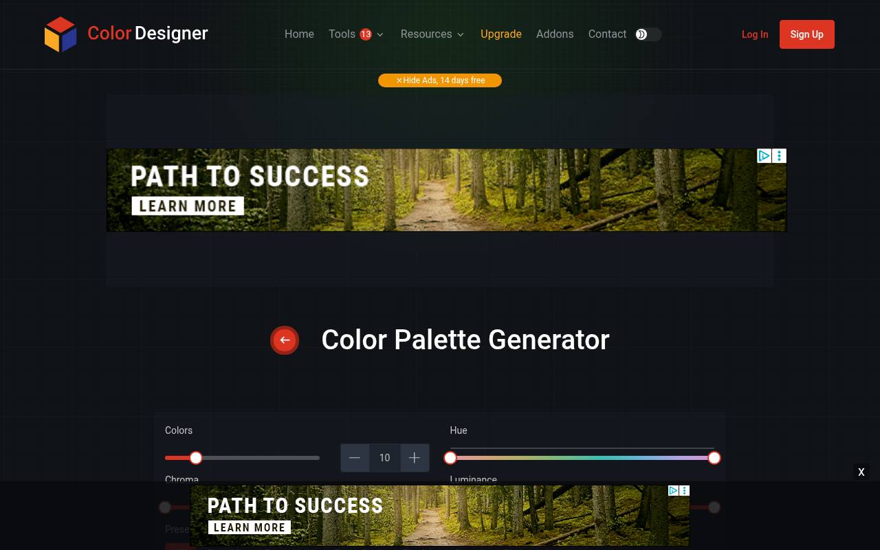
Color Designer describes its generator in terms of HCL color space, separating hue, chroma, and luminance to support combinations aligned with human perception. The page provides Generate Palette, an Export Colors control, and a route into its Color Palette Builder for further work.
That makes it a useful alternative when you want to compare a different generation approach rather than keep spinning the same wheel. The free browser generator sits alongside an optional ad-removal offer; the advertising subscription is distinct from simply opening the tool and exploring its palette suggestions.
- Type
- Web app
- Best for
- Exploring palettes organized around perceptual color relationships
- License
- Free generator; optional paid ad removal
- Price
- Free + paid options
ColorSpire
Web app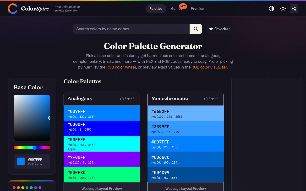
ColorSpire presents itself as a color palette generator built around familiar color-theory relationships, including complementary, analogous, and triadic combinations. It also provides an RGB wheel and visualizer, giving you related ways to explore the same starting idea without moving immediately into a full design platform.
Choose it when your main question is which hues belong together, rather than how to manage a large asset library. Its harmony-first approach makes a useful comparison point against machine-learning tools: evaluate a predictable geometric relationship before deciding whether a less conventional suggestion better suits your project.
- Type
- Web app
- Best for
- Exploring familiar harmony rules without a large platform
- License
- Free browser palette tool; site terms apply
- Price
- Free tool
Figma Color Wheel
Web app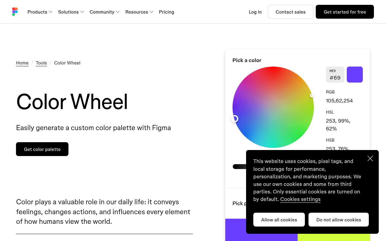
Figma’s public wheel combines interactive color exploration with explanations of complementary, split-complementary, monochromatic, analogous, and other schemes. The page includes copyable hex values for its harmony examples, making the relationships easier to transfer into a working file.
Shades and tints are also presented alongside the color-theory material, helping you distinguish a new hue from a lighter or darker variation of your base. Use this free color wheel as a focused browser utility; it is separate from decisions about Figma workspace seats, collaboration features, or paid product plans.
- Type
- Web app
- Best for
- Comparing harmony examples and copying precise hex values
- License
- Free public color wheel; Figma plans separate
- Price
- Free tool
Choose a generation method that matches the decision
Use a random palette generator when you need fresh directions and can tolerate surprises. Coolors suits fast iteration, while Colormind makes locked positions part of the process.
Choose a wheel when an existing brand hue must remain recognizable and you want to explain why supporting colors belong together. For an early presentation, Huemint’s applied approach can be more informative than comparing disconnected rows of swatches.
Start with one anchor and a limited brief
Write down the intended mood, audience, and main viewing environment before generating anything. Keep one anchor brand color fixed if it is genuinely nonnegotiable, but avoid locking every supporting hue too early.
Shortlist three directions with meaningful differences, such as warm, cool, and neutral-led. This gives stakeholders a clearer choice than ten nearly identical palettes differentiated only by small saturation changes.
Turn harmony into hierarchy
A triadic or tetradic scheme describes hue relationships, not equal usage. Give your dominant palette color the largest visual role, reserve another for emphasis, and let neutrals create breathing room.
Test the combination on a headline, a photograph border, and a small action element. A palette that feels balanced in equal swatches may become overwhelming when its brightest color covers most of a page.
Save values in a transferable format
For digital work, record hex color values in a plain-text note or shared specification, along with names that explain their intended roles. If a tool offers CSS, SVG, or a printable report, choose the format your collaborators can actually use.
A screenshot helps communicate appearance but should not be the only record. Screenshots can be compressed, resized, or displayed differently, while written values preserve the original numeric choices.
Understand free access and usage terms
A free browser tool is not automatically open-source software, and access to a generator does not include a license to copy its interface, examples, or branding. Likewise, an optional subscription may cover storage, ad removal, or export customization rather than basic generation.
Check current terms when using connected assets or services in commercial projects, and keep project specifications independent of any paid library feature you might later stop using.
Check readability after choosing the palette
Color harmony alone does not establish accessible color combinations. Check the actual foreground and background pairings used for text, buttons, and meaningful graphics, then adjust lightness where necessary.
Do not use hue as the only signal for an error or selected state. These checks belong after initial palette exploration and before approval; an attractive complementary relationship can still produce unreadable small text when applied without sufficient luminance difference.
Can one palette work for screens and print?
A shared brand color palette can connect both environments, but a numeric conversion is not a guaranteed visual match. Screen colors emit light; printed colors depend on ink, paper, and production conditions.
Use calculator-provided CMYK values as discussion inputs rather than final press specifications. Ask your print provider about the appropriate output profile and proof the important colors before approving a substantial production run.
Know when to stop generating
Stop when a shortlisted color scheme supports the content, remains legible in realistic uses, and offers a clear reason for each major color. More generation can introduce indecision rather than improvement.
Save the final values, note which combinations are approved, and document one or two examples of intended proportions. That small handoff package usually contributes more to consistent design than an extensive folder of unused alternatives.