
Well-placed motion can explain an interface faster than another line of instructions. A bell can acknowledge a new notification, a checkmark can confirm a completed action, and a weather symbol can make a forecast easier to scan.
These free animated icons offer practical starting points without requiring you to animate every path yourself. The strongest choice is usually the library that fits your existing stack and the specific behavior your interface needs.
Not every animated asset works the same way. Lottie animation files need a compatible player, while animated SVG can carry its own motion instructions. CSS loaders are often small pieces of markup and styling, and React or Svelte icons arrive as editable components.
This selection includes general interface collections alongside focused weather and loading libraries, so you can compare genuine implementation options rather than treating every moving image as an interchangeable download.
Free also needs a little interpretation before production. Some collections publish their entire source under an open license; a marketplace may offer free downloads alongside paid products and separate asset terms.
Check the linked project before redistributing files, and keep any required notices with your code. Above all, plan reduced motion support and a clear static state, because movement should improve feedback without becoming a barrier to using the page.
Quick picks at a glance
| # | Resource | License | Best for |
|---|---|---|---|
| 1 | useAnimations | MIT | Interactive controls with purposeful hover and click feedback |
| 2 | lucide-animated | MIT; retain applicable Lucide notices | Adding animated line icons to React interfaces |
| 3 | moving icons | MIT | Native animated icons for Svelte application controls |
| 4 | Its Hover | Apache 2.0; check repository license | Customizable animated actions and technology interface symbols |
| 5 | Meteocons | MIT | Coherent animated symbols for detailed weather interfaces |
| 6 | SVG Spinners | MIT | Compact loading indicators with alternative animation techniques |
| 7 | SVG Loaders | MIT | Simple editable loading animations without a player |
| 8 | loading.io CSS Spinner | CC0 loaders; MIT other source code | Lightweight CSS indicators for asynchronous interface states |
| 9 | CSS Loaders | MIT | Distinctive loading patterns implemented directly in CSS |
| 10 | LottieFiles | Lottie Simple License; check each asset | Discovering varied free motion styles from multiple creators |
useAnimations
Lottie & React icons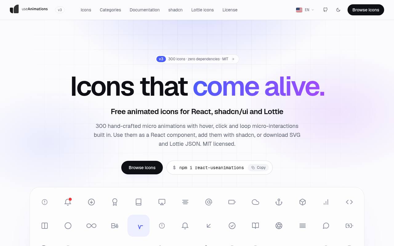
useAnimations organizes its catalog around both icon subjects and interaction patterns, which makes it especially helpful when you already know how a control should behave. You can browse alerts, navigation, media, commerce, and other interface categories, then choose hover, click, or looping motion.
The project supplies Lottie JSON files, static SVGs, and a React package, with registry installation options for shadcn workflows. Its MIT license allows commercial projects and modifications; preserve the license notice when redistributing the files rather than assuming free means notice-free.
- Type
- Lottie & React icons
- Best for
- Interactive controls with purposeful hover and click feedback
- License
- MIT
- Price
- 100% free
lucide-animated
React & Motion components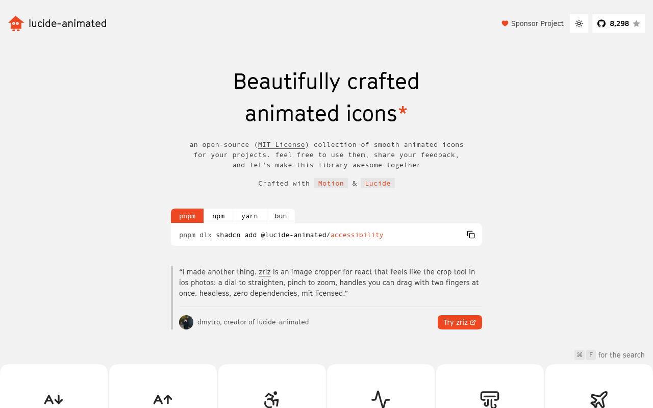
lucide-animated takes familiar Lucide-style outlines and adds component-level movement through Motion. The site offers individual icons with copyable source and a registry route for installing a chosen component into a React project.
This is editable React code, not a folder of ready-rendered GIFs, so it suits teams comfortable maintaining animation dependencies. Standard SVG properties let you adjust presentation alongside your existing components. The project advertises an MIT license; also retain applicable notices for the underlying Lucide artwork when packaging a derived icon collection.
- Type
- React & Motion components
- Best for
- Adding animated line icons to React interfaces
- License
- MIT; retain applicable Lucide notices
- Price
- 100% free
moving icons
Svelte SVG components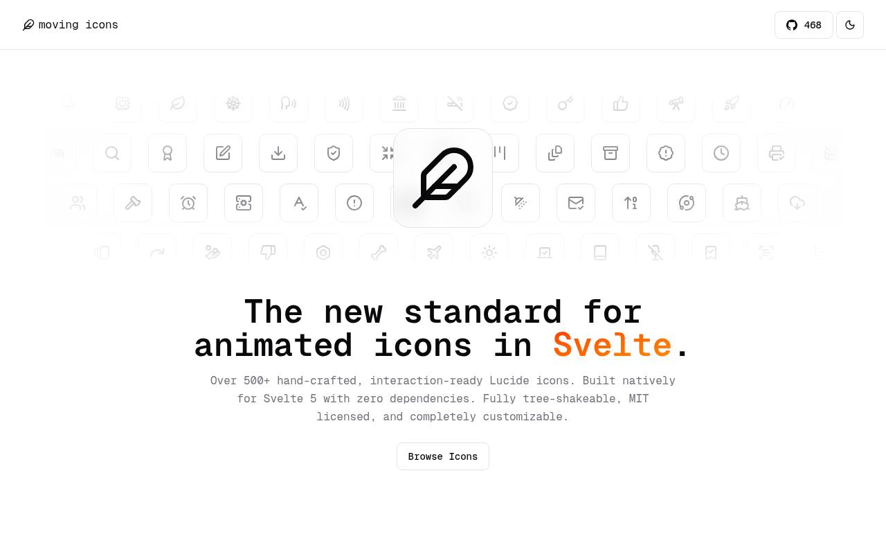
moving icons is built specifically for Svelte rather than wrapping a React library in another integration layer. Its Lucide-based components can be installed through the package, added through a shadcn-svelte registry, or copied from the website.
The documented properties include size, color, stroke width, and an animate switch, giving you parent controlled animation for buttons and other composed controls. The collection is MIT licensed and describes itself as dependency-free. Choose it when native Svelte components matter more than downloading a standalone animation file for a design presentation.
- Type
- Svelte SVG components
- Best for
- Native animated icons for Svelte application controls
- License
- MIT
- Price
- 100% free
Its Hover
React & Motion components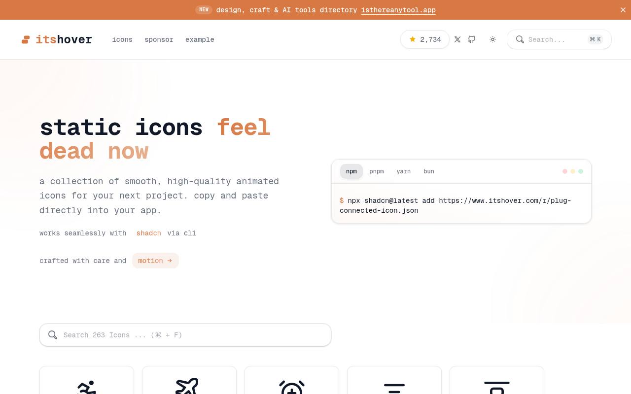
Its Hover provides interaction-focused React icons covering interface actions, status symbols, social services, technology, and currency. Its documentation shows both shadcn registry installation and manual copying from the icons directory after adding Motion.
Because the files are source level components, developers can tune stroke width, color, and movement rather than relying only on a fixed export. Check the repository license file before shipping: its documentation includes conflicting MIT wording, while the linked license identifies Apache licensing terms. Keep the applicable license material with redistributed source.
- Type
- React & Motion components
- Best for
- Customizable animated actions and technology interface symbols
- License
- Apache 2.0; check repository license
- Price
- 100% free
Meteocons
Animated SVG & Lottie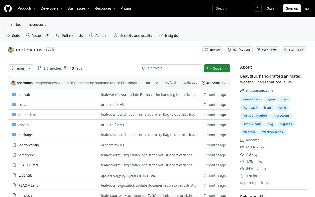
Meteocons, maintained by Bas Milius, concentrates on forecast graphics rather than general navigation symbols. The project documents separate packages for animated SVG icons, static SVG alternatives, and Lottie assets, making it easier to use one visual family across different presentation environments.
Its weather-specific scope is useful for dashboards where conditions, precipitation, and atmospheric states need a consistent treatment. The repository carries an MIT license and includes build information for the source workflow. Select the static package for places where motion is unnecessary instead of trying to freeze every animated file yourself.
- Type
- Animated SVG & Lottie
- Best for
- Coherent animated symbols for detailed weather interfaces
- License
- MIT
- Price
- 100% free
SVG Spinners
CSS & SMIL SVG loaders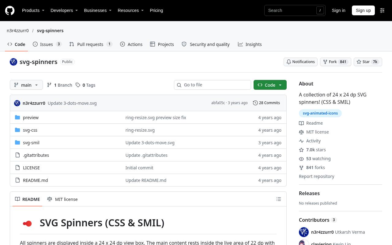
SVG Spinners presents loading graphics in a shared 24-by-24 view box, with examples grouped into families such as rings and dots. Its preview table links to both CSS and SMIL implementations and shows file sizes, allowing a practical comparison before you choose an asset.
The documentation also flags browser behavior when animated SVGs are referenced through image elements, including zoom-related issues in WebKit. This MIT licensed collection is a focused option for loading feedback, especially when you want to inspect small SVG files instead of adding an animation player.
- Type
- CSS & SMIL SVG loaders
- Best for
- Compact loading indicators with alternative animation techniques
- License
- MIT
- Price
- 100% free
SVG Loaders
Animated SVG loading icons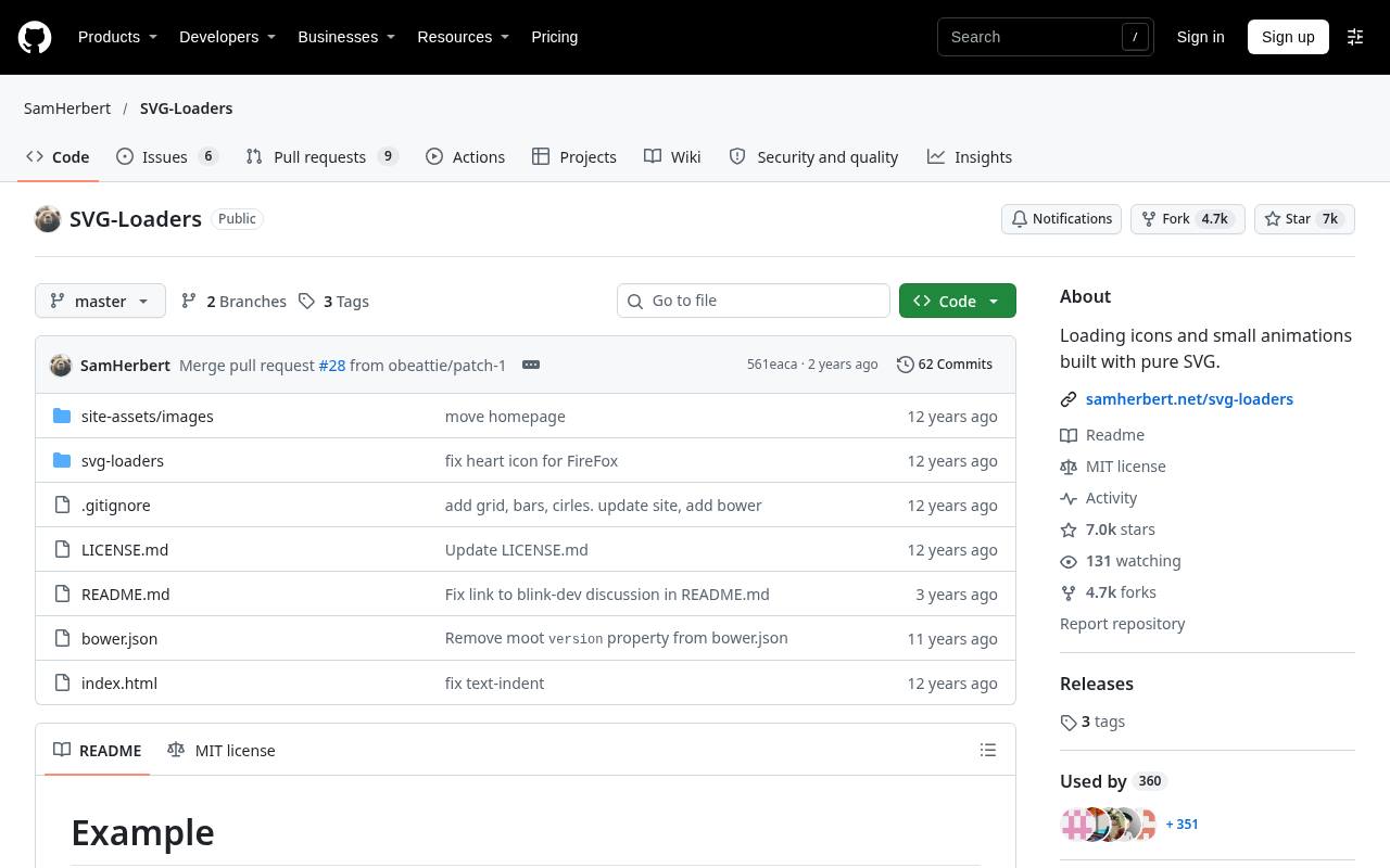
Sam Herbert's SVG Loaders is a compact repository of animated loading indicators with a straightforward download workflow. The documentation explains that you can recolor an icon by changing its SVG fill attribute, and it points to a preview page for comparing the designs.
These are standalone SVG loaders, not a broad system of animated interface actions. The project uses an MIT license and discusses browser support and optional SVG optimization. It is particularly approachable when a developer wants to inspect a small loading file directly and adapt it for one screen.
- Type
- Animated SVG loading icons
- Best for
- Simple editable loading animations without a player
- License
- MIT
- Price
- 100% free
loading.io CSS Spinner
CSS loading animations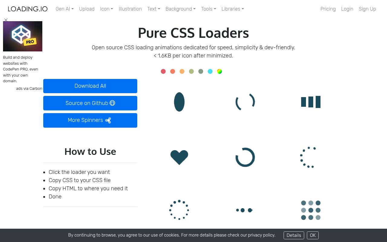
loading.io's CSS Spinner page offers a dedicated set of loading animations built with HTML and CSS rather than video or Lottie playback. You can examine the examples and take the markup and styling into a website, which is convenient for teams that prefer to keep motion inside their stylesheet workflow.
The associated repository distinguishes CC0 loader files from other source code released under MIT. This page is the free CSS collection, not a promise that every product elsewhere on loading.io has identical licensing or export access.
- Type
- CSS loading animations
- Best for
- Lightweight CSS indicators for asynchronous interface states
- License
- CC0 loaders; MIT other source code
- Price
- 100% free
CSS Loaders
Single-element CSS loaders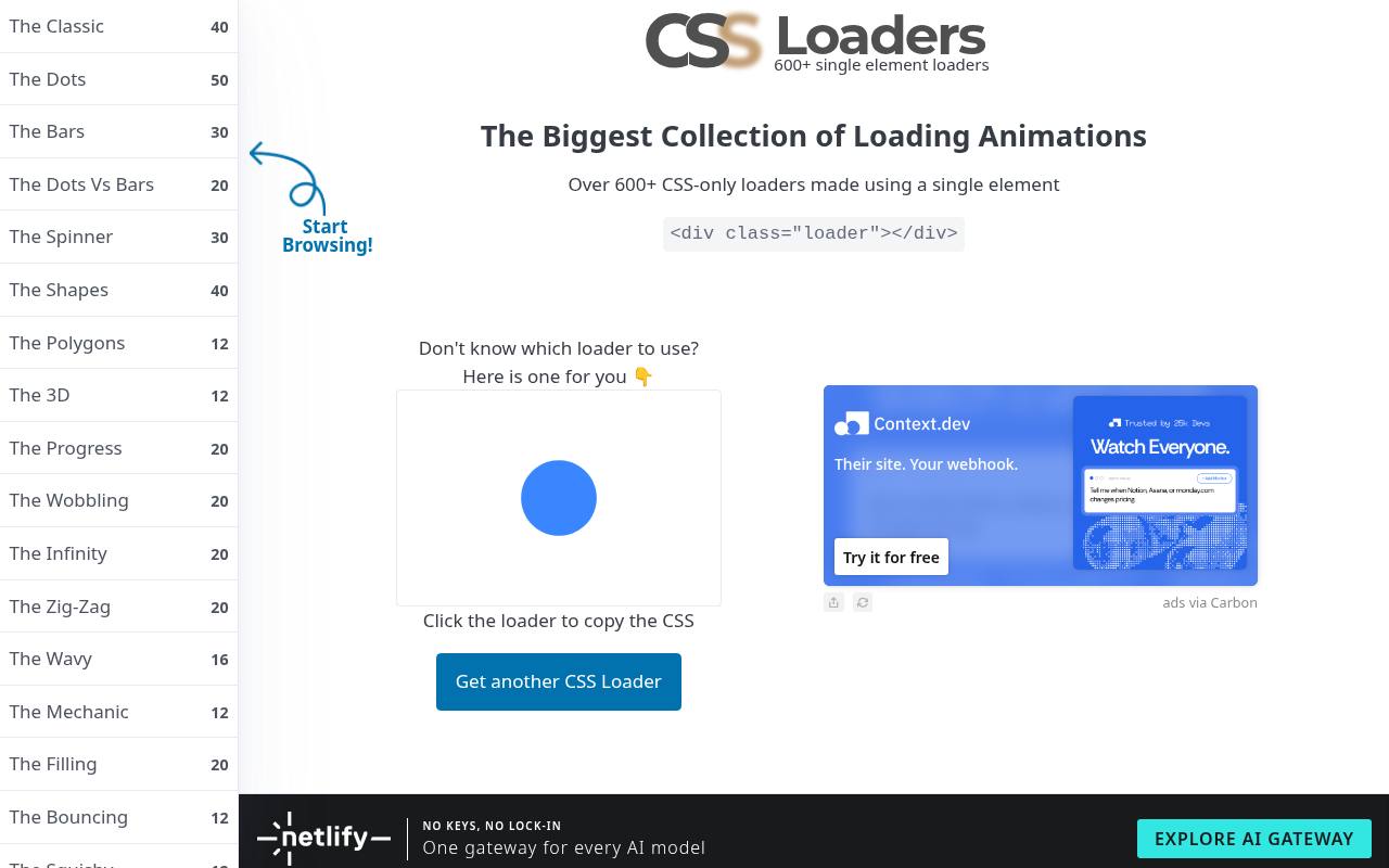
Temani Afif's CSS Loaders explores loading indicators through many visual categories, including dots, bars, spinners, and other geometric patterns. The examples emphasize single element CSS, making the collection useful when you want to understand how a loading effect is constructed rather than embed a rendered animation.
Browse a category, inspect the chosen pattern, and adapt its CSS within your component styles. The project is MIT licensed. These effects are best treated as loading-state building blocks, not semantic pictograms for navigation or a replacement for accessible status text.
- Type
- Single-element CSS loaders
- Best for
- Distinctive loading patterns implemented directly in CSS
- License
- MIT
- Price
- 100% free
LottieFiles
Lottie icon downloads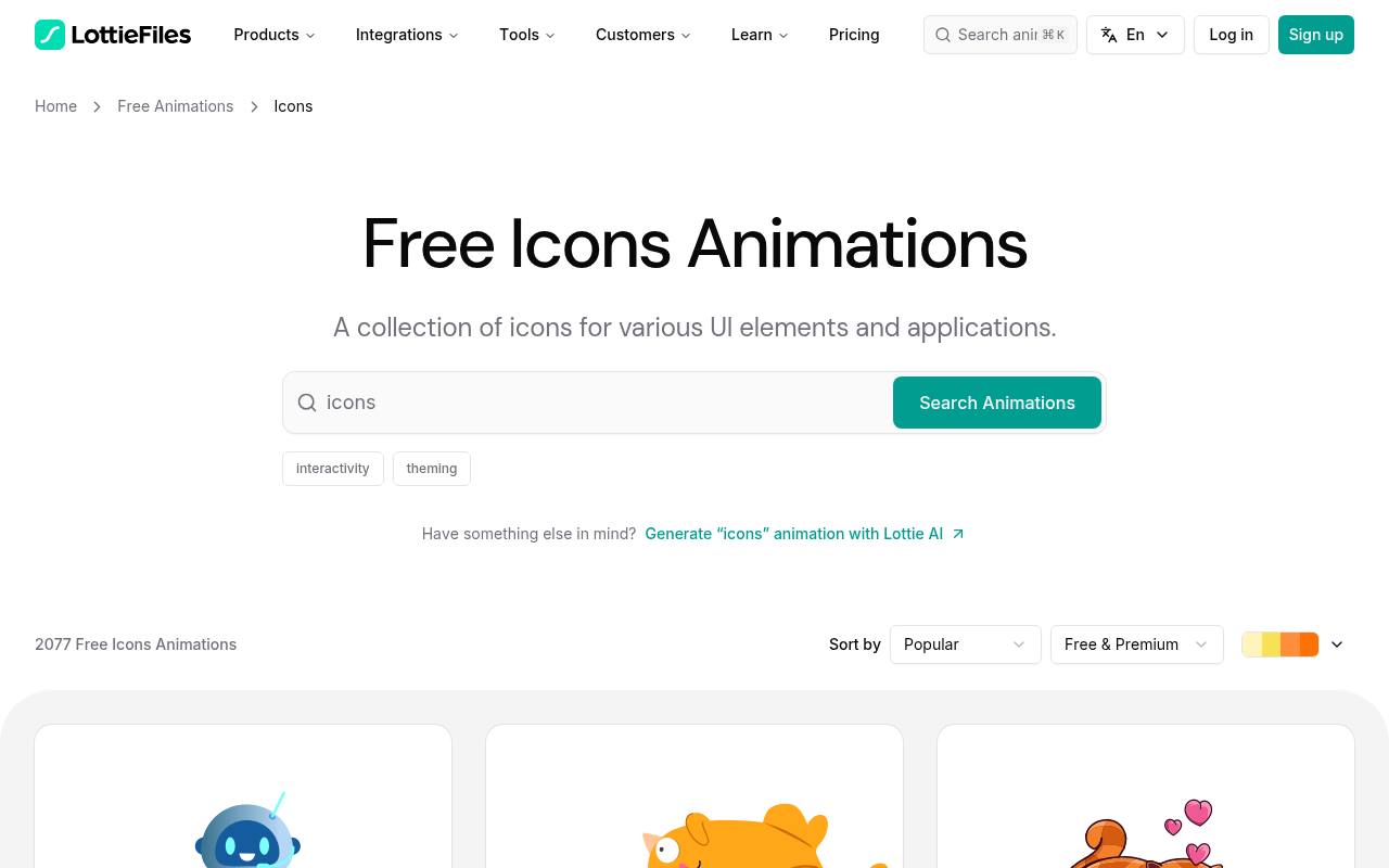
LottieFiles has a dedicated free icon animation category that brings together work from multiple contributors. It is useful for finding free Lottie icons in different visual styles when a single open-source line collection feels too restrictive.
Inspect an individual animation before downloading to confirm its available formats, creator information, and license details; free browsing does not mean every editor feature or platform service is unrestricted. Downloads covered by the Lottie Simple License permit broad project use but have redistribution conditions, so avoid repackaging the marketplace files as your own competing asset library.
- Type
- Lottie icon downloads
- Best for
- Discovering varied free motion styles from multiple creators
- License
- Lottie Simple License; check each asset
- Price
- Free + paid tools
Choose a format before choosing a style
Start with your application stack, not the most impressive preview. React and Svelte libraries make sense when motion needs to respond to component state. Standalone SVG is convenient for reusable visual assets, while CSS loaders fit naturally into existing stylesheets.
Lottie is valuable when designers and developers share a motion workflow, but its player is an additional dependency. Build a small proof of concept with one realistic button or status area before selecting an entire collection. That experiment will expose sizing, triggering, and packaging issues much earlier than a mood board.
Give every animation a clear job
Use purposeful motion cues to confirm something the visitor has done or to explain a state change. A submit button can transition from pending to complete; an endlessly bouncing navigation icon rarely adds comparable value.
Decide whether each animation plays once, repeats while work continues, or responds to pointer and keyboard interaction. Do not leave a loading spinner running after a request has failed. Pair the visual state with an actionable message so the user understands whether to wait, retry, or continue elsewhere in the interface.
Respect reduced motion preferences
Treat reduced motion settings as part of the component contract. For CSS, a prefers-reduced-motion media query can remove or simplify keyframes; JavaScript-driven players need an equivalent preference check and a sensible nonmoving state. Stopping on the first frame is not always enough if that frame is blank or ambiguous.
Choose a useful still icon deliberately. Keyboard focus should offer the same meaningful feedback as pointer hover, without forcing animation to be the only indication that a control is available or has changed state.
Compare actual delivery costs
Measure complete page weight, including runtime libraries, not just the size of an icon file. One small JSON animation may still require a player, while dozens of individually copied components can introduce maintenance overhead. Import only the icons you use and verify what reaches the browser bundle.
For repeated loading indicators, reuse one component rather than duplicating markup and configuration across screens. Test animation on an ordinary mobile device with several instances visible; smooth desktop previews do not demonstrate acceptable battery use or rendering performance on every target.
Keep licensing records with the assets
Record the original download source, project license, and any required attribution when you add an icon. MIT and Apache projects generally allow commercial use, but redistributing source still comes with notice obligations. Marketplace licenses can have separate rules around resale and standalone redistribution.
If a README and license file disagree, resolve the discrepancy before releasing a reusable package. A short asset manifest in your repository is easier to maintain than reconstructing provenance later from filenames, especially when several designers and developers contribute icons to the same product.
Make loading states accessible
A rotating symbol should accompany meaningful status text, not replace it. Hide a purely decorative spinner from assistive technology, and expose relevant progress through an appropriately labeled status area. Avoid announcing every animation cycle or rapidly updating a live region.
When progress is measurable, a progress indicator can communicate more than an indefinite loop. Reserve enough space for the loading and completed states to prevent layout shifts, and check that your icon remains distinguishable against both light and dark surfaces at the small sizes used in real controls.
Test the final integration, not just the preview
Before launch, check real interaction states: first render, hover, focus, repeated activation, loading failure, and disabled controls. Look for icons that restart unexpectedly during rerenders or continue playing after their screen is hidden. Confirm your fallback appears if a player fails or a user disables animation.
Keep duration and easing consistent across the product even when individual assets come from different sources. A restrained group of free animated icons usually feels more polished than a large collection of unrelated effects competing for attention on every page.